
Our refreshed visual language is not just a facelift; every color, every line, every detail is crafted to tell our story—one of passion, progress, and a relentless pursuit of unleashing the potential of every team.
For more than 22 years, we’ve been on a journey to tell the story of teamwork. In December of 2022, we challenged ourselves to map our visual identity system to what teamwork really looks like— a bit messy, a bit eclectic, and made up of lots of different perspectives, skills, tools, and processes.
No two teams are alike and that’s something we proudly celebrate. We partnered with Michael Bierut’s team at Pentagram to help us explore how we might evolve our foundations and key storytelling elements. Through several iterations over many months we landed on some new thinking, principles, and execution that we pressure-tested across various Atlassian surfaces throughout 2023. And we proudly had our public debut at our Team ’24 conference.

Our brand refresh is a strategic and craft-led effort to strengthen Atlassian’s connection with its customers. Our aspiration is to build an enduring emotional connection with our audience through simple but profound consistency.
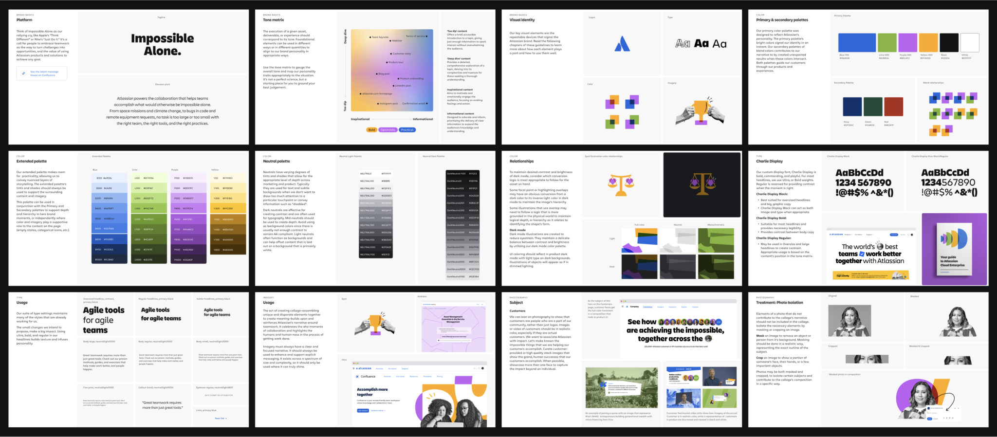
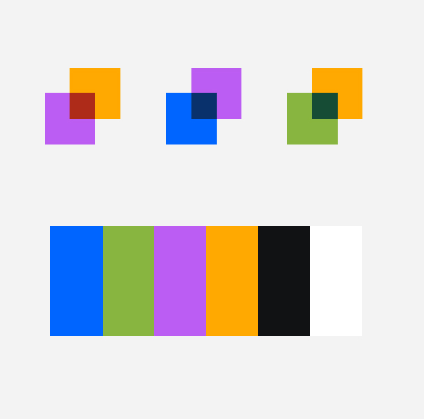
About the visual language
Atlassian believes that when teams come together, they can solve problems big and small. When we thought about a visual refresh, we wanted people to be at the center of it. Our goal was to make the brand feel like it had a human touch, despite it being digital. We sought to evoke this feeling so when people experienced the brand, it created a more tangible connection to Atlassian.
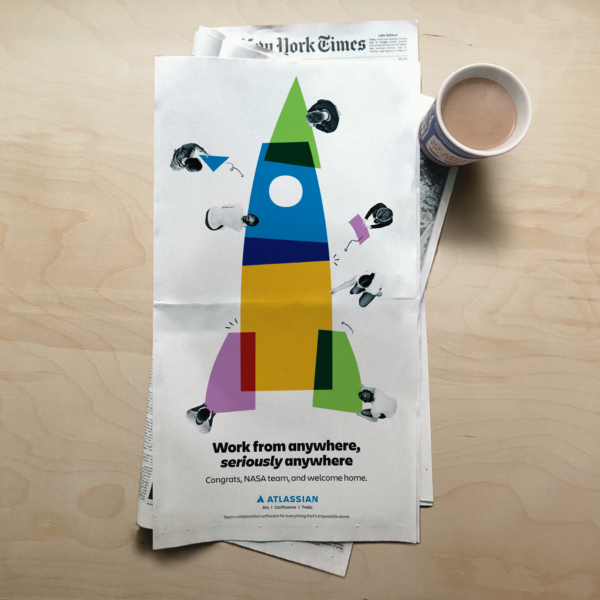
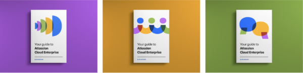
The visual language employs an approach of typography and use of mixed media to “defamiliarize the ordinary”. This approach presents common things in an unfamiliar way to express communications that present new perspectives. It helps us express complex ideas and narratives in a visually engaging way. All the different elements alone are mostly meaningless but when brought together to express our brand in various communication, create something meaningful expressing our brand platform, Impossible alone, Possible together.


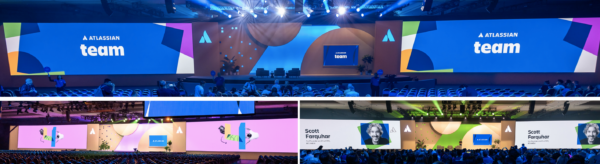

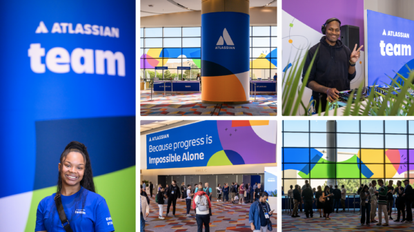
The new visual language came to life at our Team ’24 conference. On stage, we showcased the work of partners, customers, and developers. We also showed the early phases of elements of the language translating into our products, supporting new features in Jira.
While still in its early stages of rollout (pardon our dust), this refresh will be experienced across all customer touch points and will capture and signal the vision we are building toward, embracing the full range of software we build bringing it all together under one company brand.
As we embark on this exciting new chapter, our refreshed visual language is not just a facelift; it’s a vibrant reflection of our commitment to innovation, excellence, and the Atlassian values that unite us. Every color, every line, every detail is crafted to tell our story—one of passion, progress, and a relentless pursuit of unleashing the potential of every team.