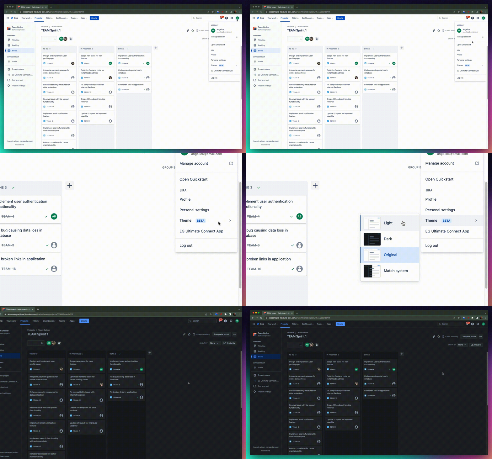
On March 23rd, 2022, Atlassian celebrated its 20-year anniversary. For many of us here at Atlassian, that day marked 2 decades of building on our products to make them the best they can be, listening to our users to make sure we deliver the right features and ultimately helping to unleash the potential of every team.
Even after 20 years, we still have heaps to deliver and we’re not afraid of a challenge. Shortly after our birthday, it was time to tackle one of those challenges, which also happened to be the number 1 feature request from our users: dark theme (hold for applause).
How it started
Just between you and I, we’d tried in the past to release a dark theme for Jira but we just couldn’t jump the hurdles we’d created for ourselves. You see, Jira was built like many digital products of its time. Shared components were under-utilized and we hard-coded the colors throughout the product using hex values to dictate the colors of Jira. As we’ve rapidly grown our products, we’ve built out our component library, but we still had the same approach to colors, until the Atlassian Design System team embarked on a strategy rehaul and introduced design tokens. But what are tokens?
Introducing design tokens
Design tokens are a single source of truth for naming and storing design decisions (including color). Instead of using a hex value in the code to dictate the color of something, we use a design token. The Design System team has the colors of each token stored at a system level, so if we decided to change the color of all our buttons across Jira (for example), we’d only need to update one token instead of updating thousands of buttons manually throughout the whole product.
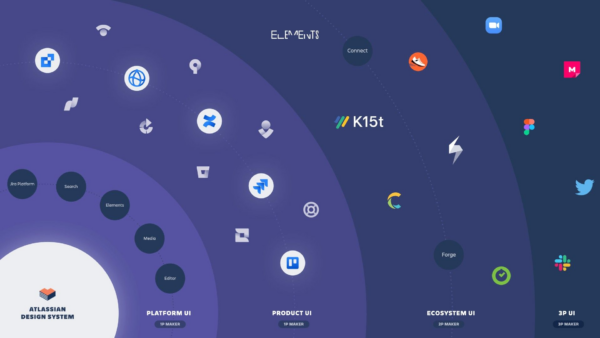
The next step in the process was taking the brilliant idea of tokens and actually implementing it across our products. Unfortunately, this was no small task. We needed to account for the scaleability of it all. Not only do tokens need to work in our products, but they also need to work with marketplace apps and other products that are integrated with Jira. The scale of this is demonstrated in the image below, where Platform and Product UI represents Atlassian internally, Ecosystem UI represents our trusted partners, and 3P UI represents 3rd party apps that need to integrate seamlessly into our software.

But we had to start somewhere, so the Atlassian Design System team wrote an automation script that would hunt for all those hex values and transform them into tokens, reducing 90% of the human work.
So, while most of the work was done using Atlassian tools, we still needed a human touch. Over 25 teams reviewed what felt like a billion screens, then we were confident we’d done it! Tokens were implemented across Jira products, saving a few gaps we were continuing to work on. Surely after that, it would be as easy as flicking the switch and making dark mode happen, right? Not quite. We needed to do more work to extend our solution to images, obscure features in our products, and the thousands of marketplace apps that would need to quickly adopt the change in order to be compatible with the new themes.
The alpha release, and the early access program
Thanks to the tokens working across the Jira products, we were able to create a rough working version of a dark theme and a new light theme with better contrast. We believed the themes were working well in most corners of Jira’s products, but Atlassian doesn’t make your typical software, so it was never going to be that simple. Part of what we do is make highly customizable products that work for any and all teams – not every team is the same after all. Not to mention, we have thousands of marketplace apps created by our partners in the Atlassian ecosystem that can further customize someone’s experience with Jira. Unfortunately, that means it’s hard to know exactly how our Jira products could look to every one of our millions of users. Our best bet was to go live using a release method we call Jira Labs.
If you’ve never encountered Jira Labs before, it sits within your Personal settings. It’s where we release experimental features that we want to live test with our users and iterate based on their feedback.
We knew there would be a few bugs and we wanted to make sure everyone using themes through Jira Labs fully understood what to expect. So, instead of doing a full marketing campaign and fanfare inside Jira, we quietly wrote an article and published it on Atlassian Community last December.
Rather unexpectedly, the alpha release blew up! There were YouTube videos, massive numbers of eager users opting in to use the experimental feature and feedback, lots and lots of feedback.
Eating up the feedback
We love feedback, it gives us direction and helps us understand what we got right, but also helps us focus our efforts on what we need to improve. When we first launched into Jira Labs, we were receiving around 700 pieces of feedback per week! Continuous improvements brought that number down to around 17 pieces of feedback per week. Overall, we got over 5176 bits of feedback on the alpha release for themes in Jira. It took around 5 months to dig through the feedback and conduct audits and usability tests to make improvements to the themes experience by fixing hundreds of bugs of varying sizes.
One of the big improvements we needed to tick off while we were testing in Jira Labs was ensuring marketplace apps would continue to be compatible with Jira while using the new themes – that meant getting our Atlassian partners the support they needed to implement tokens into their own experiences. One of Atlassian’s values is “Open Company, No Bullshit”, that value allowed us to support our Atlassian partners so much faster because we don’t keep secrets. Before all this work started, we were able to share the intention of our design strategy rehaul with our Atlassian partners. As soon as we could, we publicly released tokens on our open design system for anyone to use and we shared our APIs with our partners so they could sync up their appearance with the user’s theme selection.
How it’s going
We’ve come a long way and dozens of Atlassians have worked tirelessly to fundamentally rehaul how we do things in order to support a themed experience for our users and make it the best it can be. The best part of it though, it’s paid off.
Beta has landed
In April this year, we moved the new themes out of Jira Labs and into the live product. Our most recent numbers (as of writing this blog) show around 350,000 people using the new themes and we’ve barely started spreading the word that it’s there for everyone to use.
Beta, by definition, still isn’t the final product. We’re nearly there, but we’ve still got a few more kinks to iron out and we are still hungry as ever for feedback from you.

Still in the works
If you do try out dark theme while it’s in beta, there’s one thing you may (or may not) notice. Some of the images across Jira won’t look quite right. That could include little icons and creative illustrations. These things don’t use hex values, so there is more work to be done to make those things fully compatible with the new themes.
A handful of developers have banded together once more to create a new script that will find and collate more than 1200 images across our Jira products, owned by more than 60 teams, so our design team and the brand team can start individually creating alternative versions for the new themes.
We did it
Our focus now is moving through the beta phase of the new themes we’ve already built and getting the final version out in the wild, but we’re so proud of where we’re at.
Delivering on the number 1 feature request was a challenge, but we can confidently say (even after 20 years of it) we don’t intend to slow down when it comes to facing these challenges. We still have plenty of awesome features to deliver, and we’re as excited as ever to unleash the potential of every team.

