Life of a Growth experiment
A while back, we spoke about What does a Product Growth engineer work on? This was a great introduction to the world of Growth engineering and what we, engineers, do. This blog is going to look more into the details of how we do an experiment, using a real production example. We introduce the flow and the structure of an Atlassian Growth experiment. Then, we run through an experiment lifecycle, starting from an idea up to the experiment results – and reveal a surprise twist at the end.
Is growth all about hacking?
So, why do companies experiment? Experimentation has strong historical association with the term “Growth Hacking.” That term had some romantic flavor around it in the early days, yet the meaning has somewhat changed over time.
When people say “Growth Hacking“ they mean something like this:
Growth teams run random quick and dirty A/B tests
to achieve disproportional wins.
Sometimes this could be true, but a typical Growth experiment diverges from this notion. Growth teams occasionally get quick wins from low hanging fruit, but those situations often happen when teams start on a new problem area and have a good idea of what’s broken. Chances are, those opportunities wouldn’t last for too long and more thoughtful experimentation is needed.
Most big wins would be a result of careful work
and placing strategic bets.
At the end of the day, the majority of experiments we run are well-designed, prepared, and targeted. Let’s now look at one such example to illustrate this point.
The experiment
The team was working on a new area for them – the problem of users ‘cross-flow’, or users starting to use one Atlassian product from another product, between Trello and Jira.
Although these products are very different in general and help users with different kinds of jobs, there are also many similarities between them, such as a board view of tasks, and usage patterns can blur and mix. We want to serve users’ needs with the right product that matches their needs the best.
To help users navigate those products better, Atlassian surfaces them in the “Switcher“ component, which allows them to navigate to or join another Atlassian product:

When a user clicks one of those product links, they can start using it after an initial setup. Let’s take Jira as an example. The user will have a screen presented to them, explaining Jira’s use cases upon selecting Jira from the switcher.
Here’s the flow a person will see:
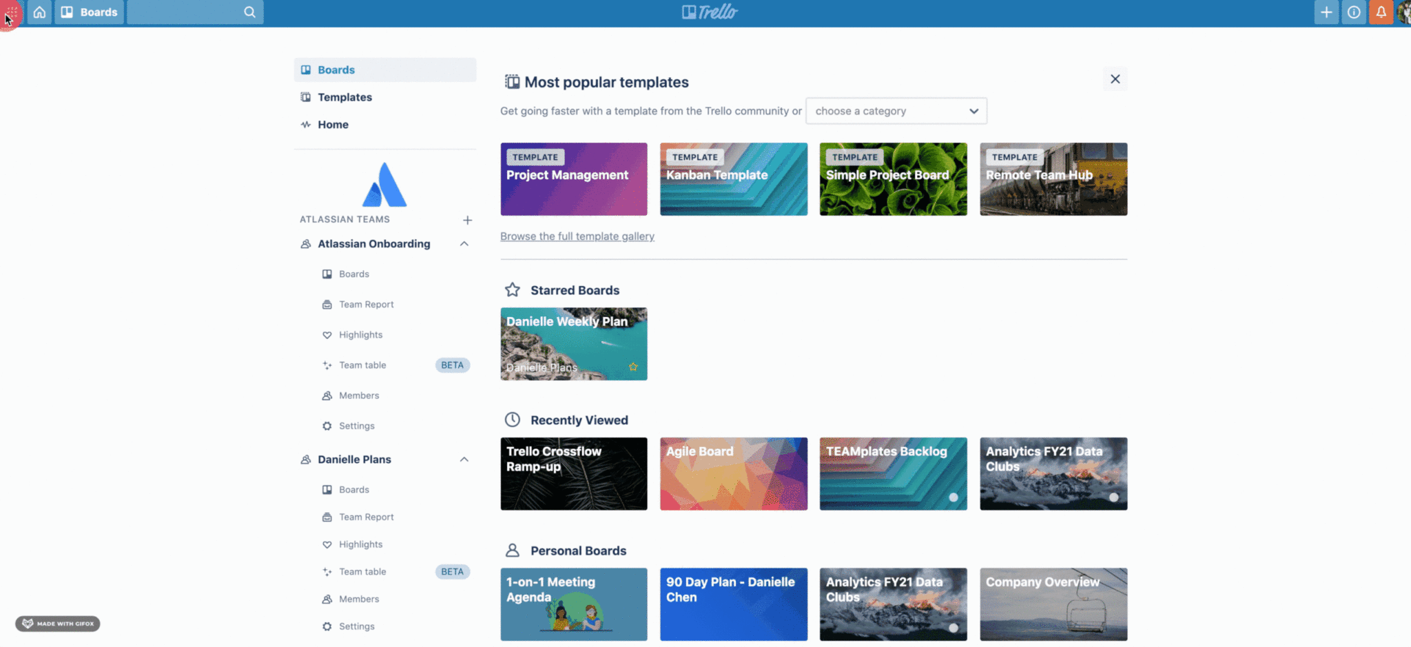
The opportunity with this experience is that users receive a generic product description on that screen, which doesn’t provide useful information about the product.
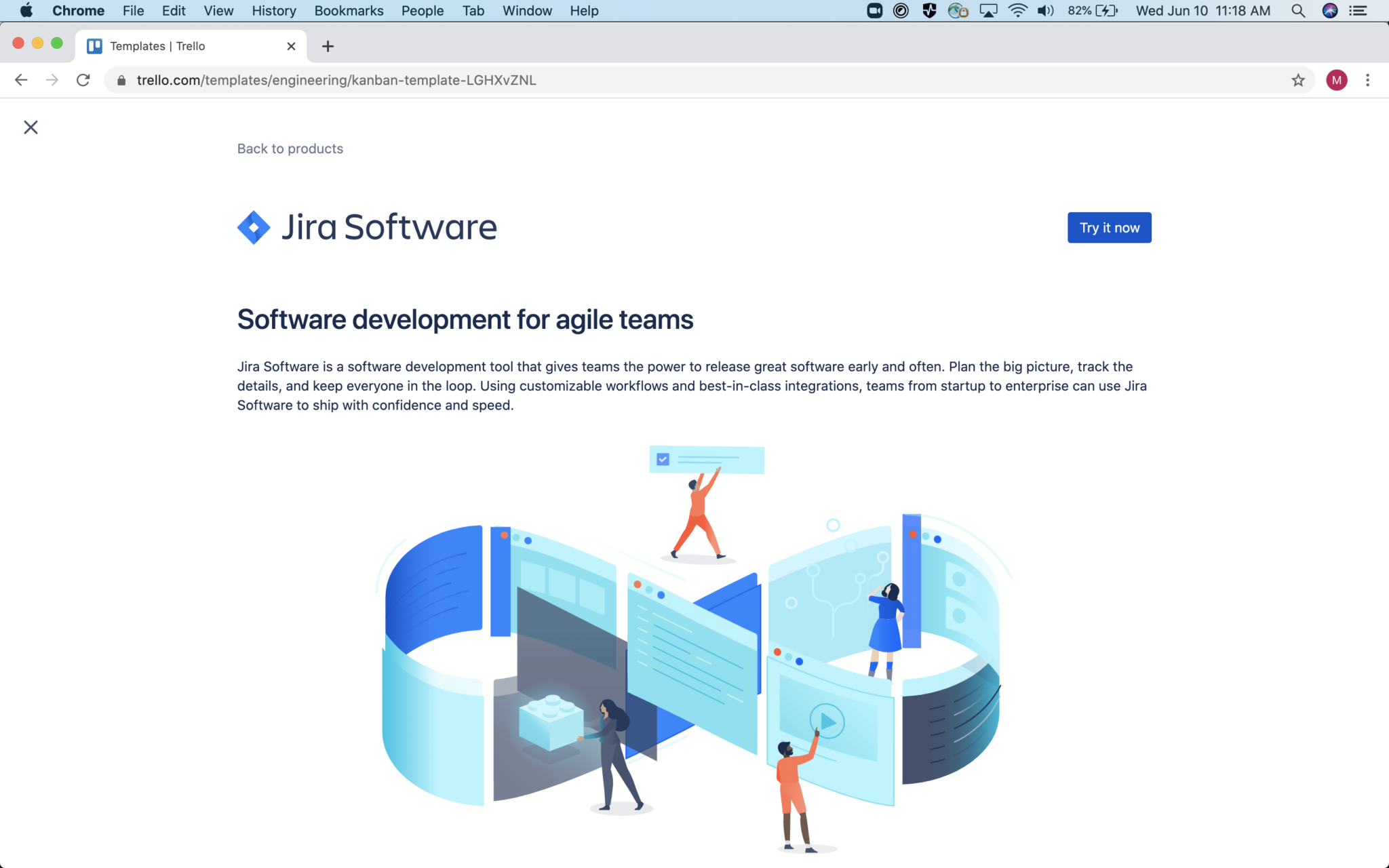
We would like to present users with a compelling story about their use cases and where Jira can help. The data also showed that 58% of users who get to this screen drop off, meaning they abandon Jira onboarding at this point.
User drop-off rates vary across various user journeys, but this percentage represented thousands of users dropping off on this screen in a period of time. All in all, this seemed like a significant opportunity to explore!
Narrowing down the experiment scope and targets
Seeing a potential opportunity is not always enough. It’s a common trap to discover a huge opportunity and assume that one can tackle it easily. We should have a better idea of the experiment opportunity before we start because experiments can be costly in terms of time and effort.
Hence, we do opportunity analysis. We start by producing a hypothesis of an experiment first. In this case it was:
We believe that highlighting key feature differentiators
of Jira will help Trello users learn about how Jira can optimize
their work process […] compared to the existing screen where the
illustration is too abstract and the copy is not use case specific.
And at the same time, we defined our target metric:
We will know we have succeeded when Jira expands* increase.
* Expands: number of people starting to use Jira from Trello in this case
Combining this together:
We hypothesize that updating the value props on the
JIRA product value page will reduce the drop off rate on
this screen and increase expand rate as a result.
The good news is that in this case we already have the number: only ~40% of users who saw the screen would click the button to continue their Jira exploration.
Looking into the Trello usage patterns, we could also make educated guesses about which user cohort would find Jira helpful. Analyzing this cohort, we saw an opportunity for “click-through rate“ to improve by ~10%. This click-through improvement translates to our target metric goal. We also forecasted an increase in “expand rate” by ~10%.
In this case, analysis gives us enough signal to proceed with the experiment by confirming the opportunity.
Solution
At this point we know that the experiment is worth a try and we start working on the actual implementation. Remember, the hypothesis was about explaining the value of the target product better. After a few iterations of design we decided to go with a carousel component, consisting of several rotating images explaining Jira’s value and use cases:
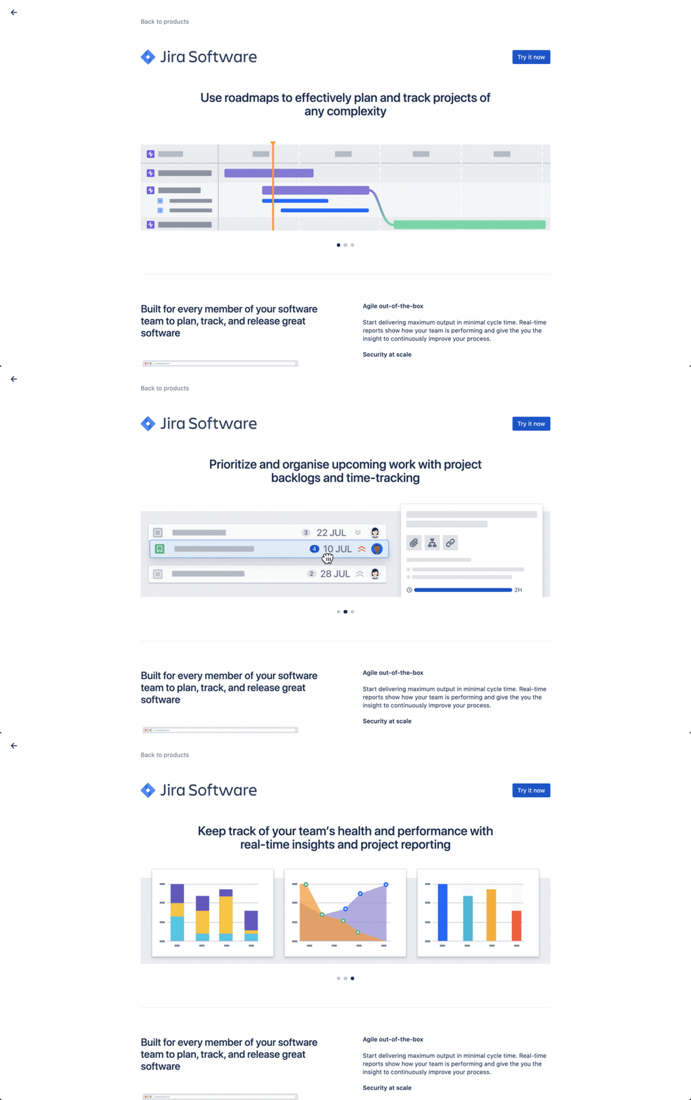
Here, implementation is simple in that we’re just replacing one image with another. We also still need to target the right users and ensure that we have enough instrumentation (analytics) to measure the difference in the final outcome.
Analytics are de-personalized records of user actions in the product. Frontend code generates analytics events, which is delivered to the Atlassian analytics infrastructure. In the end, they end up being a record in a data warehouse available for further analysis.
For this experiment we had enough analytics implemented already, but we added a few events measuring the details of users’ interactions with the carousel.
Targeting happens to also be quite simple. We were changing a niche aspect of the product, and there were no other experiments running on this experience at this point. As such, the experiment can cover all the users going though this flow. To make things simple, we split the target user base into two halves – experiment and control. We did not need to use a concept of holdout for this experiment or the use flow.
So, now we’re ready to ship this experiment to production!
Rollout
As part of the development cycle at Atlassian, we use feature flags that allow us to enable or disable a feature in production with a quick configuration change. Most changes deployed to production are initially disabled by the feature flag so that the user experience is not impacted by deployments, and then features get enabled when ready (the exception to this is the changes that cannot be feature flagged, such as library upgrades). Typically, features are not enabled in one big switch – instead, they get rolled out in chunks, starting from a small percentage and moving to a 100% rollout. Until 100% rollout is complete, some users see the old experience while some see the new.
This is what front-end implementation of a feature flag may look like in actual production code:

Users will automatically be getting either the experiment or the control experience based on their user ID. It is important that users will always get the same treatment when they get to the experiment rollout, regardless of the rollout percentage so that there is no re-balancing of users between groups. And when user gets into the experiment, they stay there. This is important as we do not want to have users changing their experience based on the percentage of rollout. Launch Darkly (our feature flags platform) explains it well:
When you set up a percentage rollout, the variation a
user receives is determined by the user’s key. The percentage
rollout logic generates a hash from the user’s key or attribute,
the user’s secondary attribute (if provided), the flag’s key,
and a hidden salt attribute stored in the flag.
In Growth we use gradual rollout heavily, but we also do something else. In our case a 100% rollout means a deployment to all target users in the experiment. But we roll out experiment experiences to only part of the target cohort so that we’re able to measure the impact of the experiment. In this case, we rolled out the experiment to 50% of the users in the overall cohort, and 50% stay in the control. Control receives the existing product experience with no changes. Sometimes we also keep a “holdout group“ – a group of users who are not getting any experiment changes. This group helps us measure the cumulative effect of a few experiments within a single experience. Holdout groups will get their experiences upgraded, too, albeit less often and never as an experiment.
In this experiment, we deploy to Trello users who interact with the Values screen. We start the rollout from a small percentage of target users, and increase to 100% (50+50 experiment+control in this case) within a few days.
The process is explained by the below visual. We start from three groups, where all the users (100%) start in the “not-enrolled“ group. However, during the rollout progression, we moved users from “not-enrolled“ to both “experiment“ and “control.” Control and Not-Enrolled groups do essentially get the same experience, but the experiment only starts when all users reach either Control or Experiment groups (as in the screenshot below).
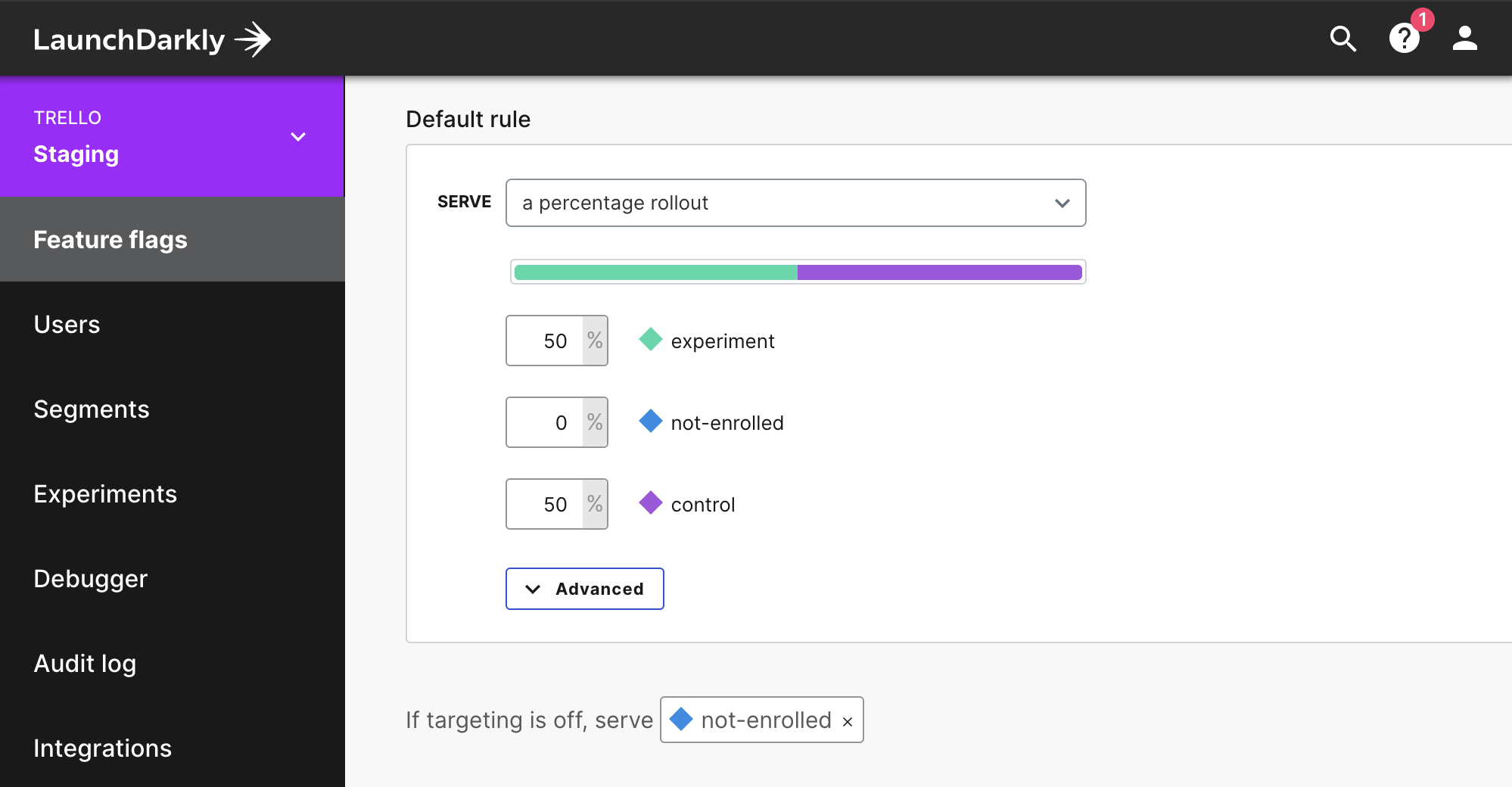
During the rollout, we check and test for any problem reports. This phase allows us to verify that the experiment is functioning in the first place, by rolling out from 5 → 15 → 25 → 50 → 100% over the course of a few days. We do this slowly since mistakes are inevitable and some of them will slip through testing. There have been experiments that have had to claw back and pause roll out due to analytics or edge case experience issues. Thanks to the staged rollout, only a small subset of customers would typically be affected, and issues were resolved quickly.
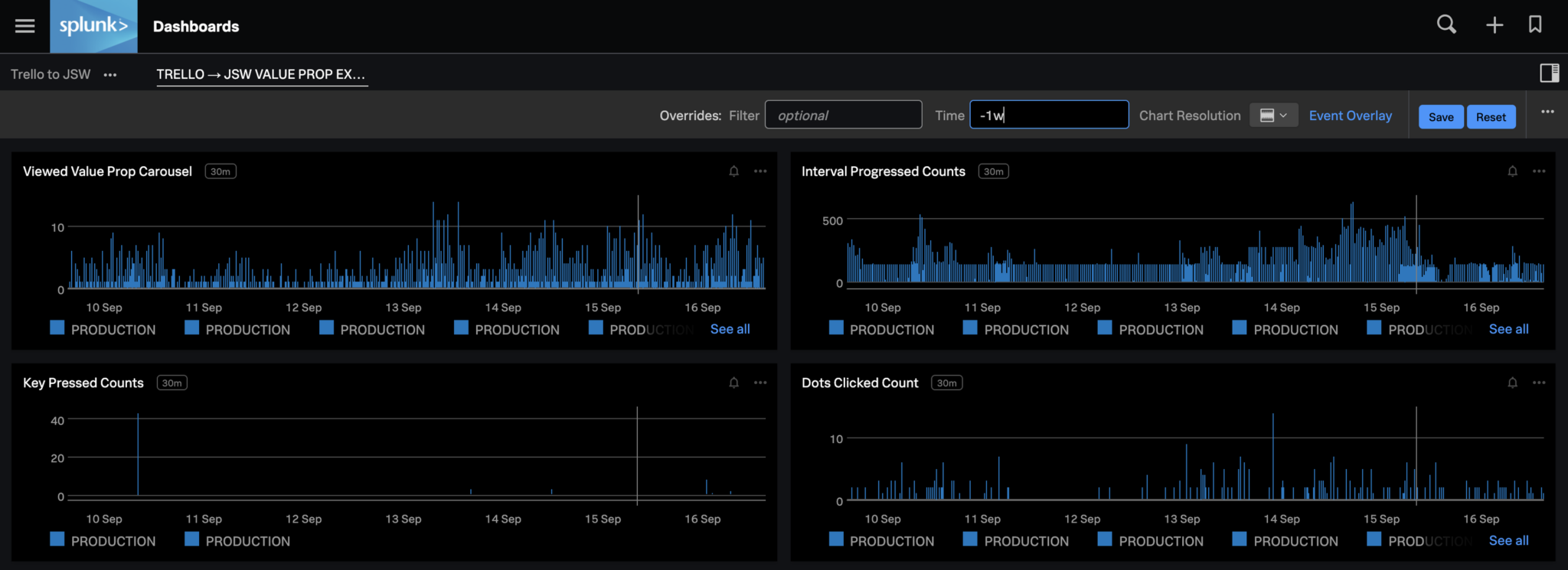
We also monitor the rollout heavily and often use various telemetry and monitoring tools for it. Here’s an excerpt from one such tool showing some of the metrics being tracked.
When Rollout is finished, the experiment run time starts. No active work is carried at this stage apart from monitoring.
Note: Sometimes we need additional time to run the experiment due to lagging metrics. An example of this is inviting users, which is measured 7 days after seeing the experience to provide time for such users to accept the invitation.
An experiment matures when enough data has been gathered for a statistically significant result, at which point the experiment ends. That means we switch off the experiment experience and revert it to the original experience.
Results of the experiment
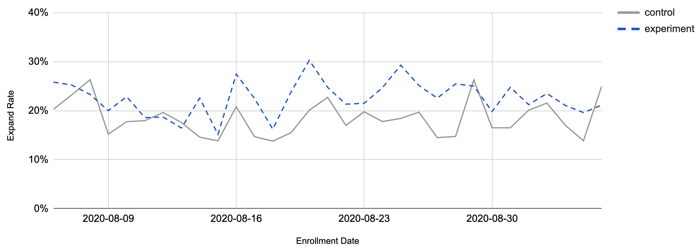
In this case, the hypothesis was confirmed!
Explaining the value of the product in a more specific way did help users. They chose Jira as a product for their use case (whilst retaining Trello) more often in the new experience. Some numbers:
Users clicked the new version of the screen ~20% more often […]
nearly 30% more users expanded from Trello to Jira as a result
These results were statistically significant and proved the hypothesis. Over time, this is what we saw with the expand rate metric:
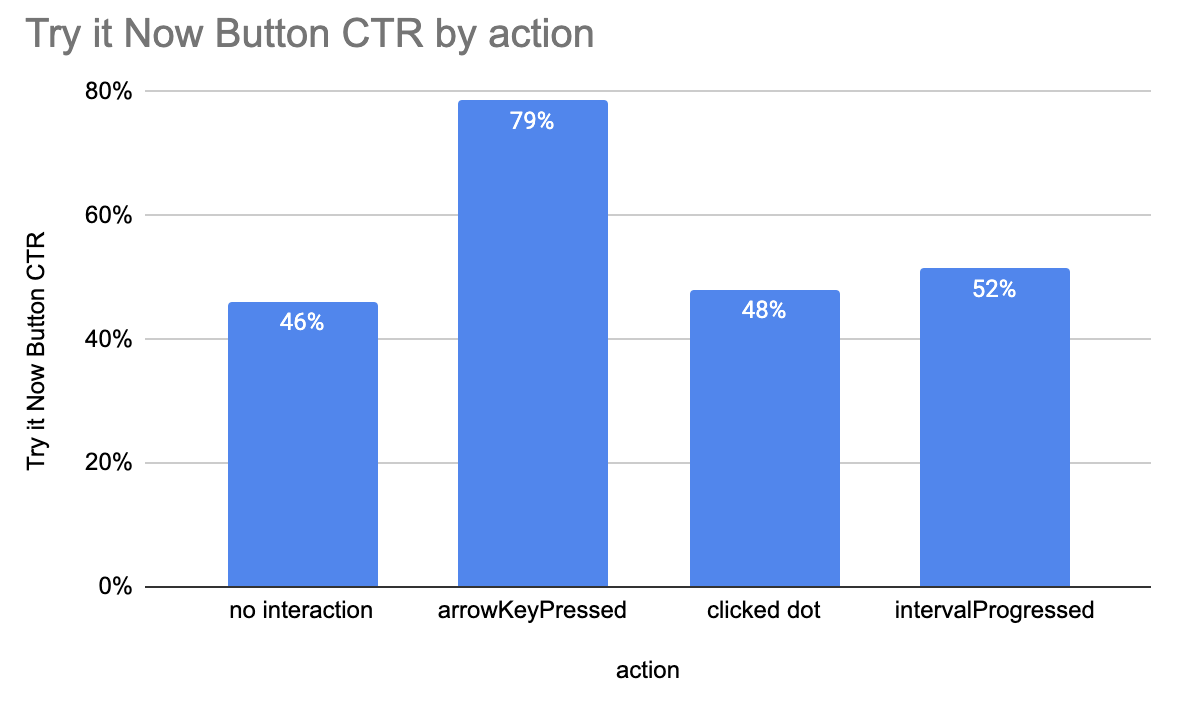
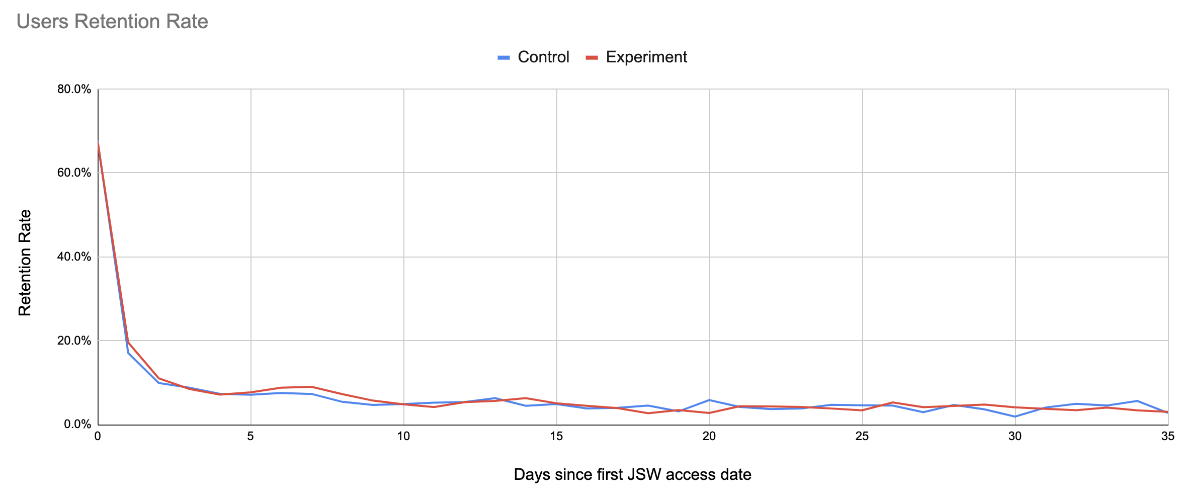
Along with primary metrics, we measure some secondary and “guardrail“ metrics that help us balance the value delivery without over-optimizing the product. In this case, we measured retention on both products and product usage on both sides. We did not notice any issues there, either, checking metrics like “Click-Through Rate“ (CTR), MAU (Monthly Active Users), Cross-flow rate and others.
Here’s an example of the CTR secondary metrics:
And here’s one of the guardrail metrics tracked to ensure there’s no negative impact from the experiment:
Evolving the experiment
We achieved a positive result and learned a few things from this experiment, so what’s next?
Since we experimented with one pair of products (Trello and Jira), it makes sense to try this approach again with another pair of products. It happens that other Atlassian products have the same user flow integrated, such as Confluence, Jira Service Desk and Bitbucket.
The new hypothesis is the same one as we had before
We hypothesize that updating the value props on the JIRA
product value page will reduce the drop off rate on this screen
and increase expand rate as a result.
But it applies to users working with products other than Trello. For the second stage of an experiment, we target Bitbucket users who interact with the Switcher in a similar way.
The second experiment is even simpler than the original one. With a comparable opportunity and the same experience, we can scale it easily. In addition to that, much of the original delivery implements common components, so the second experiment is just a targeting update. We now target Bitbucket users in a similar 50/50% fashion.
Results and learnings
So, what were the results? It’s tempting to expect that the second experiment produces similar results of a positive change to expand rate and to expect CTR to improve with no effect on guardrail metrics.
Sounds legit? Bang! Here comes the surprise. This second experiment resulted in a negative trend in target metrics. Bitbucket users seeing an updated page have expanded less, not more!
In fact, we observed a 12% statistically significant decline in expands. That came along with a negative 11% effect on retention guardrail metrics! So, we rolled back this experiment as a result.
If you think this result is counterintuitive you’re not alone. But that’s why we do experimentation in the first place – to find out and learn.
The moral here is that our guesses can be wrong, even if they seem to look like a sure-fire success.
For the sake of this blog, we omitted many other learnings gathered by this experiment. However, we did notice quite a few interesting facts on user behavior, such as the dependency of their behavior on their team composition and activity, the difference between guided tour experience (other experiments), and carousel, and others.
Conclusion
In this blog, we presented two simple Atlassian Growth experiments. We examined basic principles of experimentation and the tools assisting them. We explained the differences of experimentation and “Growth hacking.” We also learned that experimentation helps us understand product and user behavior better. And we saw how experiments are implemented in practice.
Some experiments may also result in an unexpected surprise. We can prove our near-certain hypothesis wrong. That’s why experimentation is useful for product evolution and user experience discovery. It helps us deliver better value to the people using Atlassian products.
