Bitbucket Cloud’s pull request sidebar is useful because it displays all the relevant details of the pull request you’re looking at. However, with so much information present, it can be hard to find the information you need. To address feedback we’ve received about its readability and usability, we’ve given it a redesign.
Tabs for easier navigation
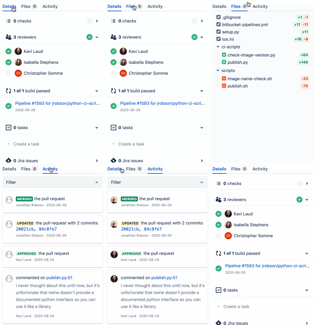
The previous composition of the pull request sidebar resulted in a long view that necessitated scrolling. With so many sections, it was also difficult focusing on information of interest.
We decided to introduce tabs. We lifted out two of the largest, most used sidebar components, and placed them in their own contexts:

This makes it much easier to find the content you’re looking for. Instead of scrolling up and down to find whatever file or piece of activity you were interested in, you can now click on the relevant tab. Additionally, the sidebar feels neater and less cluttered.
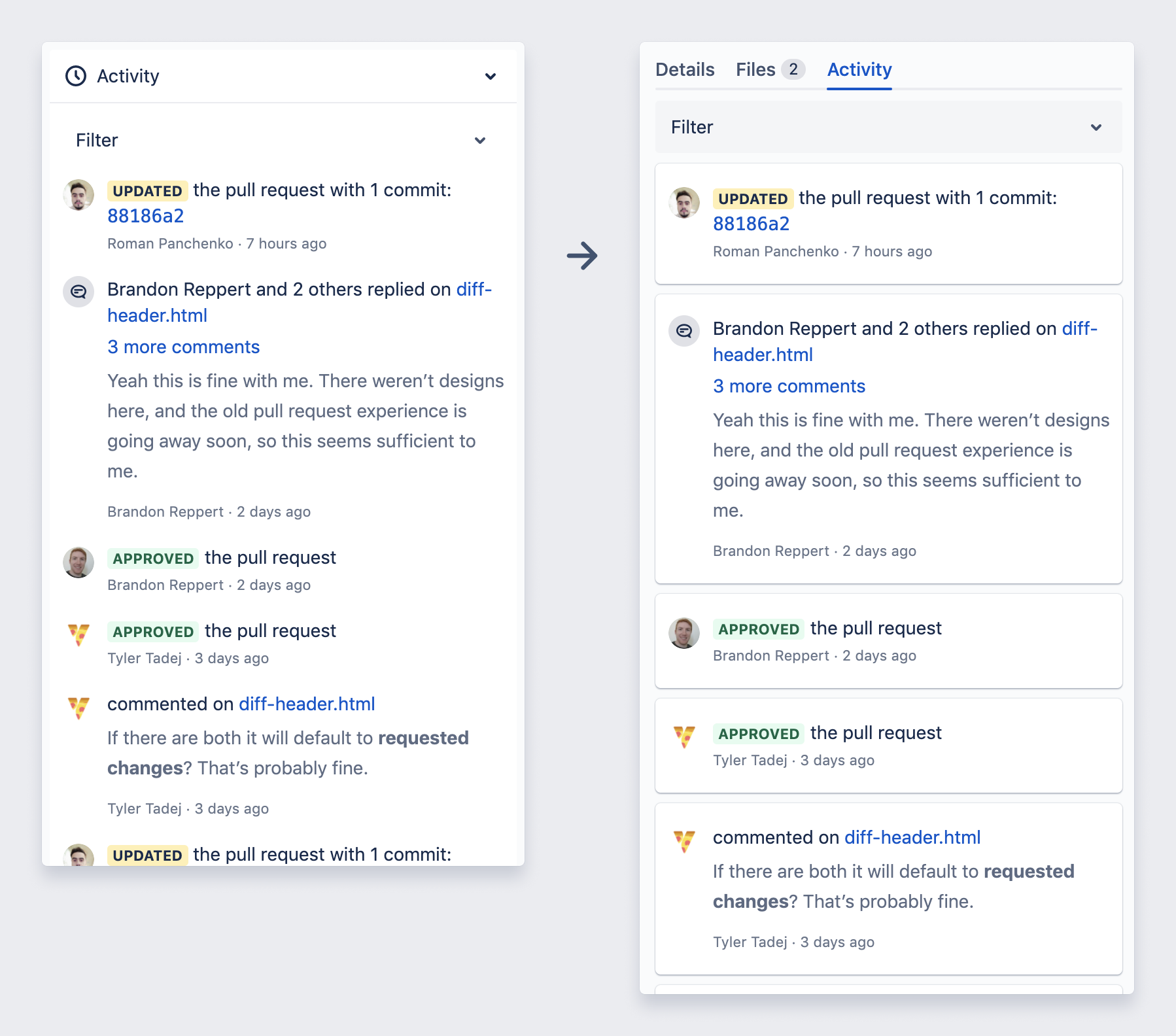
Activity Feed is now easier to scan
There’s usually a lot of events on the Activity Feed. So we separated each event so they are seen clearly as their own entities. This serves to make the feed much easier to scan and review.

Simplified File Tree
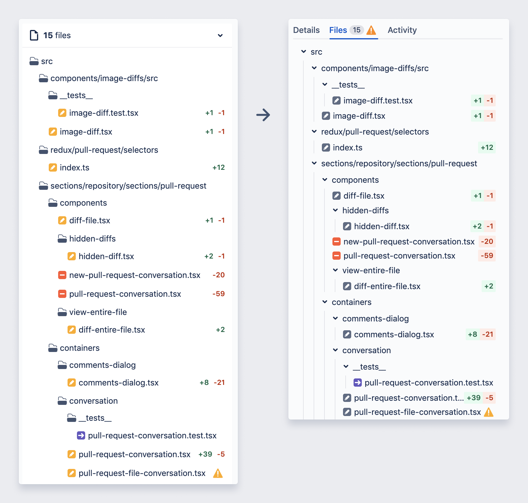
A critical part of the pull request view is its representation of modified files. For the old view, there were numerous complaints on the file tree’s size and digestibility.
So, the file tree view was re-vamped. Among other things, we slimmed its design, simplified the elements and introduced guidelines.
We also enhanced the collapsing/expanding of directories: we made it more discoverable and provided the number of files underneath a collapsed folder.
Here’s the before and after.

Try the brand new file view
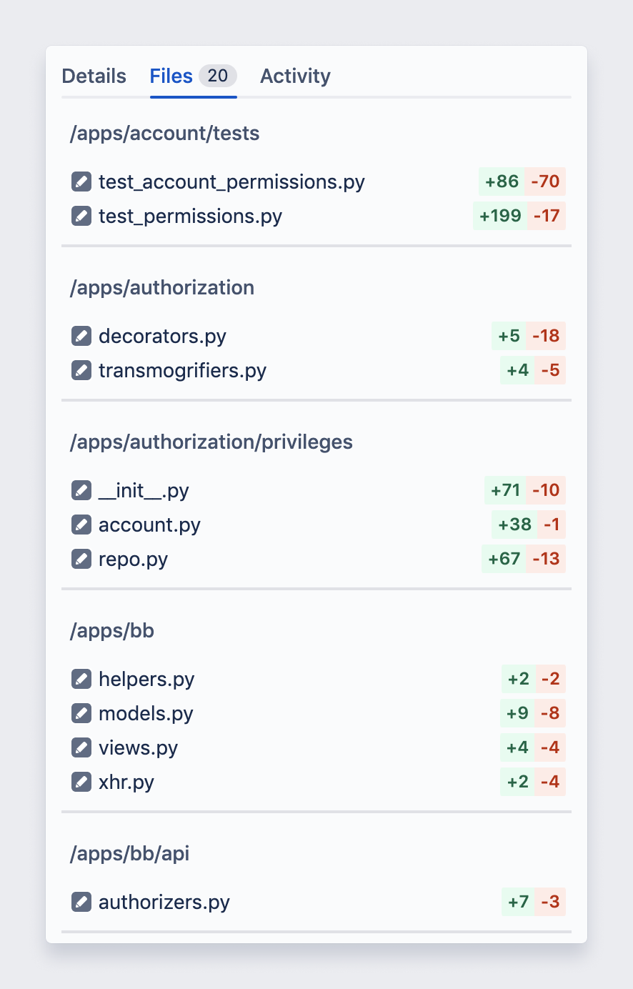
We also released an entirely new feature: the file list. It’s a brand new view for a pull request’s modified files. Instead of displaying each file in relation to all its ancestral directories, we present a flat list of files.
We imagine this will be handy for developers looking at a pull request containing code in languages such as Java or Kotlin. Even if you’re not using such languages, the file list is still a beautiful and simplified presentation of the files you’ll be reviewing. To activate it, just click out the settings button atop any pull request, and under “Sidebar” options, click “List”.

What’s next?
There are a number of under-the-hood improvements made to the sidebar as well. While we think all these changes will provide a simpler, cleaner experience that will help you easily find the information you need and complete your code review faster. We’ll continue to listen to your feedback to improve our UI and features.
