Software development requires a comfortable setup to be successful. If a key on your keyboard isn’t working, it feels like nothing is working. Your chair, lights, monitor – they all come together to help you be productive.
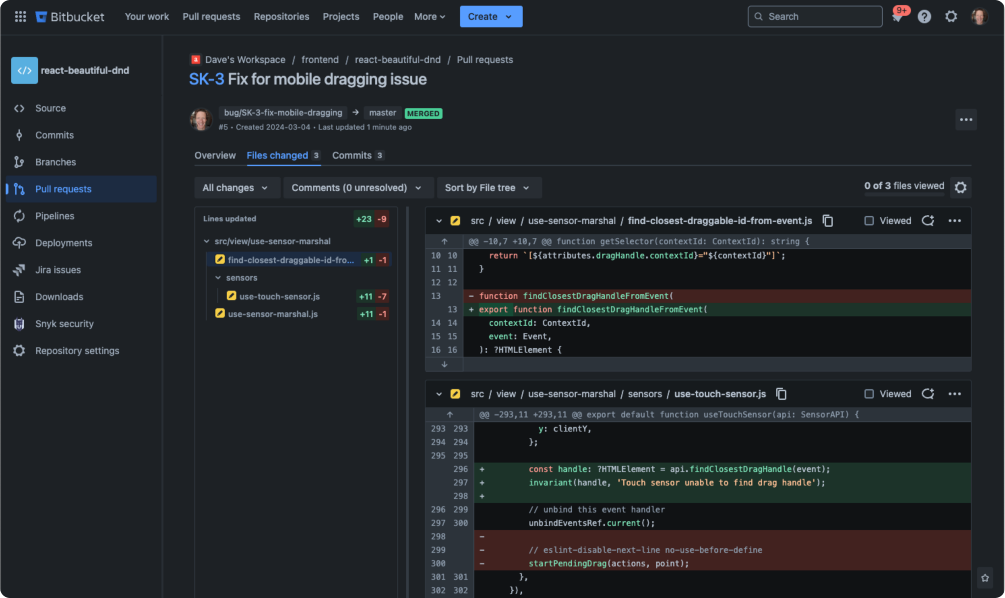
But what’s on the screen matters too. If you’re looking to improve your focus, reduce eye strain and lift your overall code review experience, Bitbucket Cloud now offers a dark theme option, a long-awaited feature among our most passionate users.
Starting today, we’ll be rolling out this feature to our entire user base. We invite you to sit back, dim the lights, and see a whole new side of Bitbucket.

Breeze through code reviews
If you’re used to writing code in a dark-themed IDE, you’re going to appreciate having the same option for doing code review in Bitbucket. We’ve taken special care to make the overall pull request experience look fantastic in dark mode, focusing on all the little details like file tree icons and a great syntax highlighting theme. (What’s that, you haven’t turned on syntax highlighting yet?) It all adds up to a more seamless experience for engineers who prefer to spend their working life in dark mode.
Theme selection available soon in your Bitbucket profile menu
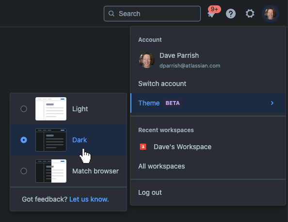
Starting today, dark theme will be gradually rolling out to Bitbucket users. You’ll see an announcement message in Bitbucket when we’re ready for you to start using it. To turn on dark theme, open your profile menu and then choose Theme > Dark.
Of course, you’ll always have the option to stick with light theme if that’s what you prefer. And just like in other Atlassian products, you can choose “match browser” to lock your Bitbucket theme to your system setting.

Share your feedback with us
Our product, design, and engineering teams read every single piece of feedback you send – the good and the bad – and it helps us make Bitbucket better. We’d love to hear your thoughts about dark theme after you’ve given it a try.