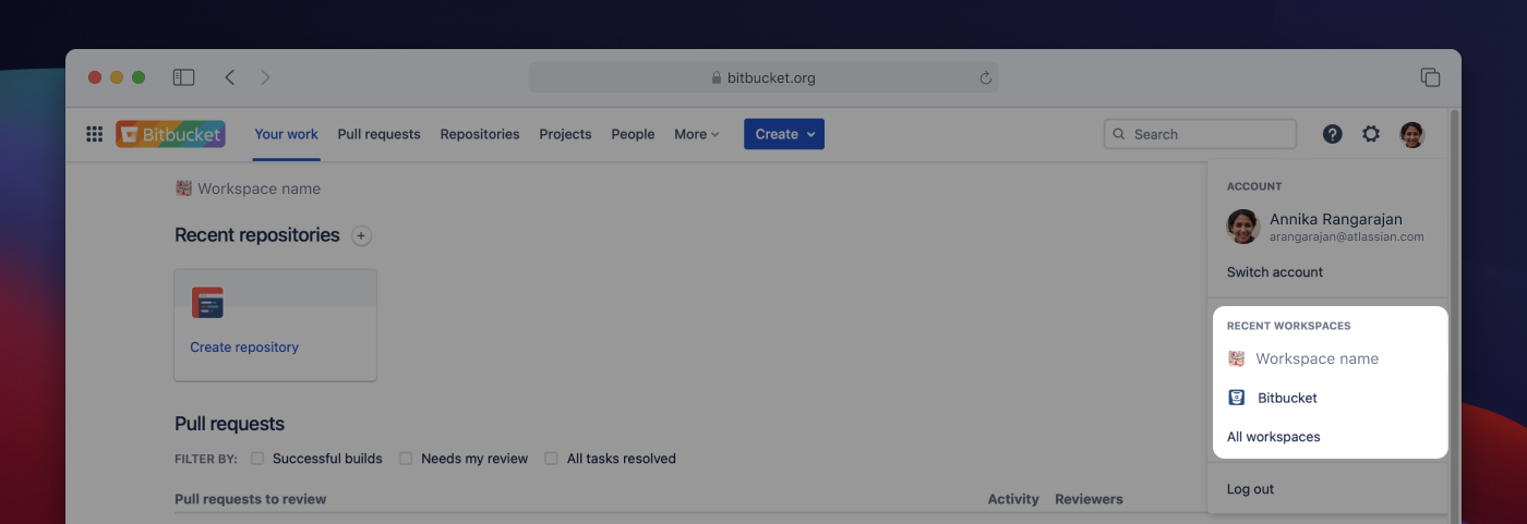
Following on from the adoption of the horizontal navigation, the Bitbucket Cloud team is pleased to announce some improvements to the way users move around the product.
You’ll begin to see these changes over the next few days, if you haven’t already.
What is changing?
Single workspace scoped navigation
Up until now, the top (global) navigation bar in Bitbucket Cloud was scoped to all workspaces that the user is a member of. For example, the Your work page displayed your relevant pull requests from all workspaces, and the Repositories page displayed a list of repositories from all workspaces you have access to.
Going forward, the top navigation will only show content from the workspace you are currently viewing. Content from other workspaces will no longer be shown. That means that the top navigation menu is scoped to a single workspace to make it easier for the user:

When you want to see content from a different workspace, you will need to switch to that workspace. Use the workspace switcher in the top right corner of your profile menu to switch to a different workspace, or to see a list of all workspaces you have access to.

Besides the workspace switcher, there are a few other ways to switch workspaces:
- Select a direct link to Bitbucket Cloud content (e.g. a bookmark, or an email or Slack notification from Bitbucket Cloud)
- Enter the workspace URL manually in the address bar
- Use search to find and navigate to content from a different workspace (the search bar remains global and across workspaces)
To help users see which workspace they are currently viewing, we’ve added a workspace indicator to each page.

Additional navigation bar improvements
We’ve made a few smaller changes to the top navigation bar as well:
- Direct access to the Pull Requests page
- Workspace members directory is now under the People tab
- Consolidated menu for all settings – if you are a workspace admin, this is where you’ll access workspace settings going forward. Reminder: Workspace settings are scoped to the workspace you are viewing.

Why these changes?
There were two main reasons driving these changes:
- Alignment with other Atlassian products – Jira and Confluence utilize a concept called sites to help situate users. Scoping the user experience to a single workspace brings Bitbucket closer to that experience.
- Performance improvements – Many views and pages in Bitbucket Cloud had to query content from several workspaces. With all these views scoped to a single workspaces, we are expecting some pages to load faster due to less content needing to show on screen.
