We are excited to announce that improvements to the Branch page will be available in Bitbucket Cloud in the coming weeks!
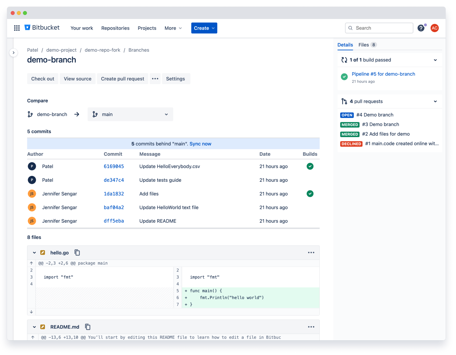
Comparing two branches can be a critical step before creating a pull request. We recognize that it can be a cumbersome experience to see the Branch page displayed differently than the Pull request page. To solve this, we have redesigned the Branch page to better align with the pull request experience and give you a ‘code first’ view into your branch and files so you can get to work quickly and confidently.
A familiar design
Instead of having them spread across different tabs, diffs and commits are now both centrally located on the page, requiring fewer clicks to jump right into the diff.
Diff file headers are also sticky to the top of the page as you scroll, so you don’t lose your place viewing long diffs. To further reinforce this, the current file is highlighted in the file tree on the right sidebar as you scroll.
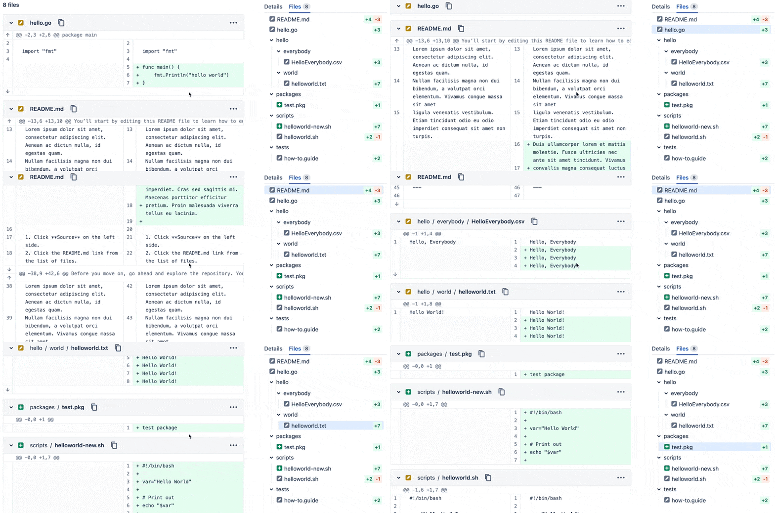
Before, it was easy to lose your place when reviewing long or similar files. Now it’s always clear which file you’re viewing.
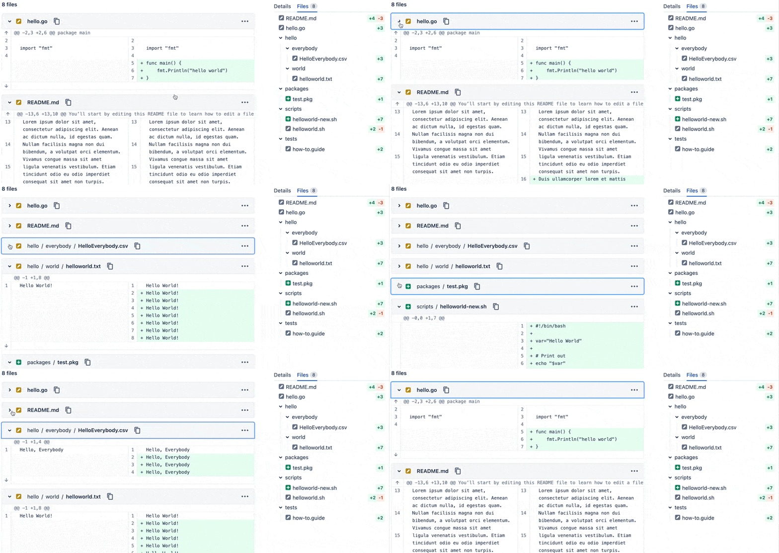
In addition, each file’s diff is collapsible so you can mark your progress and reduce scrolling as you move through and review the branch. And each diff’s side-by-side view is now available inline, instead of in a modal window.
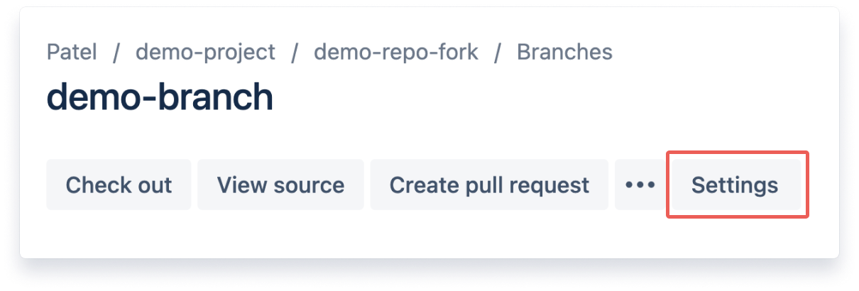
To provide you with the same settings you have when working on your pull request you can now select your preferred diff viewing settings by using the Settings button at the top of the branch page.
Sidebar with file tree
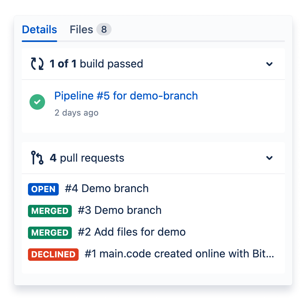
Similar to the right sidebar on pull requests, we’ve moved key details onto collapsible cards in the branch sidebar, including the build status and relevant pull requests between the two branches, allowing for quick reference at any time.
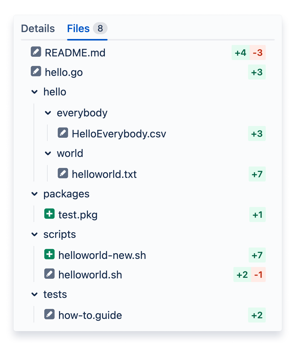
One of the right sidebar tabs is the improved file tree for navigating between different files in the diff. You can see the status of each file and the number of diffs in each. At a glance, you can tell which files have the most changes without having to open each file, and now, you can jump between files without having to scroll back to the top of the page.
Better support for forked repositories
Previously, the branch page did not support cross-fork comparison, but now it does! On a forked repository the Compare option displays all the branches from the original repository for comparison.

These changes will be progressively rolled out over the next few weeks.
Happy branch reviewing!