Introducing A new Bitbucket pull request experience
Here at Bitbucket Cloud, we are focused on helping you and your teams have the best possible experience for code review. That’s why we continue to add features like batched comments, marking files as viewed, AI-assisted pull request descriptions and iterative reviews.
We also want to give you the best possible experience navigating a pull request, which is why we’re proud to be introducing a brand-new layout for pull requests. It’s available for you to try as of today, and over the coming weeks we’ll be rolling it out to all of our users.

What’s new in the design?
The pull request page is the place in Bitbucket where your most critical work gets done, and we’ve consistently heard a couple areas of feedback that we wanted to address:
- It can be difficult to understand what’s changed recently, which is critical when you’re returning to a pull request you’ve already viewed.
- Navigating PRs with a large number of files can be challenging with the existing sidebar file tree.
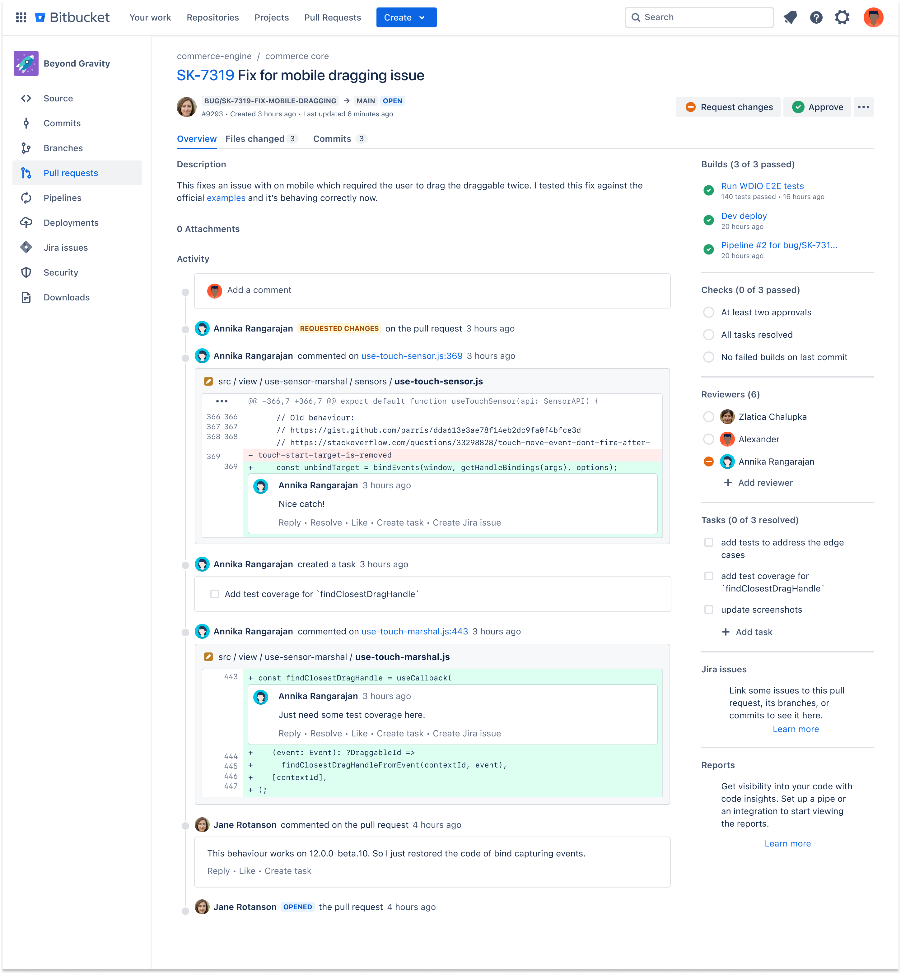
That’s why we’ve moved to a tabular design that puts recent activity front and center, as well as providing a dedicated diff tab for full-screen code review. This design was heavily influenced by our sister product Bitbucket Data Center, so those of you who have used BBDC will find our new layout particularly familiar.
Rich activity feed
Right away, you’ll notice that we’ve moved the activity feed from the right sidebar to its own prominent space on the Overview tab. Here you’ll find all the latest updates on the pull request – comments, approvals, new commits – in an easy-to-read format.
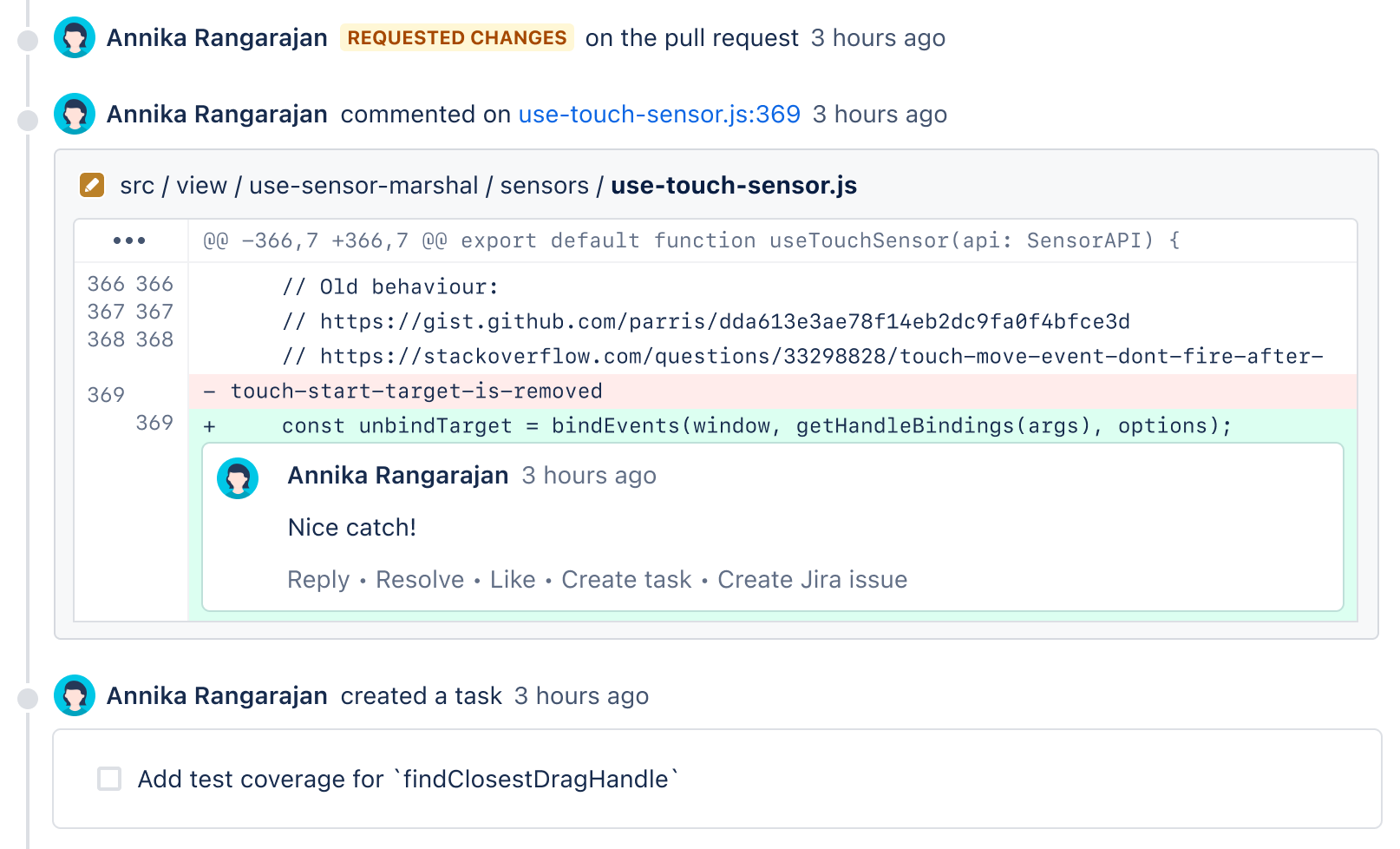
We’ve given particular attention to comment threads, which now include the context of code changes that they apply to. You can also reply to, resolve, and create tasks from comments right on the activity feed. And, when you need to, you can jump from a comment thread straight into the diff.

Focused code review
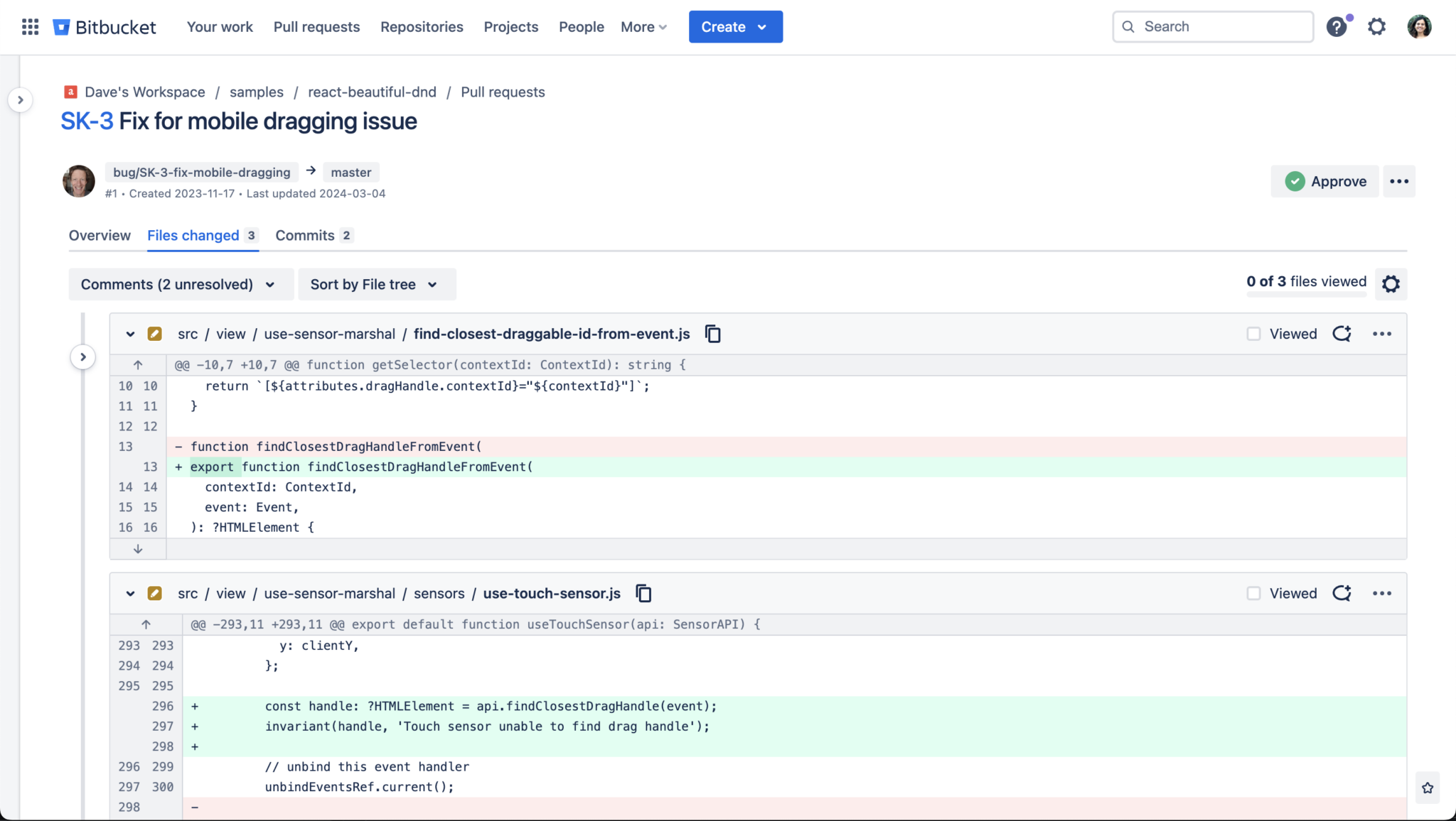
The Files changed tab provides a dedicated space for you to dive into code review. We’ve moved the file tree from the sidebar to the left of the page, a more natural location. If you like, you can fully collapse the file tree and side navigation for full-screen code review.

This new design for the diff includes all the viewing options you’re used to, like side-by-side code review, hiding whitespace changes, and loading files individually so you can focus on one file at a time.
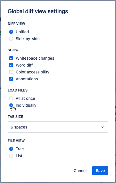
We think this new diff view works particularly well in single-file mode. To switch this on, go to the Files changed tab, select the cog icon, and then choose the option to load files individually.

Available today
Starting May 13, we’ve made the new layout available to all Bitbucket Cloud users on an opt-in basis. If you’d like to be one of the first to try it, visit Labs in your Bitbucket settings, then switch on the New pull request experience feature.

In the coming weeks we’ll be gradually rolling out the new experience to users, so you can also just wait and you’ll see it automatically. We know it can take time to adjust to a new layout, so as we’re rolling out the feature, you will have the option to temporarily change back to the old view.
Starting June 10, the new layout will be fully rolled out, and we’ll permanently retire the old view.
We’d love your feedback
Here at Atlassian, our teams have already been seeing the benefits of working with this more streamlined view of pull requests. And while we are confident that your teams will have this same experience with the new layout, we would love to hear from you after you’ve had a chance to try it.
If you have any feedback whatsoever – or if you’ve found a bug – please head to the Bitbucket help menu > “Give feedback” to share your thoughts with us.