It’s been a busy quarter for us at Bitbucket. As you may have noticed, Bitbucket is faster than ever, and even more reliable for our human users, cloning agents, and even for our robot friends who reach on behalf of CI systems and other integrations.
We also have a bunch of new features that have launched recently. Here’s a recap:
Merged pull requests in compare view
It’s often useful to see the pull request history when comparing a branch to master, or between tags. In this way you could see all the features (and fixes) that have been pushed from, say ‘staging’ to ‘deployed’ versions of your application, shown as a list of pull requests.
A tab called ‘Merged Pull Requests’ now appears alongside the familiar ‘Diff’ and ‘Commits’ tabs on all Compare and Branch results to list any pull requests that have been merged into the source, and you can now examine each of these pull requests with a single click.
Introducing ‘Omnibar’
Sometimes you just can’t be bothered with your mouse. For the power users of Bitbucket, we’ve created the Omnibar, a one-stop shop for finding the things you want and taking action on them without ever having to leave your keyboard. Your repositories, pull requests, and issues are just a few keystrokes away. Just hit the period key to reveal Omnibar.
Ignore whitespace in diffs via URL
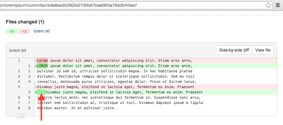
Depending on language and coder style, sometimes you do care about whitespace in diffs. But sometimes whitespace differences just clutter up the diff. Bitbucket now gives you the option to ignore whitespace in diffs.
Whenever you’re on a Bitbucket page showing a diff, you can add “w=1” to the query string in the URL to force the diff engine to ignore whitespace when comparing lines. On reload, differences in the files where a given line has only unmatched whitespace will not be shown.
Custom tab size via URL
So, how wide should a tab be? It’s a matter of taste, and, if the discussions on our team are any example, of religious conviction. Now you can set all tabs in Bitbucket code displays to the width you believe is best by adding a “ts” query param to the URL and reloading the page.
For example, adding “ts=4” to the query string of a URL will set the tab size to 4 spaces for all code on that page. The feature is currently supported in Chrome, Firefox, and Safari, but not Internet Explorer due to CSS limitations there.
Emoji Auto-complete
Sometimes, code comments, wiki pages, and readmes are just crying out for emoji. But who can remember ‘Face With Stuck-Out Tongue And Tightly-Closed Eyes?’ (表情(いー))
The many (many) emoji Unicode has to offer can now be entered in Bitbucket by ‘type-ahead’ when you type a ‘:’ followed by any part of the emoji description string (followed by a brief pause then pausing a bit). For example: typing ‘:ast’ will autosuggest a number of matching emoji including ‘:astonished:’ with the astonished face emoticon shown for your selection, ‘train’ will return all sorts of train emoticons.
Improved emoji
And, now, your emoji on Bitbucket are in high-res.
Bitbucket now supports the so-called ‘twemoji’ set used by Twitter and others, which cover the entire Unicode space with emoji in scalable, resolution-independent vectors. Previously, we were using a stagnant set of .png file emoji that simply scaled to twice their source size on high-dpi (including ‘retina’) screens, and didn’t map perfectly with modern Unicode characters. We render our new emoji set as native DOM images, and they look great in all modern browsers, including IE9.


