One question we get a lot is “How do I get people to actually read my Confluence pages?” We’ve found that often beautiful pages are the most read and engaged with. So the real question here may actually be: “How do I make my Confluence pages pretty?”
Before we dive too deep, check out this video, which covers a number of versatile tools, like templates, layouts, and all the secret macros you need in your arsenal to make an engaging page.
The 4 steps to creating engaging Confluence pages
Follow along as we share tips on how you get your coworkers to engage with your content.
1. Use a template
Templates are a great way to get going fast. Each and every template you see in the Confluence gallery was born from multiple SMEs; in designing them, we incorporated best practices from how we use templates Atlassian, but we also consulted the experts. Hubspot developed the quintessential Creative Brief. Indeed.com created a pretty-much-perfect Hiring Process template. And Lucidchart documented an AWS architecture diagram that would make any boss proud. To find your perfect template, check out the entire gallery, or simply start with a template when you create a new Confluence page.
“The templates – I really love them. If you want to make a decision, there’s a template for that. You don’t need to know a business process, because the template shows you.”
Jose Lorenzo Rios Guerrero, Management Information Systems Manager, Yutaka Tech
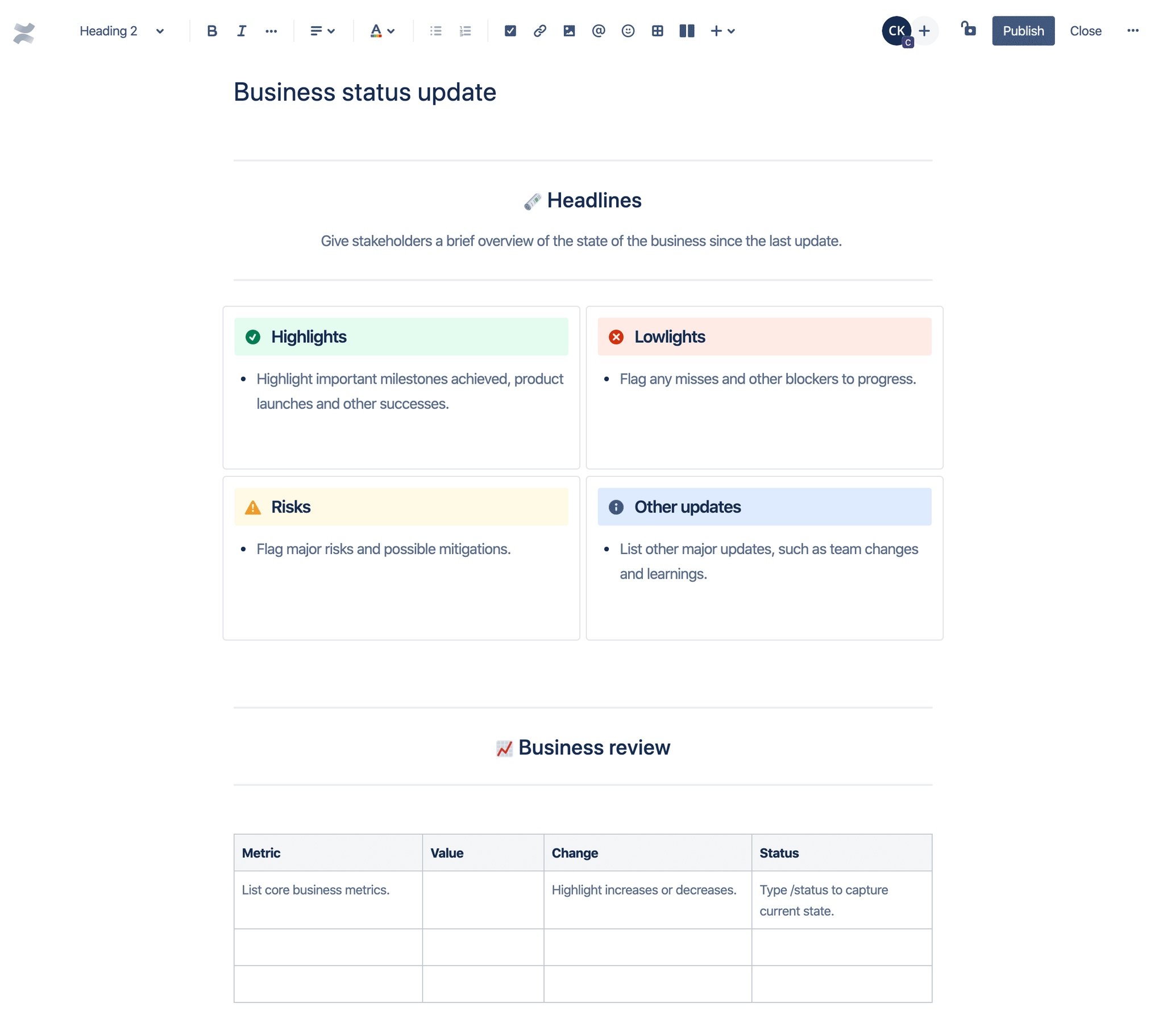
Personally, we love the Business status update template because it creates really nice, skimmable blocks with distinct colors. This helps with readability and ultimately is easier to engage with.

2. Choose your editor tools
Here are the basic elements that take your editing to the next level and ensure your page is easy to read.
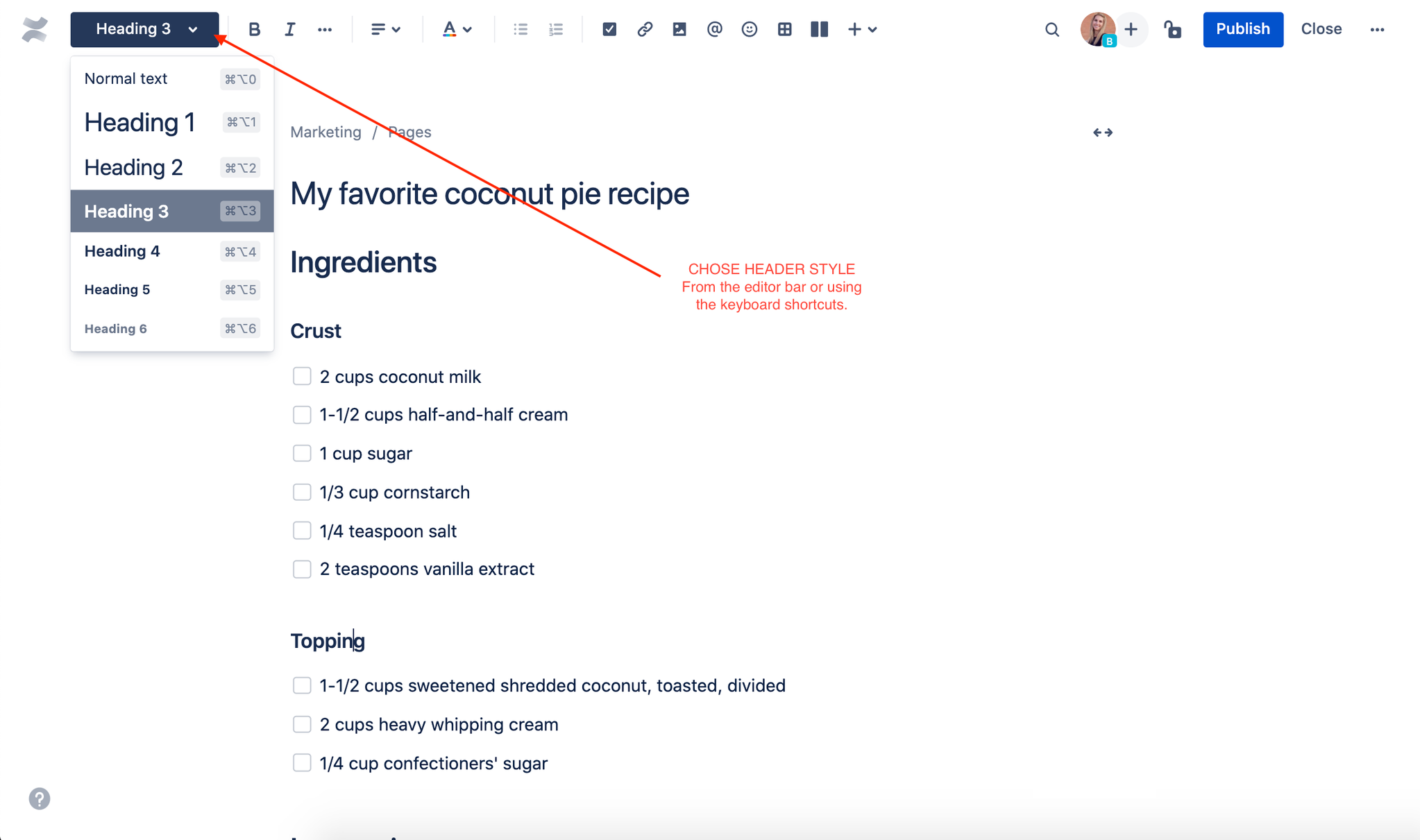
- Headings: Instead of font sizes, Confluence pages have different headings you can use to organize your text and make your page scannable. And like with any other word processor, the font can be bolded, italicized, underlined, and colored.

- Lists: Create bulleted and numbered lists to outline steps or summaries.
- Action items: Assign a work item with a due date to someone on your team (assigned work items will show up in My Tasks).
- Tables: Strong and sturdy, they add structure to your page. You can even merge or color-code cells, or make an entire page a super table!
- Images: Click on an image to resize, add borders, or set additional properties. Try the “wrap text” option to set an image in line with your text.
3. Mix in some special macros
For some extra formatting options on your page, use the all-powerful slash command.
For example, the Attachments macro lists the files attached to a page, while the Widget Connector macro lets you include assets like a YouTube video or Twitter feed.
Some other favorite macros that really make a page pop:
- Children Display Macro: No, it doesn’t show you pictures of your kids – but it does list the child pages connected to a page.
- Roadmap Planner Macro: It creates simple, visual timelines that are useful for planning pretty much anything.
- Expand Macro: Displays an expandable/collapsible section of text on your page, making big blogs of text way more readable.
- Navigation Map Macro: Displays the pages that have been tagged with a specific label.
4. Choose your layout
Once you have all your content and macros on your page, you’ll need to figure out how to put them all together in the most compelling way possible. We recommend you wait until you have all your content on the page before considering the layout; it’s hard to present what you don’t have yet.
To determine the layout of your Confluence page:
- Press the “Page layout” button on the toolbar, or type “/layouts”
- Adjust the number and proportions of columns
- If you want, you can also expand the width of each section to full or medium width
Tip
While Confluence gives you the freedom to organize the perfect layout for your page, sometimes less really is more. If your content is best communicate through a simple page, there’s no need to get too fancy.
And with that, you have a beautiful page that is easy to read and engage with. Soon you’ll be getting fellow Confluence users asking you: “How do I create Confluence pages that look like yours?
Click below for much more on Confluence features!

