This is a guest blog by Charles Hall from OpenBet, a specialist software company that provides gambling and gaming solutions.
At the start of 2012 I joined OpenBet. OpenBet had been undergoing significant growth and realized that their approach to knowledge management needed to change accordingly. The Twiki software had served as the company intranet and wiki for 7 years, but the information within it had grown stale and the system itself developed some significant frailties. Confluence had been identified as the replacement intranet platform, and so I joined in January to implement this change. We launched the new site based on Confluence 4.2.1 and a choice selection of plug-ins providing additional capabilities in September this year. The subject of this blog concerns one aspect of the OpenBet wiki – the company glossary. In Twiki there were a couple of glossary pages here and there, but no coordinated effort. In Confluence the glossary is a single global space open to everyone for capturing and sharing company and industry specific terms. This blog series is composed of three parts:
- Developing a template to capture the glossary definitions
- Putting in place navigation structures to help with information discovery
- The maintenance challenge, and how we’ve leveraged the glossary in different ways
Where applicable, examples of content have been provided in markup (that has been stored on paste bin) which you can insert into Confluence pages easily, regardless which version you’re using. So, read on to discover how we built a truly kick-ass glossary!
Putting the basics in place
Early in the design stage, we needed to answer some fundamental questions:
- How are the glossary definitions going to be recorded?
- How will users find the information they need easily?
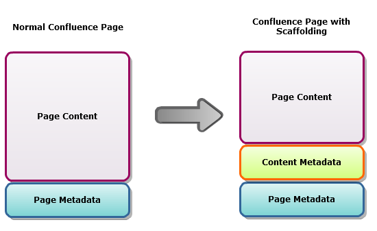
First of all we decided that the basic principle of our glossary is that all the terms will be recorded in one space, in individual pages. You don’t want to force your users to perform two searches, one in Confluence to find the page, then another within the page itself to find the term. The one page per definition approach seemed the right way to go, provided we could implement navigation options which would scale well as the glossary grew. To ensure consistency across these definition pages we decided to create a page template, but not just a static template. Instead we made a “live” template. So, any pages created with the template maintains their association with it, ensuring consistency over time. The first plugin we used was the Scaffolding plugin from Customware. In a nutshell, it offers the ability to define specific fields in a Confluence page. If you consider that a regular Confluence page is composed of 2 parts; “content” and “page meta-data” (title, authors, editing dates, position in the space structure, etc), then adding Scaffolding into the mix brings an extra dimension that we can think of as “content meta-data”.

When used in a template it means we can provide regions of the page that the user can edit, but other aspects such as layout and presentation can only come from the template and cannot be modified by the page author. Ensuring consistency is crucial in a space such as this.
We named our template “definition” and the main fields we defined were as follows:
- Definition – a rich text field.
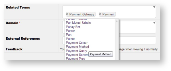
- Related terms – a drop-down list allowing the author to choose from the other definition pages in the space.
- Related Business Domain(s) – a drop-down list offering choice of business domains the term is applicable to.
- Feedback – using the kbsurvey macro.
The related terms drop-down is a useful aspect here. It’s more convenient for the page author than pasting a URL:

It also creates a link to that page, which Confluence will update should the name of the target page change. We went one stage further and brought in the definition for that term into an expand macro. This means that the reader can follow the link if they wish, or show the expanded content easily and avoid the extra time for a full page fetch by the browser. For the feedback loop we opted to use Content Survey & Reporting plugin. Bringing it into the template was easy just by including the {kbsurvey} macro, and defining the following questions (in Space Admin) to encourage user feedback:
- Was this helpful?
- Do you think the article is accurate and complete?
- Do you think the article is up to date?
At this point we’re pretty much done defining all the fields for our first version of the template. There are a couple of other aspects to mention though.
Date-stamp
Right at the start of the template we’ve used the htmlcomment macro to date-stamp the template. The idea behind this is to provide a clue as to the origin of any pages created from the template, in case of any problems arising. It doesn’t show up directly in the browser, but it will be included in the HTML source of the Confluence page.
For markup see: http://pastebin.com/cqY1j3a1
Presentation
Clearly we need to make the definition pages legible and attractive for users, but we’ve got two types of user to consider: the reader who comes across the definition and the contributor who may create or edit the definition and other details. While the experience for both should be as intuitive as possible, we decided to tune the presentation for each type of user with the aid of the show-if macro from the Composition plugin. This macro allows criteria to be set, so that the contents of the macro are only shown if the criteria are met. So, we can use ‘show-if:action=edit’ for users creating or editing the definition and ‘show-if:action=view’ for consumers of the information. Typically in edit mode we’re providing the contributor with a few hints about what is expected to be filled in, or suppressing some information like the feedback questions For consumers we’re trying to make the information gathered available as cleanly as possible. While the template contains a few panels and also a table to lay out the fields, much of the special styling tweaks for those elements is held in a separate page which is then simply included into the template using the include page macro. This improves maintainability, and is also a safeguard because Confluence maintains a history for normal pages but not for templates. Here’s how the markup looks for all this: http://pastebin.com/qu51MiW0
It’s worth noting the label “glossary_definition” we defined as part of the template, which is then added automatically to pages created from it. More on this in the next part of this series.
Included Page: Panel Formatting
For markup see: http://pastebin.com/9KHP06VE
As you may notice, the content of the “Panel Formatting” page requires the \{html} macro to be enabled. We’re using the jQuery Javascript library (embedded in Confluence) to tweak the presentation of the panel macro and its contents.
Included Page: Records jQuery
For markup see: http://pastebin.com/7eFsJBNN
We’re using the jQuery library again here to hide the usual “Edit” button to avoid confusion with the “Edit Contents” button which will appear because the page contains Scaffold fields.
Included Page: Domain Links
For markup see: http://pastebin.com/ra9s0fXE
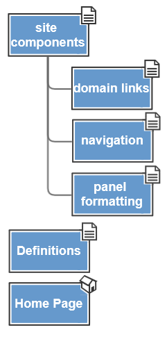
In the page above we’ve defined a number of div elements which are hidden when the page is viewed normally. They do however contain links which the jQuery code applies onto certain span elements (status macros). All of these included pages are located as child pages of an orphan page called “site components”. This organization reduces the chances of someone coming across the pages by accident and wondering what they do. You can set permissions on these pages if you wish so there’s no chance of accidental modification.
Here’s an example of how a real page based on this template actually looks:

We’re almost in a position to begin seeding the glossary with terms, but first we need to establish a structure to support creation and storage of the individual terms. The key aspect to this is to provide any user wanting to create a glossary term with a special link to ensure that the page template we devised is used correctly, i.e. as a “live” template. Using the standard templates in Confluence would work up to a point, but if we wanted to change the template later on, any changes would not ripple through to existing pages. This is where a live template comes into its own and makes the whole system vastly more adaptable and maintainable. Both the add-page (Linking plugin by Customware) and create-page (Content Formatting plugin by Adaptavist) macros allow you to create links which specify the use of a template in this way. In our case we used the create-page macro, and so here’s the markup for this: http://pastebin.com/GpRyVDbD
The parameters for this macro dictate not just which template is used, but where the new page should be created. In our case we used a page called “Definitions” which is an orphan page within the Glossary space. The intention here is to ensure all the terms are located in the same place for easier analysis later on. The create-page link was inserted into the home page of the glossary space and presented to encourage any one to make use of it and share their knowledge of specific terms. Aside from the specific page restrictions in place on site components and its children, the space permissions allow any one to create and edit pages, but not remove them. So, the basic structure is now in place. Here’s a map of the bare bones space structure:

To be continued…
Stay tuned! In part 2 of this series we’ll see how we can help users identify and retrieve information from the glossary easily.
New to Confluence?
Want to get started building your own company glossary? It’s easy to get started with Confluence with our FREE 30-day trials.
