
Atlassian’s Design System is a robust source of foundations and components for more than 18 apps, such as Jira and Confluence, allowing us to create a cohesive experience for our customers. However, making changes at scale to fundamental elements – such as typography, color, icons – can feel like rebuilding the bottom of a Jenga tower: carefully altering an underlying foundation that powers and supports the huge system on top.
We are excited to share our journey of rebuilding the Atlassian typography system and how we enabled change with minimal disruption to users and creators, including the valuable lessons we learned, and where you can get a glimpse of our new system.
The problem at hand: an inconsistent experience
We set out to replace a dated typography system that had vague guidance, lacked parity between design and code, and exhibited visual inconsistencies due to the use of system fonts.
The new system needed to:
- Provide a consistent and modern visual identity across Atlassian apps
- Improve readability and accessibility for all users
- Establish a strong foundation for future growth
The journey
The necessary changes would touch every screen across all apps, affect every component, and include everyone from design to engineering to content. We were updating the vehicle for the content of each and every page, and we did not take that responsibility lightly. When working with large foundations, the change is so far-reaching it felt like we only had one shot, and we needed to get it right the first time.
Instead of falling victim to this high-pressure mentality, we were able to break down our problem. “Be agile”, of course. Our plan was to release the system through incremental improvements. This way, we continuously provided value without causing larger disturbances to our makers and users.
Establishing the framework through tokens
Our first step was to bake typography tokens and components into our apps. We built tokens to mimic our old typography system so there were no visual changes to our end users. This allowed us to do two things:
- Test our core framework in code before introducing any new visual enhancements
- Provide space for our designers to work on visual enhancements and test the solution in context
Once these tokens and components were implemented (and validated), all upcoming improvements would be as easy as flipping a switch to a new theme.

Creating visual cohesion and structure
The next phase of our work involved enhancing visual hierarchy while improving readability and accessibility across our apps.
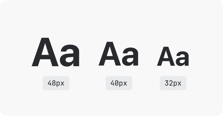
A cohesive scale for greater harmony
We created a scale for font sizes and line heights, based on the minor third scale. This meant we could cater to additional sizes, ensuring they all work harmoniously in various layouts. This step removed a lot of visual inconsistencies.
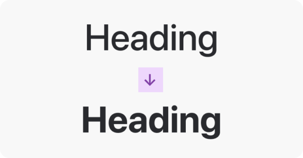
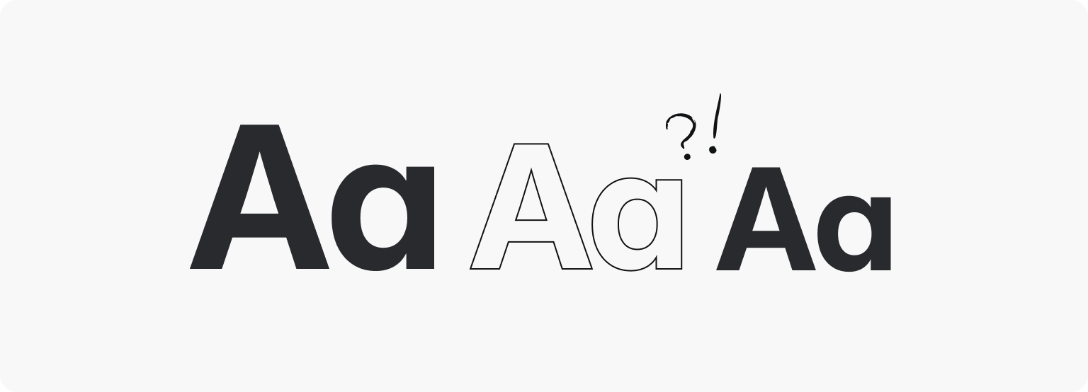
Bolder headings, stronger hierarchy
Bolder headings offer greater contrast and improved visual hierarchy within our UI. This is key for the scanability of information-dense screens and helps end users get to where they need to be.

Increased minimum body size to improve accessibility
We increased our smallest heading and body sizes from 11px to 12px for enhanced accessibility and readability.
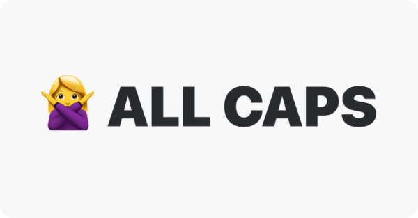
Removal of ALL CAPS to improve legibility
The removal of all caps is a win for accessibility, as it improves readability and reduces visual “noise” on our pages.
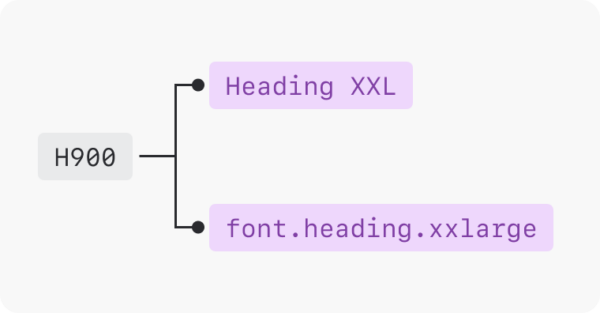
Better naming for easier use
We implemented a simpler and clearer naming convention that reflects the new scale, making our styles and tokens easier to use.
Altogether, the entire system looked like this:

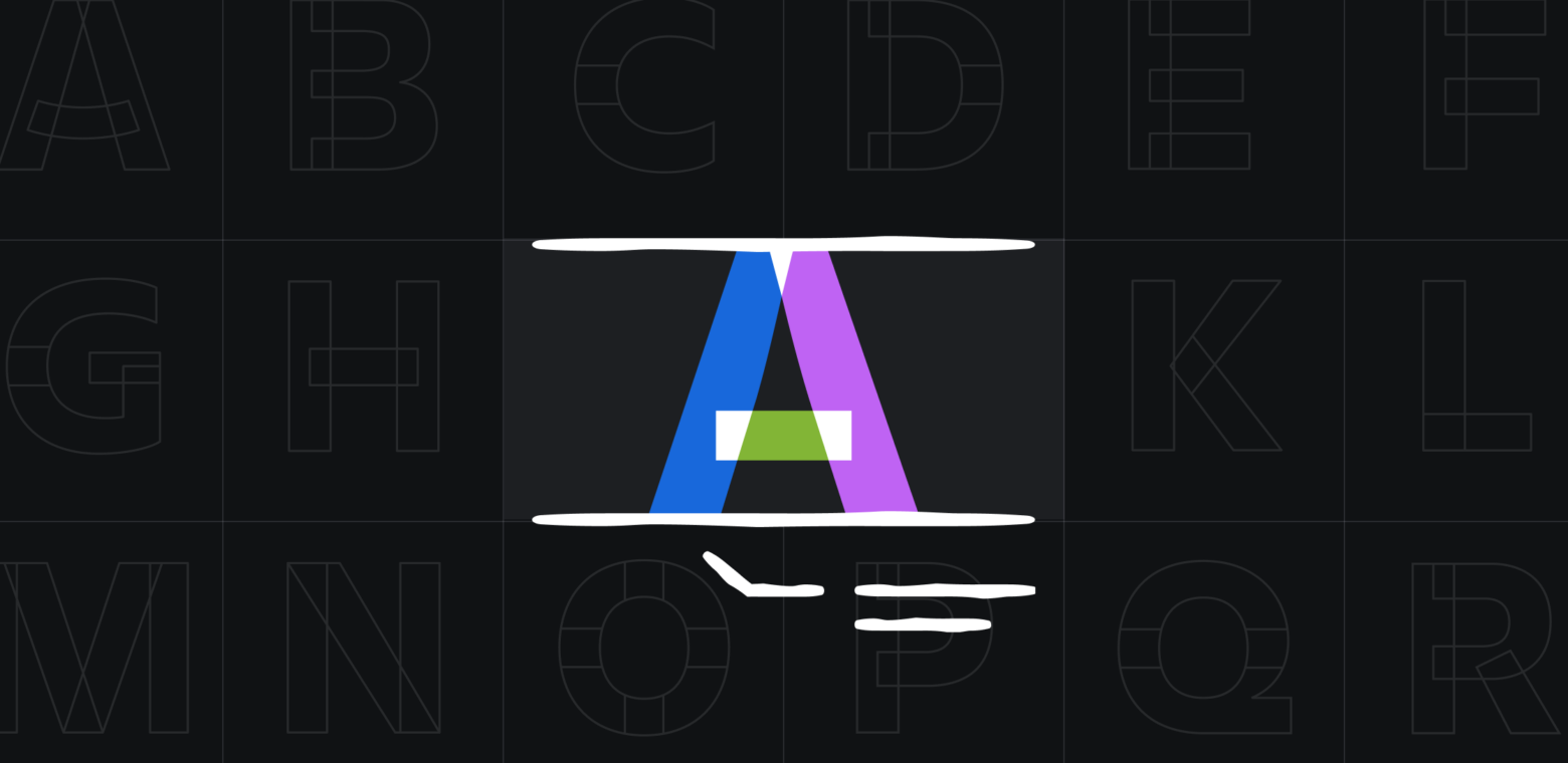
Introducing new fonts: Atlassian Sans and Atlassian Mono
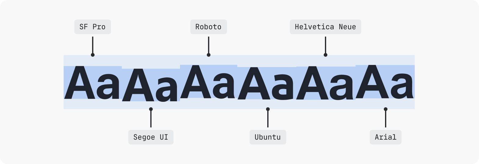
Early in the project, we realized that due to systems fonts having different weights, character spacing, and baselines, we would never be able to create a single user experience.
For example, spacing set around an icon and text to ensure alignment would render differently between Mac and PC because SF Pro (Mac OS) sits much higher on the baseline than Segoe UI (Windows).
During this phase of the project, we looked for an alternative to system fonts. We scouted for typefaces that are designed specifically for information-dense screens, enhance legibility and accessibility, and look so #@!%ing good that they could be used across all platforms and experiences.
Enter Atlassian Sans and Atlassian Mono…
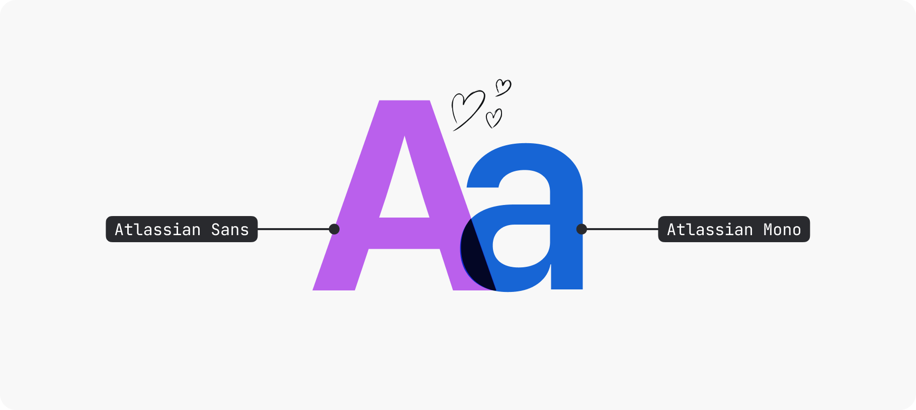
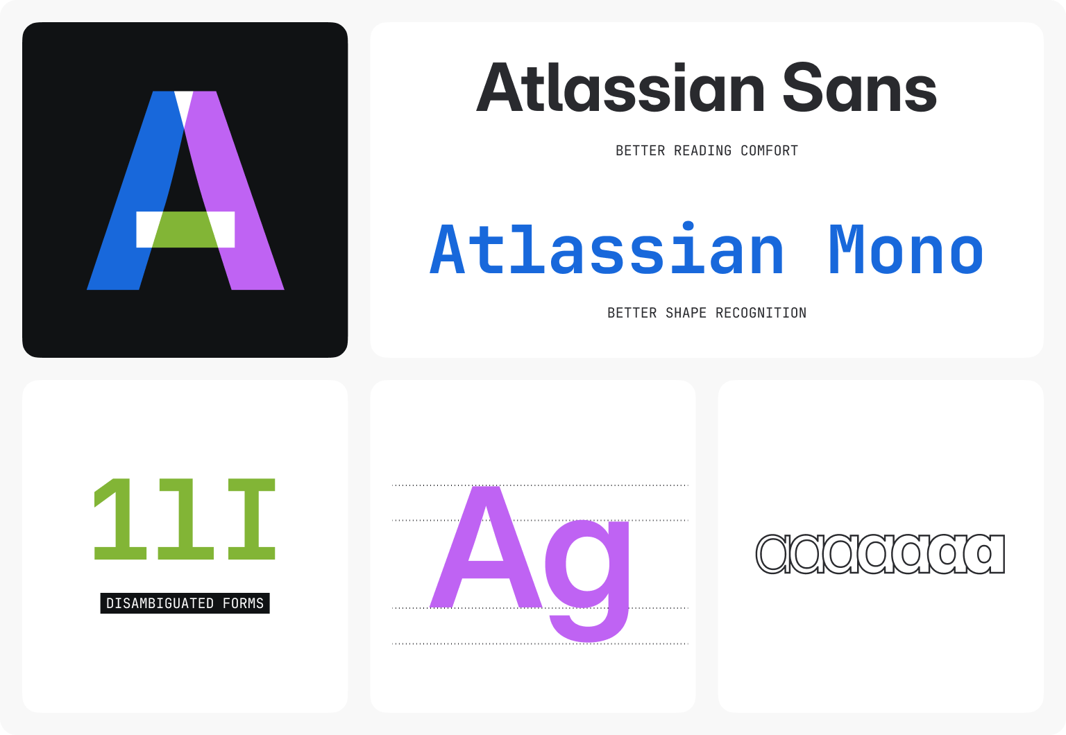
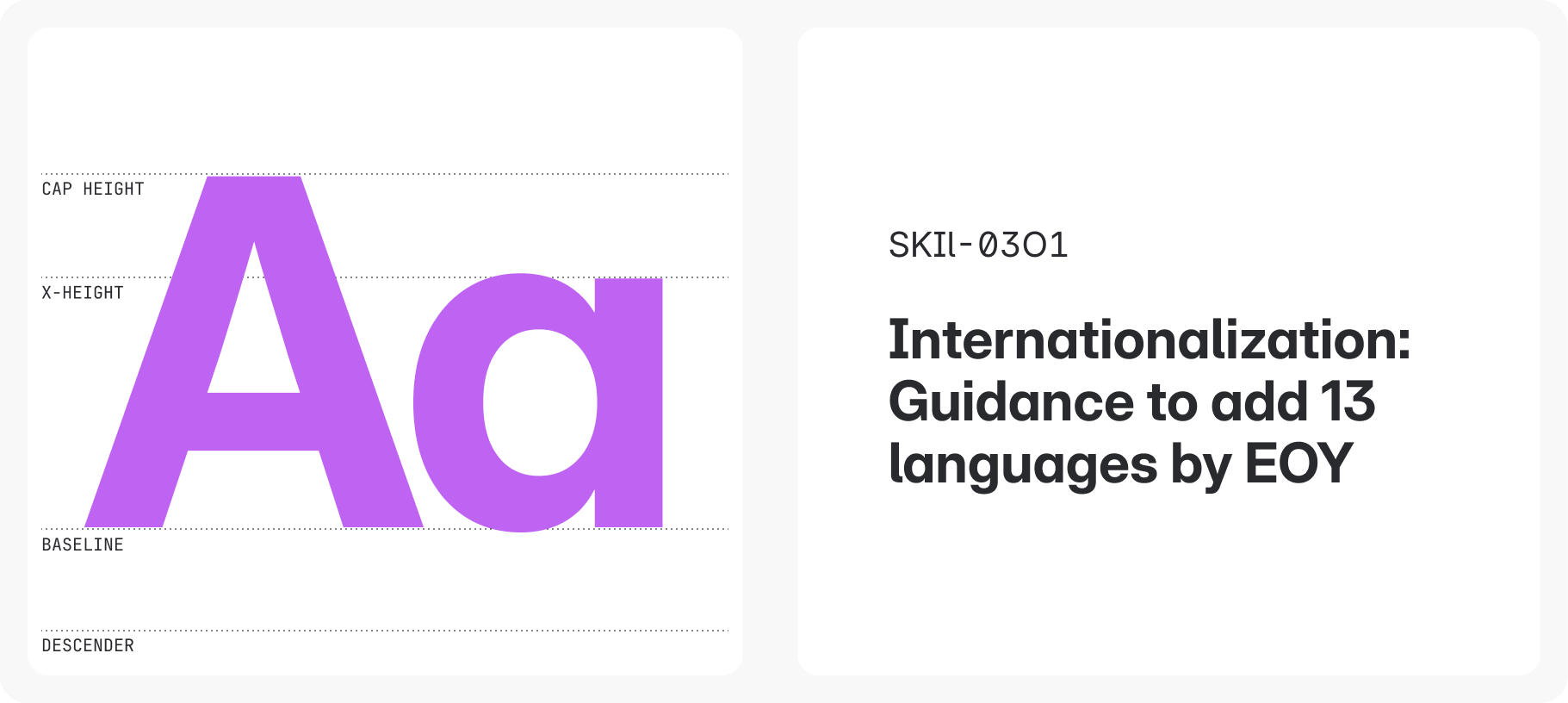
Atlassian Sans
Atlassian Sans is our derivative of Inter Variable. Inter is used widely across the industry due to its utilitarian nature, and can be adjusted to include more or fewer type features depending on the requirements of the app. This flexibility improves legibility and letter disambiguation, allowing us to prioritize accessibility while also ensuring harmony with our branding typeface, Charlie.
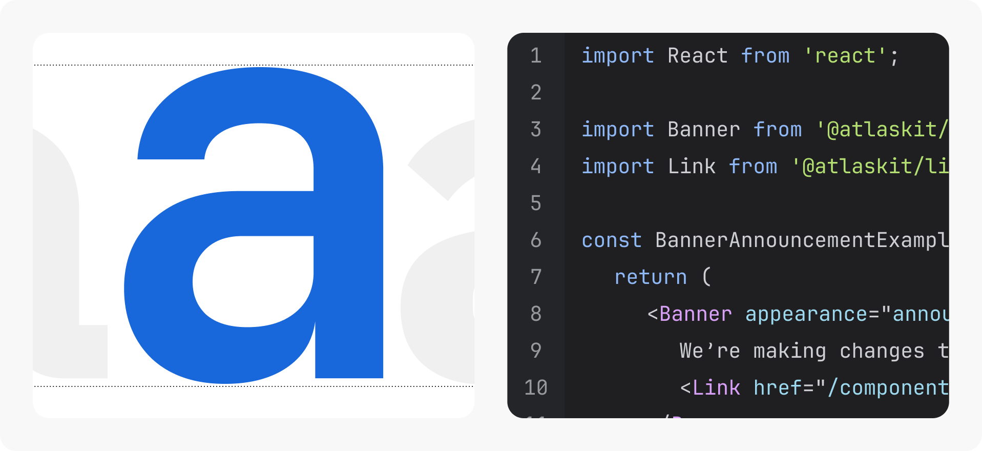
Atlassian Mono
Atlassian Mono is a derivative of JetBrains Mono which was specifically tailored for developers. It maintains standard character widths while maximizing the height of lowercase letters, which helps keep code lines at expected lengths and improves rendering at small sizes.
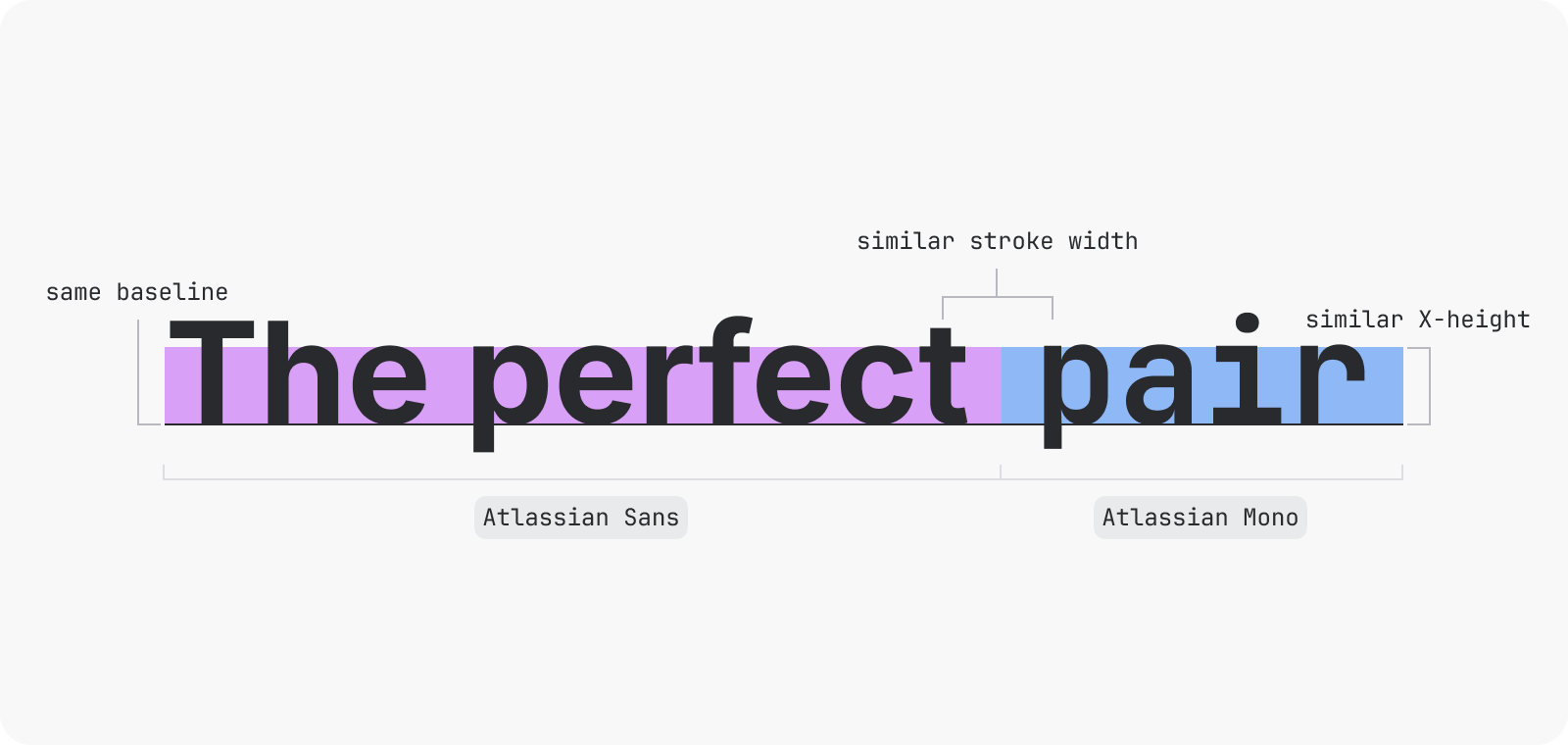
When choosing our UI typeface and supporting code typeface, we needed to ensure that there was harmony between them as they would be used in tandem across our apps. These two typefaces work really well together due to having the same base line, and very similar stroke widths and x-heights.
Due to our tokens and components being implemented throughout our apps and our enhancements already live, changing from system fonts to Atlassian Sans and Mono was a relatively simple switch to this new refreshed look.
5 lessons along the way
Reflections like this can make a project look like it was all rainbows and unicorns, but our journey also took a lot of twists and turns. By sharing these lessons, including some of the stickier moments in our work, we hope to help anyone on a similar journey as they can apply to teams of any size.
Co-design is critical
Our approach to create and validate the typography system was hands-on and collaborative. We jammed with teams across Atlassian early and often by forming a pilot group from Atlas, Confluence, and Jira teams, and providing an experimental library for early adopters. Through interactive workshops, participants evaluated:
- The effectiveness of our type scale
- How text styles and font weights applied across UI
- The visual impact and readability in different app environments
Co-design gave us the confidence in our framework before we moved to code where changes at scale become harder.
When in doubt, take it out
Early in the project we had an additional typography style called “UI text”. It was the alternative to long form text and had a 1:1 line height to font size ratio to allow for easy positioning.
However, our makers were confused by the concept, and during workshops there would be long conversations about what was text vs. UI text. As workshops progressed, and our makers became more comfortable with our new system, the confusion didn’t go away (we tried a few names too!). So, even though this style was already through code, we made the hard decision to let it go.
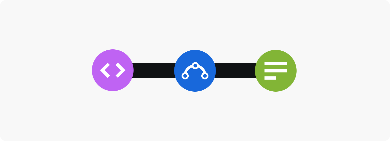
No task is simply design / engineering / content only
When we first tokenized our system, we did it with the overall mantra of “no visual changes” to the interface. This allowed for design to focus on the future enhancements of the system while the framework was being built. We allotted little design time to the tokenization, which we quickly realised was a mistake.
Questions arose around coding challenges and which aspects of the design to keep “the same” even though we knew we were going to amend them in the next release. Once we had run into a couple of unclear situations, we re-allocated design time to ensure healthy collaboration between design and dev.
Cross-browser bug-bashing sessions became another collaborative ritual for our team. This ensured that what we saw in Figma was translated into code across all apps and systems and that our typography system wasn’t just a design ideal but a practical solution ready for all customers.
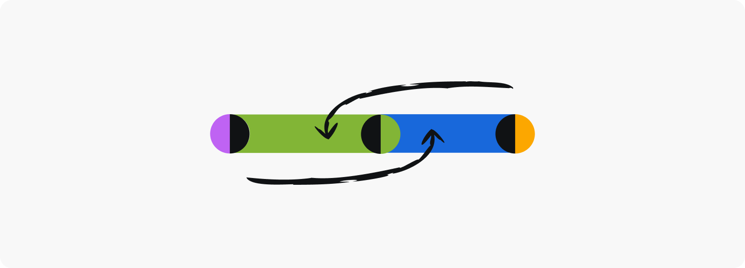
Plan time for iterations
Although our main releases were neatly planned into three distinct phases, plenty of iterations were made as we went along and uncovered issues such as: adjusting the line height of a proposed heading, refining the bold weighting, and the removal of “UI text” style to reduce confusion. Because we had broken this work down into phased releases, we could test and iterate quickly by solving individual concerns as they arose.
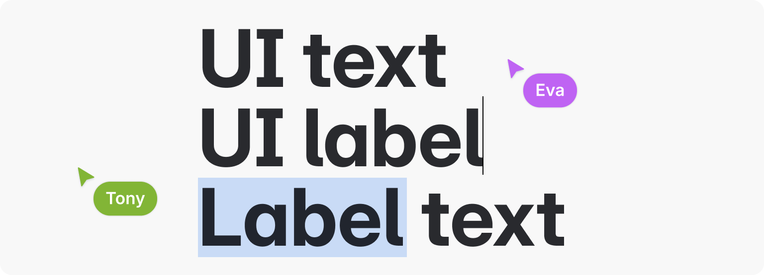
Naming is (really, really) hard
Before we removed “UI text”, we had several in-depth conversations about what to call it. (Is it “UI text”? Is it “label text”? Is it “UI label”?). We would decide on a name and then circle back a few days later due to low confidence in our decision. The process felt rushed and unsatisfying until we gave it the time and respect it deserved.
Naming in Design Systems will always be hard, but it becomes much easier when you prioritize it.
Destination: Firm foundations of enhanced legibility and accessibility
We have arrived at our destination: Atlassian users are now experiencing the benefits of the new typography system, which features a clearer visual hierarchy, enhanced design consistency, and improved accessibility.
To recap, we made this foundational transition smoother by embracing incremental changes, ensuring that value is delivered at every step. Collaboration and clear communication were essential throughout this journey, enabling us to refine our approach and ensure that our system not only meets the needs of our customers, but also empowers our creators to craft exceptional experiences.
Design System Foundations are complex, but with the right mix of strategy and creativity, even the most complex design challenges can be transformed into opportunities for teamwork.
Tell us what you think of the new typography system by filling in the feedback form at the bottom of https://atlassian.design/foundations/typography
💌 Eva Plaisted, Gorkem Kinik, Rachel Radford, Sudharsanam Narasimhan, Tony Wang, Anthony Roberts, Ali Pereira, Ward Oosterlijnck, Serena Toon, Maureen Eu, and the whole Atlassian Design System team
Passionate about Design?