10 design principles for delightful CLIs
The Forge CLI makes it delightfully easy for developers to build and run apps on the Forge platform. Read our 10 principles for designing successful CLIs.
Forge is our new cloud app development platform — now, developers can build trusted, scalable apps in minutes without the need to manage infrastructure or security. Forge is currently available in beta for customers building apps and integrations for their teams.
At the center of this new platform is the Forge CLI, a command-line interface that enables developers to create, develop, install, and manage Forge apps.
We — designers Michael Belton and Natalie Johnson — were tasked with designing the new Forge CLI. Given its centrality to the developers’ experience, our mission was to create a kick-ass CLI tool that made it delightfully easy for developers to build and run apps on the new platform.
With thousands of apps created with the CLI so far and glowing feedback from Forge developers, here are our 10 principles for designing successful CLIs. If you’re building a CLI to support your service, resource, or platform, we hope that you might use these principles, too!
1. Align with established conventions
CLIs have pretty much been around since the dawn of computers themselves, so you don’t need to reinvent the wheel to create a crowd-pleasing experience.
There are already many established conventions and guidelines that you can use to design your CLI, such as Heroku’s CLI Style Guide and the Microsoft Style Guide. By using existing patterns that your users are already familiar with, you ensure that it will be easy for them to adopt your tool.
2. Build --help into the CLI
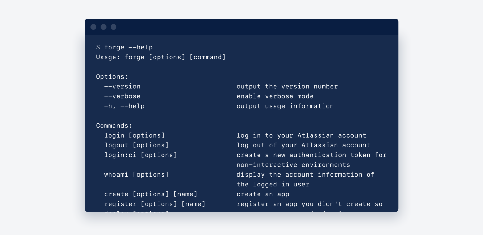
Adding a --help command to your CLI provides users with an essential piece of documentation. It lets new users discover all the commands and options available to them, while more experienced users can refer to it as a reference throughout their use of the CLI.

To help your users accomplish their tasks, the --help section should provide a complete list of commands, subcommand, and any short-name equivalents with a simple description.
You should also make sure that your users can run the --help flag after any specific command to quickly see the full syntax (usage, arguments, and options) they can use to work with the command.
3. Show progress visually
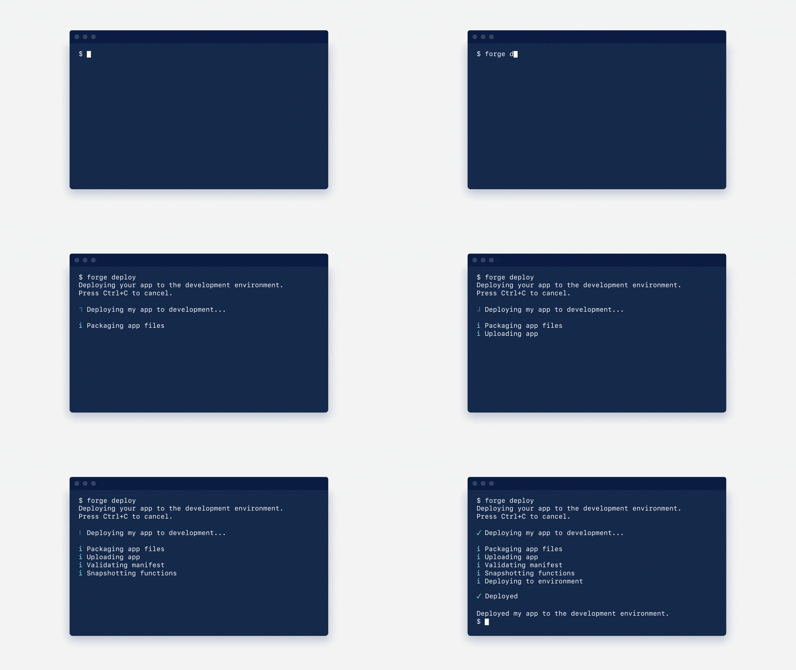
While the visibility of system status is an important heuristic to apply to the design of any interface, it’s particularly relevant when designing for the text-only interfaces of a CLI. Without a Graphical User Interface (GUI) to provide immediate visual feedback, CLIs don’t always do a good job of keeping users informed about what’s going on behind the scenes.
We suggest you show what’s happening by using progress bars, spinners, and other visual devices. We also recommend you break long-running tasks into a series of meaningful steps to help communicate the status of the system to your users.
4. Create a reaction for every action
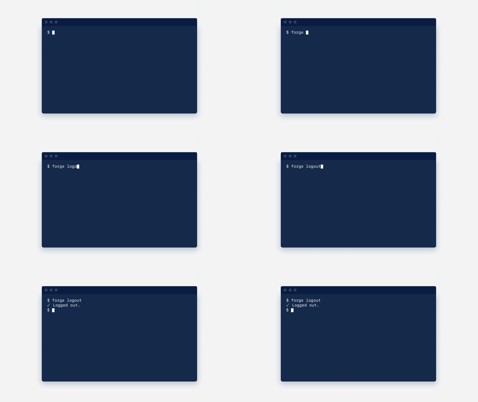
CLIs don’t always make it clear when an action has taken place. For every action a user performs, your CLI should provide an equal and appropriate reaction, clearly highlighting the current system status.
For example, in the Forge CLI, if a logged-in user types forge logout a message is displayed, providing a clear indication that the action has been successful.
5. Craft human-readable error messages
Errors are expected and even (dare we say) an essential part of using any CLI.
When testing the Forge CLI, we observed that errors are one of the key blockers that prevent developers from building their app.
Our CLI would sometimes spit out error messages that were, as one of our engineers once described it, “human-unreadable.” These are error messages that come directly from the back-end system that created it, and provide little value to the user who’s trying to figure out what’s gone wrong, and how they can quickly recover from it.
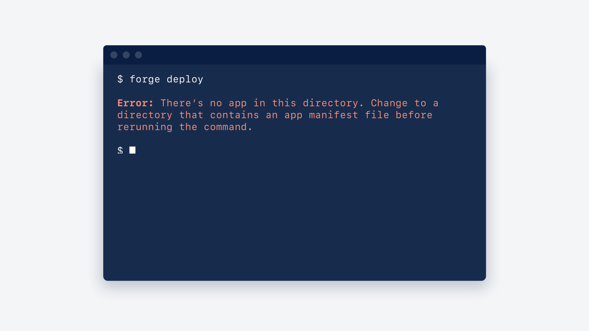
To help the user get back on track as quickly as possible, every error message that your CLI displays should not only contain a written description of what’s gone wrong but also include suggestions for how to fix it. You might even include a link to find out more information about the error.
6. Support your skim-readers
While it can be tempting to include every piece of documentation that your users must know in the CLI, this can overwhelm a user who is trying to quickly progress through the task at hand.
Throughout usability testing of the Forge CLI, for instance, we observed that many developers often skim-read the text, only looking for information that appears relevant to their immediate needs.

To support the more action-oriented users, you should break information into digestible chunks that make it easy for users to scan. A general rule of thumb we followed was to keep any instructions accompanying the CLI command to no more than 3 sentences (or around 50–75 characters) in each paragraph.
You should also emphasise important information by using visual devices such as text formatting, lists, and icons. We recommend keeping the set of icons to a minimum. This enables each icon to stand out as a useful wayfinding element.
7. Suggest the next best step
Throughout their use of your CLI, users will repeatedly run the same sequence of commands. For example, in the Forge CLI, a common sequence would be forge login and then forge create.
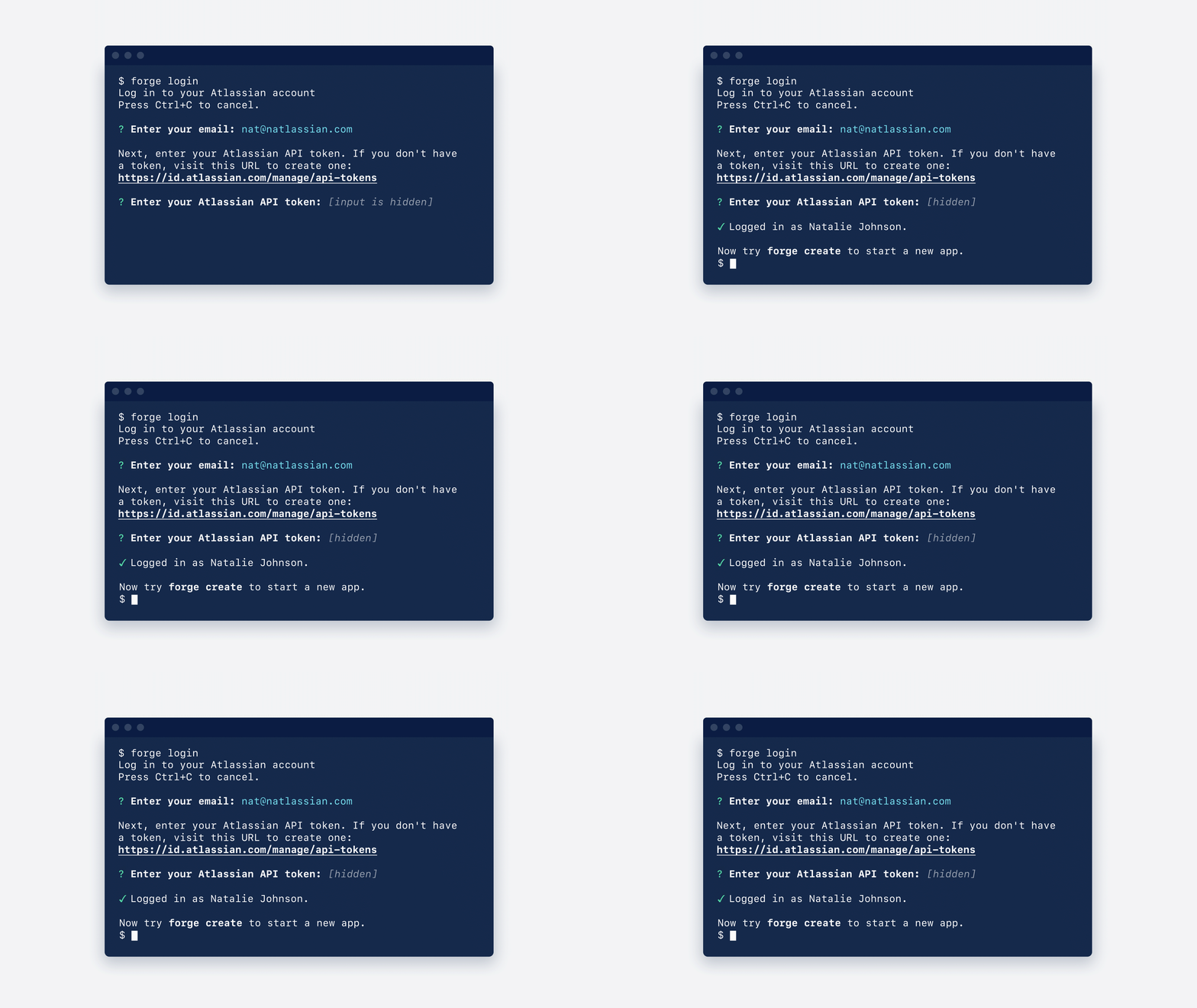
While the more experienced users of your CLI will quickly become adept at running the same sequence of commands, new and less-experienced users of your CLI might sometimes need a bit of a reminder.
By identifying common patterns of use, you can be smart about suggesting the next best step users should take at the end of each command, reducing the need for users to refer back to the documentation.
8. Consider your options
When users run a command in your CLI, they’ll likely need to also pass in some options to execute that command. While experienced users of the CLI may become adept at passing in all of the required information, other users might need a bit of prompting.
Rather than throwing an error, your CLI should prompt the user to enter any outstanding information. Make sure to consider the cases where users provide some, none, and all of the required options so that you can anticipate the various ways that users will interact with your CLI.

When possible, provide sensible defaults for options rather than asking for them each time. For example, most commands in the Forge CLI run in the context of an environment, and we believe the CLI usage will mostly happen during the development of the app. That’s why the default for most commands is to run in the development environment without needing to prompt the user for this information.
9. Provide an easy way out
Unlike most GUIs, CLIs have no visible way to stop a task from running, other than closing the terminal window.
To provide users with a sense of control, your CLI should have clearly marked exit pathways. For interactive commands, remind users there is a simple way to stop the task from running, and that returning to the prompt is only a short ^C away.

10. Flags over args
As Heroku’s CLI Style Guide specifies, rather than passing arguments directly into a command, the CLI should use flags to label the arguments. Using flags means the user doesn’t need to memorize the argument order, they just focus on what arguments to provide. The labels also give context to each value, improving the readability. We recommend providing short-names for commonly used flags.
For example, rather than writing a command like forge deploy production jira, developers write forge deploy --environment production --product jira. Experienced developers can also use the shortened version: forge deploy -e production -p jira.
Thanks for reading!
While many other factors contribute to creating successful CLI tools, if you start with these principles you will be well on your way to creating a CLI that your users find delightfully easy to use.
But don’t just take our word for it — try it yourself! The Forge CLI is available to use in the Forge beta. We’re actively looking for members of our developer community to build trusted, scalable cloud apps and tell us about their experience.
