Chances are, if you’ve listed an app on the Atlassian Marketplace, you’d probably like Atlassian customers to use it. You worked hard to create an app that helps people work more efficiently in Jira, Confluence, Bitbucket, or other Atlassian products. Your fellow Atlassian users should benefit from your app, and you should too!
Listing an app that gains traction on the Marketplace helps you build a name for your brand among Atlassian customers. Listing a paid app also generates revenue for you, your team, or your company. What’s more, the more customers your app attracts, the more you can learn about customer needs to improve your app or future apps.
One of the first things you can do to gain traction on the Atlassian Marketplace is also one of the easiest: create a strong Marketplace listing. Sometimes the listing can feel like an afterthought after shipping a new app, and some new developers publish app listings with almost no information about what the app does or who sells it. This lack of care might be undoing all the hard work you put into the app in the first place.
Even if a customer finds your app listing while searching apps on the Marketplace, they won’t install your app if it’s not clear what it does or how it will help their team. That means not only explaining the apps features (although this is a great start!) but also the value that those features bring to teams. There are plenty of great articles online about how to sell your product as a solution to customer challenges (here’s a great one to get started).
It may seem like a lot of effort to build out a whole app listing, but it doesn’t have to be!
Even a single developer shop can create an informative listing in just an hour or two. Here are a few things you can do today to improve your app listing in two hours or less:
1. Add screenshots or a demo video
To help customers quickly understand what your app can do, you can record a quick demo of your app using tools like Loom or Zoom, or even capture an informative click-through video using screen recorders in tools like QuickTime.
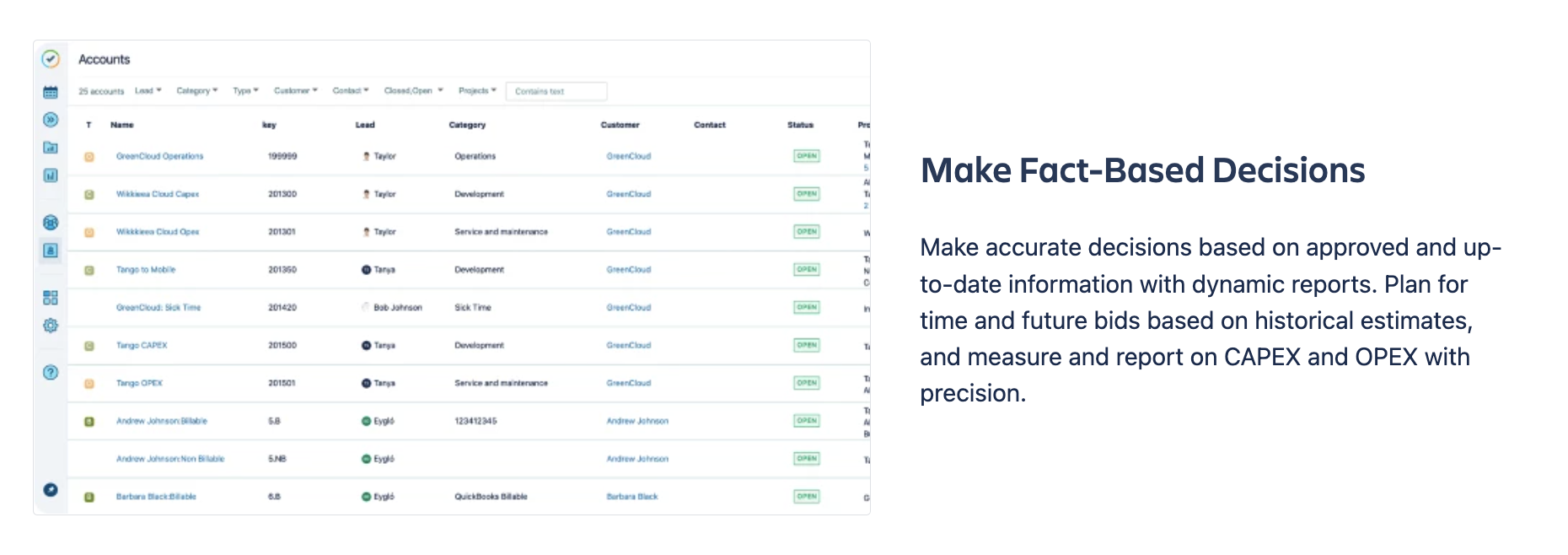
If you don’t have time or access to tools to record a demo, screenshots can also provide an important visual reference to help customers better understand how users might benefit from your app. Set up a few common use cases in a demo tenant, take screenshots of those use cases, and add them to your listing. Screenshots of common use cases can help customers better visualize themselves using your app.
Take screenshots a step further with simple arrows or circled features to direct your prospective customer’s eye.
2. Identify and include 3 key value pillars or use cases to highlight
What are 3 of the main benefits you expect customers to gain from using your app? Will they create alignment? Speed up the QA process? Continuously improve their processes? Get a quick overview of a complex process? Highlight these use cases with headings and screenshots to make it easy for customers to identify the value of your app so they don’t have to do too much guessing.

3. Add a description that clearly explains what the app does in the host product
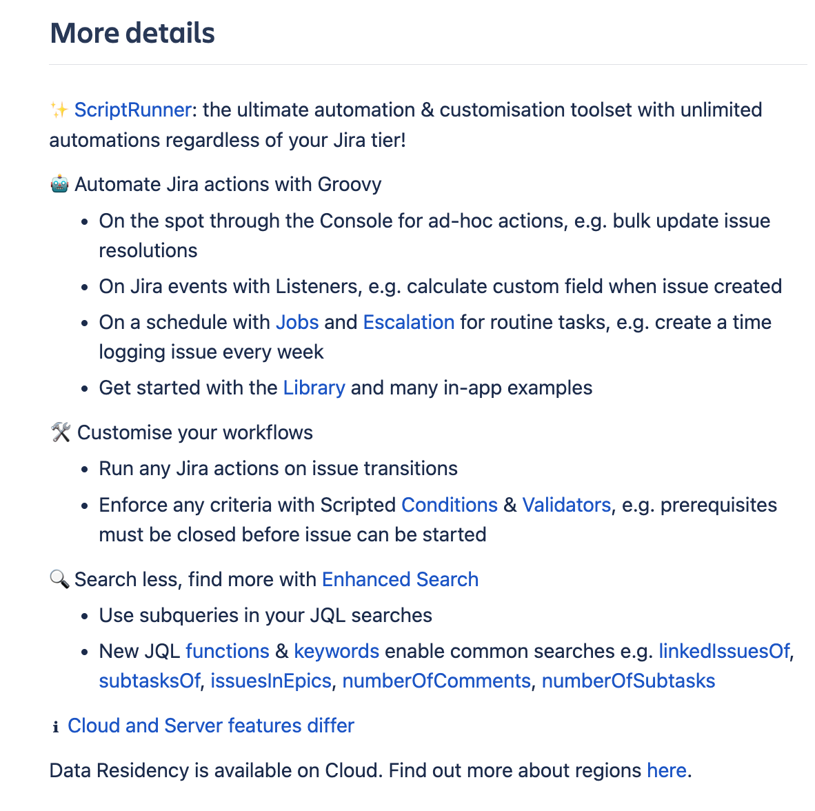
Most customers want to know exactly what your app can do, so they can assess whether it meets their needs. A one sentence description of your app in the “more details” section of your listing can leave customers feeling as though they don’t have the full picture, or make it appear that your app cannot actually do very much.
Break down what your app can do at the value level (“improve alignment across teams”) and at the feature level (“synchronize issues across projects”) to help customers understand how your app works and why you included the features you did.

4. Include documentation and information about your company
If you have documentation or more information on how to set up and use your app, include it in your listing! This will let customers know that your app and company will be easier to understand and work with.
Plus, if you read our Research team update, Appealing to customers: what do Admins care about?, you’ll know that customers tend to trust the Marketplace Partner, not the app. Make it easy for customers to learn more about you with a link to your website or a strong description of your company in your Marketplace vendor profile.
And there you have it! A better app listing in just a couple of hours. Remember, for customers who don’t know what your app does, a few extra minutes mapping out the “how” and “why” with text, video, and images can make all the difference.

