Over the past few years, we’ve reviewed thousands of customer responses that highlight a common theme: complexity and poor usability are the biggest challenges for teams using Jira. After rigorous testing and validation, we’re happy to announce that Jira Cloud will get an updated look and feel, including a collapsible sidebar navigation and enhanced search, to help your teams get things done faster.
This significant redesign simplifies Jira and helps teams create, find and collaborate on their work more easily. And, these changes are just the beginning. We’ve got big plans and lots more goodness on the way. Up next, we’ll update how Jira works with other Atlassian Cloud applications for even better team collaboration.
True to agile, we’re rolling out the new Jira experience in stages. You’ll see the changes in your own site soon – if you haven’t already! We’re adding features iteratively and improving along the way – all the while taking into account insightful feedback from our users.
We’ll continue to iterate and listen to make sure Jira is the best place to plan, track, release, and report your team’s work. Let us know what you think about the new design and navigation by selecting Give feedback in your new sidebar.
Get more meaning from an updated, modern design
One of the most striking changes for Jira is its new colors, icons and fonts. These updates showcase the third version of the Atlassian Design Guidelines and Simply Powerful design updates. Vibrant colors and clearer organization reinforce how Jira works. The new design is quick to learn and consistent across all parts of Jira.
You might recognize this new visual language from other Atlassian applications. Bringing it to Jira gives you a consistent, familiar, and streamlined experience while you jump between Confluence, Bitbucket, Stride, and other Atlassian Cloud applications.
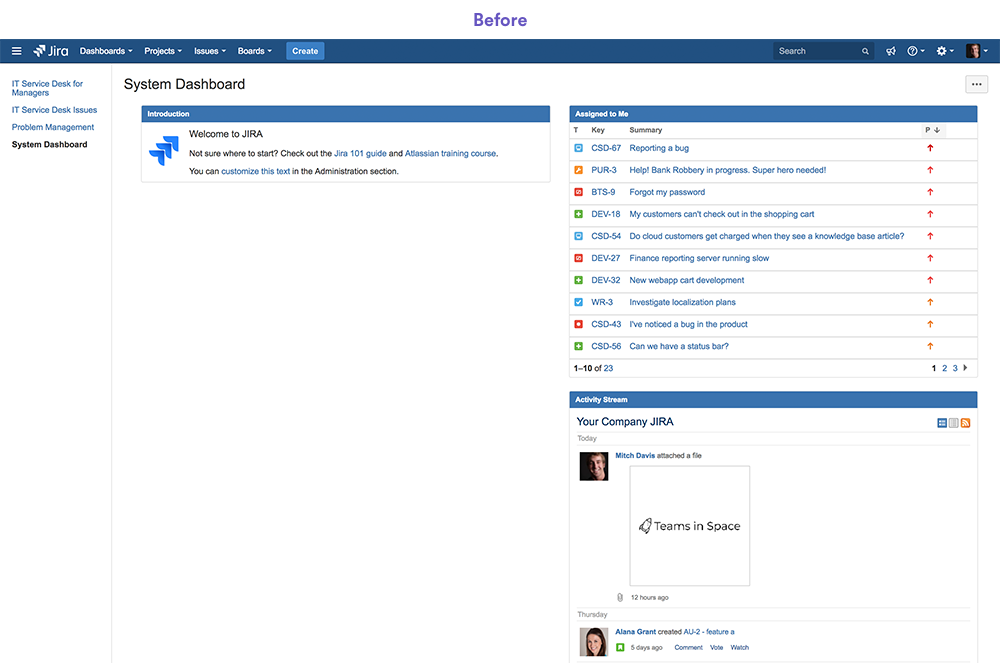
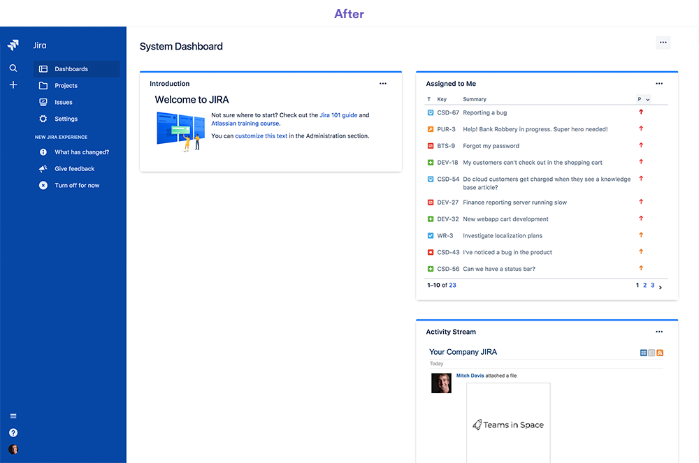
Get back to work faster with Jira’s new navigation
Look to the left to browse everything in Jira. The new collapsible sidebar tucks away so you can focus on getting work done. It’s contextual and keeps the most relevant navigation items at the ready whether you’ve just logged in, are working in a project, or browsing settings.
Pro tip: You can drag the right edge of the sidebar to expand and collapse it. Or, you can type [ on your keyboard.
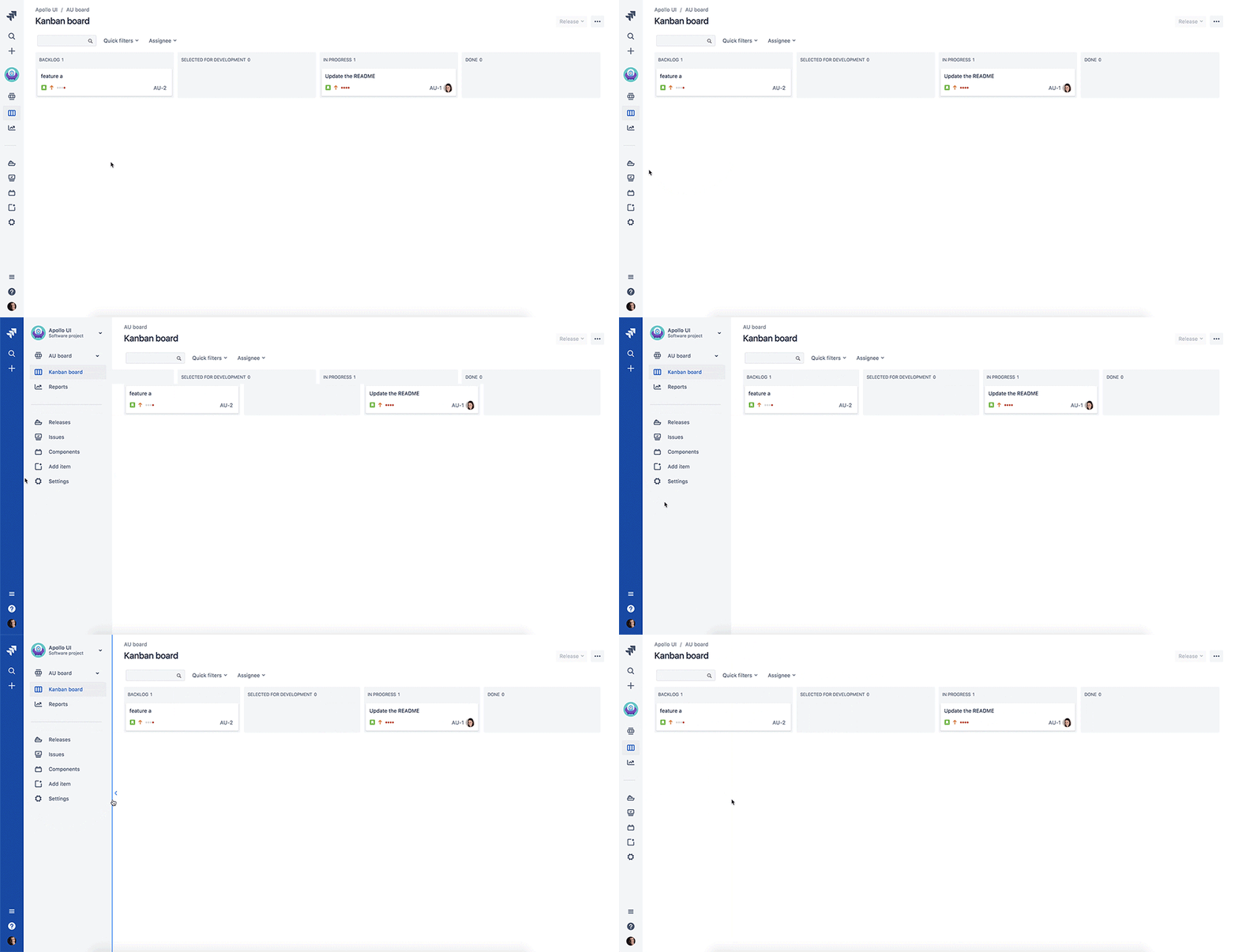
Get home, search, create and switch applications from the global sidebar
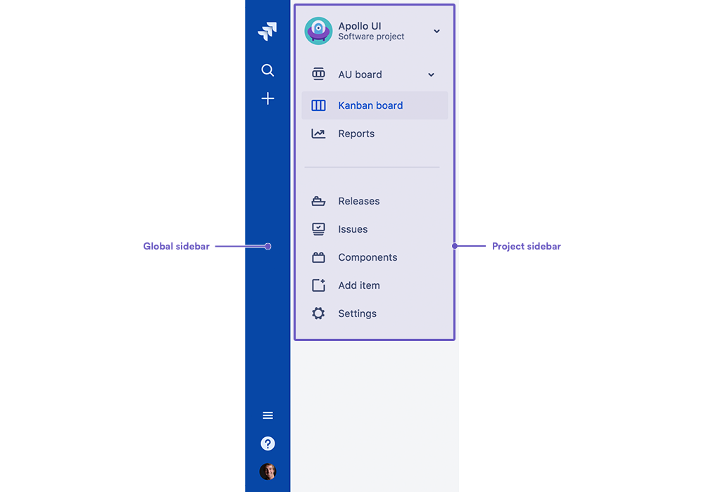
The persistent, thin blue strip is what we call the global sidebar. No matter where are you are in Jira, you can use the global sidebar to:
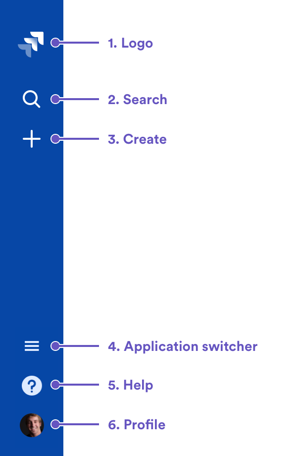
- Navigate home and view dashboards
- Search for issues, boards, and filters, or navigate to recent items
- Create issues (and projects, if you’re an admin)
- Switch to other Atlassian applications
- Get help
- Access your user profile
Get to work with the project sidebar
The sidebar changes with your context to help you stay focused on the task at hand. If you see a gray sidebar, then you’re working in a project.
The project sidebar gives you access to key project features, depending on what kind of project you’re working on. For example: In Jira Software, the project sidebar lets you quickly navigate to your project’s boards, backlog, active sprints and reports. In Jira Service Desk, you’ll find your queues, customers, reports, and the ability to raise a request.
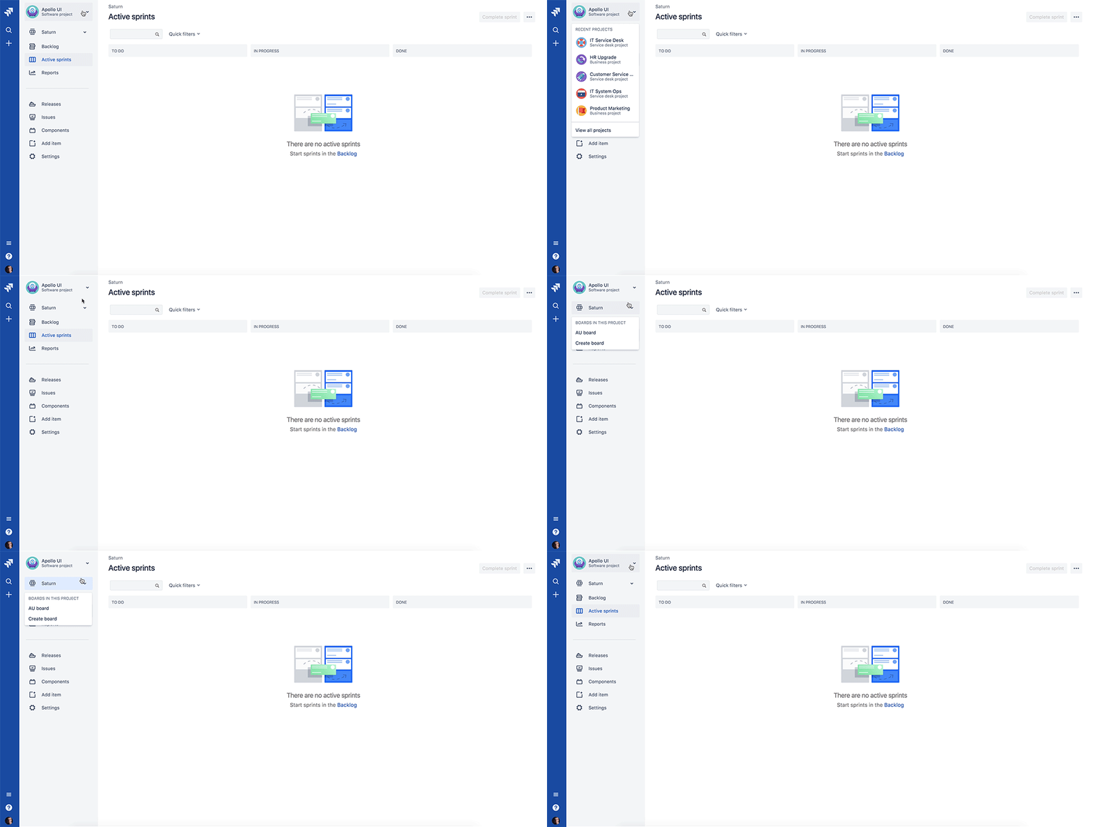
You can easily switch to your most recent projects by selecting the project avatar at the top of the sidebar. And, if you’ve got more than one board in a project, you can switch between them using the arrow next to the board name in the project sidebar.
Stay organized with new board locations
For years, we’ve heard that people new to Jira don’t quickly learn how Jira’s elements interact. Making Jira easier to use means reinforcing a stronger hierarchy. So, one significant difference in the new Jira experience centers on boards.
We’ve made a bold decision to make projects the primary container for your team’s work. Boards now live inside projects, rather than alongside them.
You can also create boards within your user profile if you don’t want them belong to a single project. Everything is shareable and searchable, so your team members can easily see and collaborate with you.
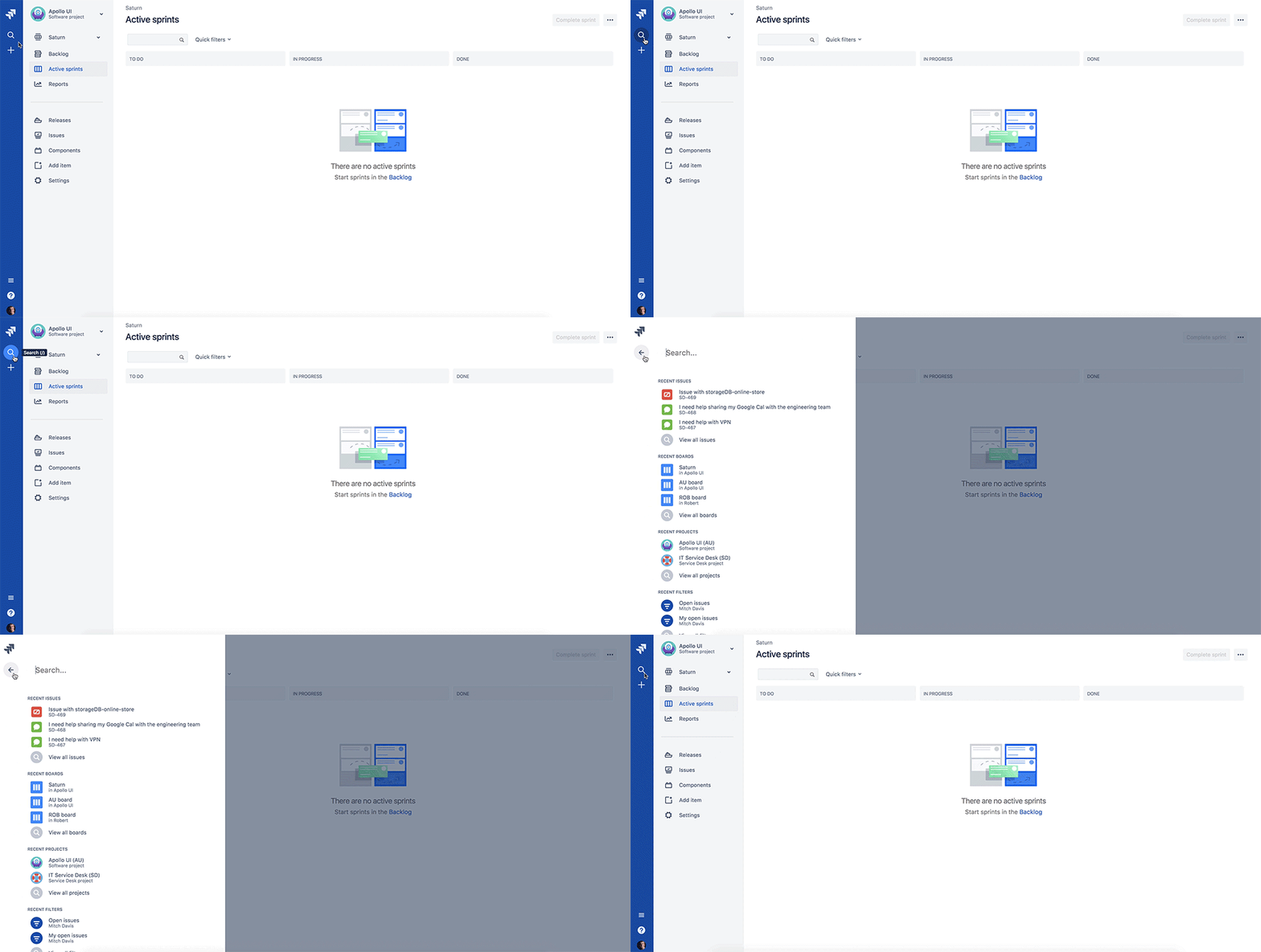
Pro tip: You can find your boards quickly by using the search panel. Select Search (icon) or type / on your keyboard.
Read more about the above changes, browse frequently asked questions, or learn about other new features in our new Jira experience guide.
