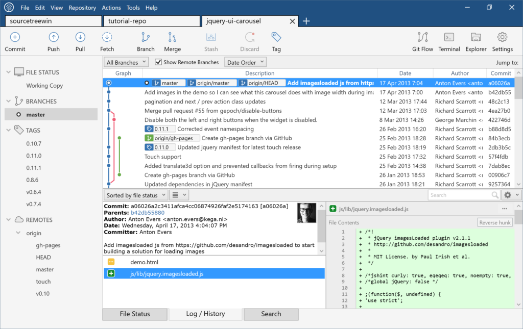
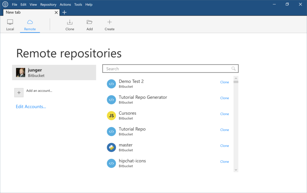
We’ve added a ton of new features and improvements in this release:
- Manage your bookmarks easily with a new and colorful tab design
- Huge performance improvements
- Pixel-perfect per-monitor DPI support
Tabs and Header
We implemented a new tab-centric design to increase vertical space and to give readability to the the repository you’re currently working in. The new header design gives you an additional 20px vertically, while the removal of the bookmarks sidebar gives you 250px horizontally.
Before (left) and after
The New Tab….Tab
The repository browser now lives in the New Tab. The old sidebar crammed repository names and had a confusing relationship to your remote repositories. Now you have a dedicated experience for both in a full window. This approach also frees up more space to focus on code once you’re in a repository.
Performance
SourceTree for Windows 2.0 is screaming fast. We improved performance by adding a hybrid LibGit2 handler for most git operations. In many cases, performance for most operations increased by almost 2x. Look how fast reading stashes are with LibGit2!
Workflow
Many primary feature workflows have been rethought and improved. Compare the steps needed for creating a remote repo in the current version of SourceTree, vs the new workflow. In 2.0, creating a remote repository and managing your remote accounts is front-and-center rather than living 2-3 menus or pop-up dialogs deep.
Before (left) and after
Design
Animations, more vibrant colors, improved contrast, and per-monitor DPI support are just a few of the improvements we’ve made. Note the removal of the Windows 2000 era pinstripes, vivid colors, and branch label readability improvements. We’ve improved contrast in many areas by tweaking our use of gray colors, and added accents to window dialogs and notifications.
Before (left) and after
Per-monitor DPI support
On systems that support per-monitor DPI settings (Windows 10 Anniversary), SourceTree will automatically adjust icons and text to be crisp and pixel perfect when the window is moved between monitors. SourceTree will still use high-DPI icons and scale properly even if your OS doesn’t support per-monitor DPI and you still have a high-DPI monitor or laptop.
Before (left) and after
Sidebar
Readability has been improved on the sidebar, with more spacing between text and increased vertical spacing.
Before (left) and after
Additionally, the ahead/behind indicator will now float on the right-side of the sidebar, and will be visible even if there’s a scroll-bar in either direction.
Before (left) and after
Download the beta and check out all the new improvements today!


