5-SECOND SUMMARY
What if you had the opportunity to redesign your organization from scratch? How would you create systems and workflows that would result in an ideal user experience, start to finish? What if, on top of that, your goal was to have a system that could respond to change at the speed of the internet?
We’re about to introduce you a team that put Conway’s Law through a real-world test.
What is Conway’s Law?
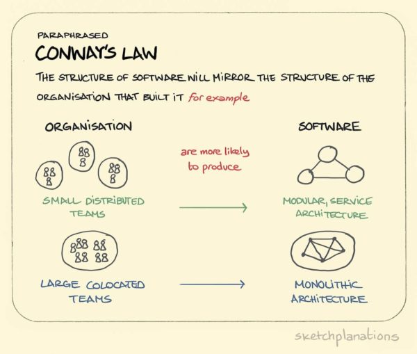
Conway’s Law is an IT theory created by computer scientist/programmer Melvin Conway in 1967. Conway’s Law states that “Organizations, who design systems, are constrained to produce designs which are copies of the communication structures of these organizations.” The theory gained popularity when it was cited by Fred Brooks in the iconic book “The Mythical Man Month.”
Conway’s Law was very much on Seb Chan’s mind when he was hired as the first chief experience officer (CXO) at ACMI, the Australian Centre for the Moving Images, in 2015. Chan’s role – newly created when he left the Cooper Hewitt Smithsonian Design Museum in New York – was pitched to him by the Director and CEO Katrina Sedgwick like this: “We want to transform the institution with technology and UX.”
That meant reforming ACMI so it could move fast – as fast as the internet. The problem is that museums, like many other large institutions, tend to approach change at a pace of every couple of years.
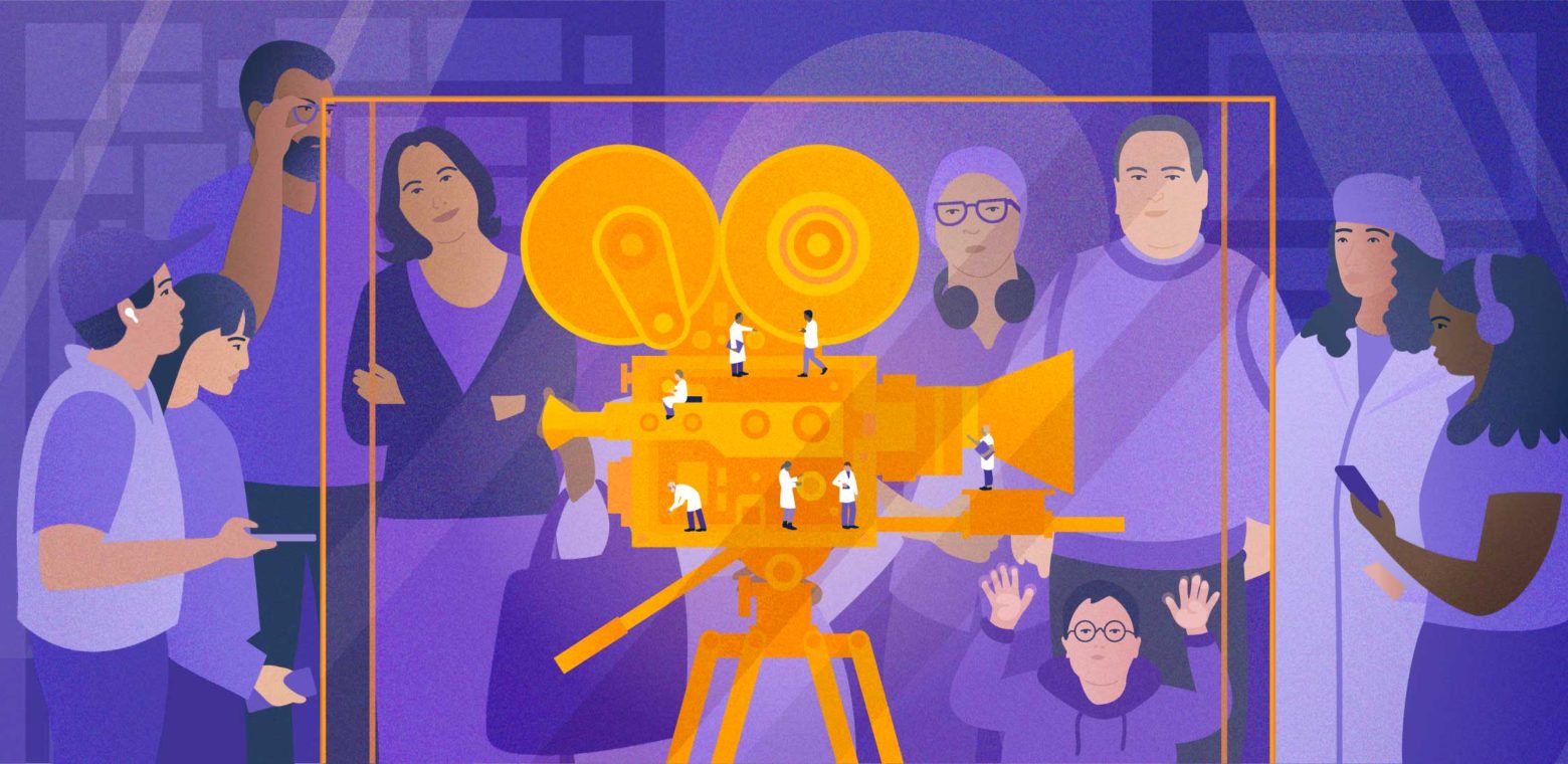
How internal information siloes lead to a fragmented user experience
“What I’ve learned from working in museums for 20 years is that they’re quite siloed places because staff hold deep expertise in very niche fields,” says Chan. “The secret to cracking them open and getting everyone more visitor-aware is to create space for transparency and openness within an institution.”
ACMI, originally known as the State Film Centre, is Australia’s national museum of screen culture (as well as an Atlassian customer). As part of the team charged with overhauling the institution, Chan saw an opportunity to validate and protect screen culture, as well as new media in all its forms – including virtual reality, viral social content, and video games. But preserving a 35mm film canister is a different experience than showcasing trending content from Tik Tok and Instagram Stories. Plus, media is often a participatory experience. Even older forms of media have become participatory, as people continue to discuss them online.
Before the redevelopment, Chan says, “Our space was conceptually fragmented across different floors.” The public would often be left confused by what ACMI did, and who it was for. “You wouldn’t have necessarily known that the David Bowie exhibition was presented in the same museum that has ACMI’s cinema programming. We’re about film, but we’re also about games, TV, art and digital culture.”
“We’re constantly trying to connect the work we do inside the museum with the visitor experience to the screen culture you have access to when you go home,” he says. “It’s about trying to keep everything connected and make the institution a part of your life, rather than just this place you visit once a year – or every couple of years.”
The reinvention of the org chart at ACMI
In 2019, when ACMI shut its doors to the public to undertake the building redevelopment process, another significant event took place, as well: with the guidance and encouragement of the director & CEO, employees voted in favor of a bottom-up staff restructure.
The benefit was obvious. “The staff redesigned the organizational chart based on what they felt the new institution would need,” says Chan.
Conway’s Law posits that smaller teams can be more cohesive and produce better results, more quickly. ACMI’s restructure led to a smaller senior executive team, broken down into three major divisions: experience and engagement, curatorial and exhibition programming, and commercial and operations. Together, they made cross-functional collaboration the norm.
The change also brought brand and marketing, collections and preservation, experience product and digital, IT & business systems, infrastructure, and front of house visitor experience staff under Chan’s remit.
Shifting power in favor of the customer experience
For any complex organization with big goals, making decisions often rely on decision-making power and buy-in from many people in many different departments. People who need to be enabled to do the work might end up losing themselves to group think and information overload.
Chan’s advice? Look at a company’s organizational chart to figure out what they care about.
“You can see through the reporting lines where things get stuck and why the visitor (or customer) experience gets janky. Maybe your digital team is part of the IT team. So everything’s looked at through an enterprise lens rather than a user-experience lens. Or your digital team reports to marketing, which means they might be accountable for social media and data capture through a narrow marketing focus,” explains Chan.
“What’s interesting at ACMI is that our digital and product team interact with the content and programming teams; the exhibitions and curatorial teams interact with marketing, who also interact directly with our visitors. The restructure was a democratic model aimed to bring staff together to lower design, technical, and organizational debt.”
Chan acknowledges, though, that dealing with these debts is a work in progress. While fear of change may encourage people to stay stuck in their ways, smaller and clearly-scoped teams can help share workload and clean up each other’s messes.
“You can’t get rid of power – you can only shift it, like energy. It’s always there. So it’s about converting that energy in a different way,” says Chan.
Merging the digital and physical experiences
Part of the redevelopment process at ACMI involved building more responsive technology to open up all elements of screen culture. “We have digital and product teams in our organization, so we use elements of Agile methodology. But museums tend to be physically built experiences, too. Often that involves building stuff that has to last a long time.”
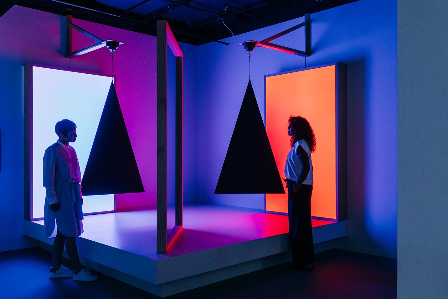
At ACMI, physical representations of storytelling aren’t replaced by screens, but instead live alongside each other, for example with shadow puppets, ceiling murals by artists like Gunditjmara Keerray Woorroong and Vicki Couzens, miniature television production sets by Emily Boutard, and animation flipbooks.
The museum’s backend technology, eXperience Operating System (XOS), connects all the content repositories with what’s happening on the exhibition floor. Chan likens it to a “content management system for physical space.”
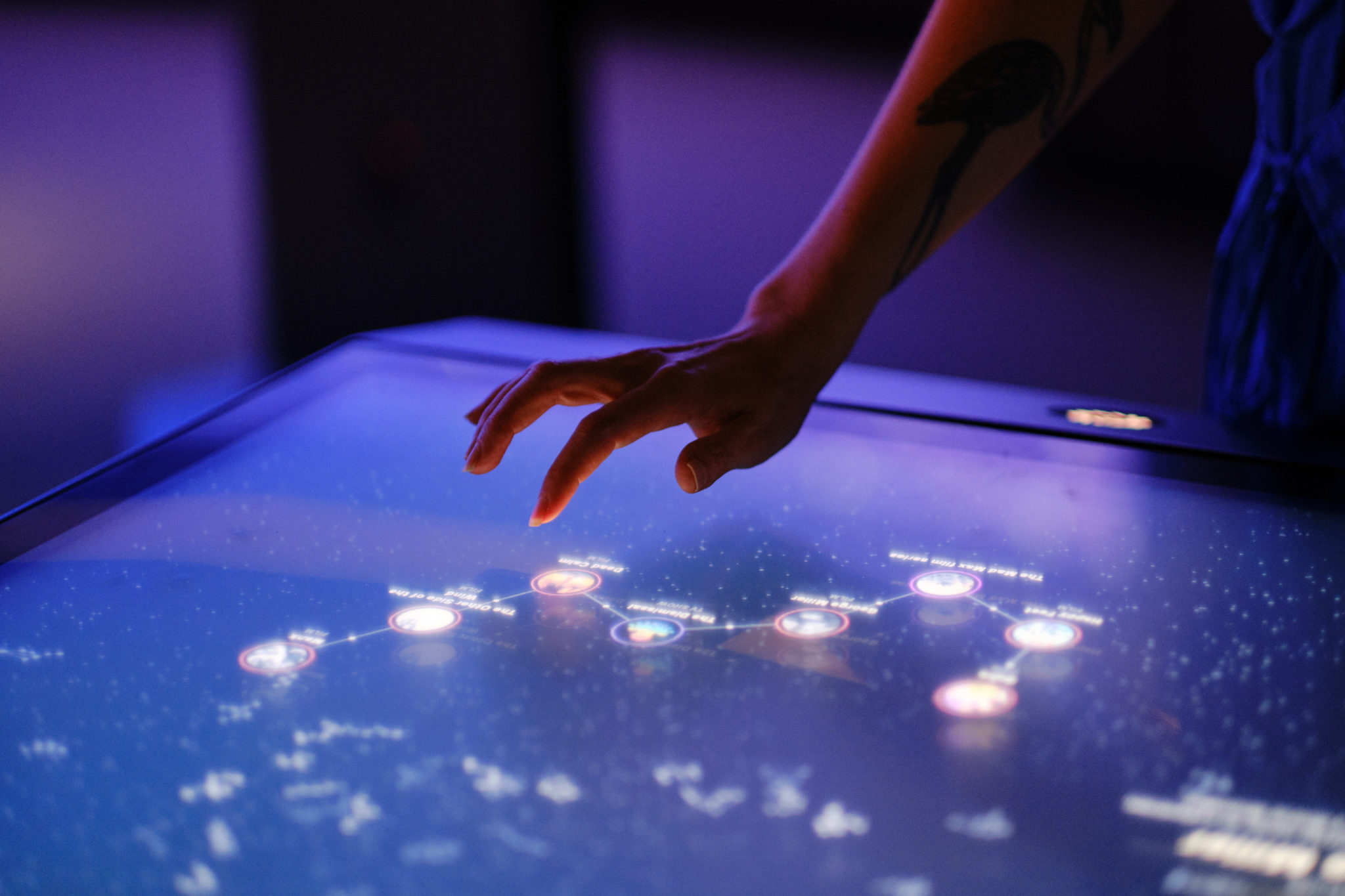
The XOS also powers the Constellation, an interactive experience towards the end of the ongoing exhibition “The Story of the Moving Image.” The Constellation connects the films, games, TV and art that visitors are interested in – and then makes recommendations, selected by ACMI’s curators, of what to watch or play next.
Building an experience with lasting value
There’s also ACMI’s signature creation: a free hand-held take-home device inspired by the design of ViewMaster reels called The Lens, which turns visitors into collectors and curators of their own online experiences.
Made in collaboration with experience design firm Second Story and manufactured with Swinburne University’s Centre for Design Innovation, the fully recyclable object has been a few years in the making.
“My first four weeks after I arrived on the job, we were already thinking: wouldn’t it be great if people could come into the museum, touch a bunch of stuff, and take it home? That’s where we’ll impact their lives,” says Chan.
And it’s working: since ACMI reopened its doors in early 2021 after the two-year redevelopment project, roughly 80% of walk-ins are brand new visitors and they’ve collected over two million items with The Lens. That’s especially significant since ACMI has only had about 120 operating days in 2021 so far due to Covid lockdowns.
“What’s nice about the take-home aspect is that it might get stuck on the fridge like a souvenir. When somebody comes over to your house, they might ask, ‘What’s that thing do? That looks really cool,’” says Chan “You might tell your own little story of visiting us and the stuff you collected. Beyond its utility, The Lens also has the same value of a memory you hold onto.”
One of the challenges of The Lens was onboarding visitors without a user manual or login prompt. “I often go down to the gallery space – as do the rest of my team – because we care about what people think and how they use things,” says Chan. “We’re often asking them, ‘What do you think of this? What does it do?’”
Chan is delighted by how quickly visitors grasp how The Lens fits into their lives. “They’re like, ‘I can collect all this. I can take it home. I’m going to think about what I want to watch tonight and maybe this can recommend some stuff.’ And I’m like, ‘Fantastic!’ You just pitched what we were trying to do.’” A big part of ACMI’s DNA is paying tribute to the past while finding new ways to draw visitors’ attention away from their smartphones – from a replica of the V8 Interceptor from “Mad Max,” to side-scrolling beat-’em-up “The Simpsons” arcade video games. “And that’s what the ‘experience’ part of my title is about,” Chan continues. “To define how we can tap into – not just the moments when a visitor is here – but also the moments before they turn up, and to change what people choose to watch and play when they leave,” says Chan.
Making transparency the default way of working
Part of Chan’s role when he was first hired was improving the staff experience, as well as the visitors’. “That meant asking questions like what were some ways to change how we designed experiences, programmed, and curated events for the public to allow for more experimentation and better cross-collaboration between teams?”
In Chan’s first year, the team rolled out Jira, Trello, and Confluence with the aim of driving a bias toward transparency, but only since the restructure have they reached more of their potential.
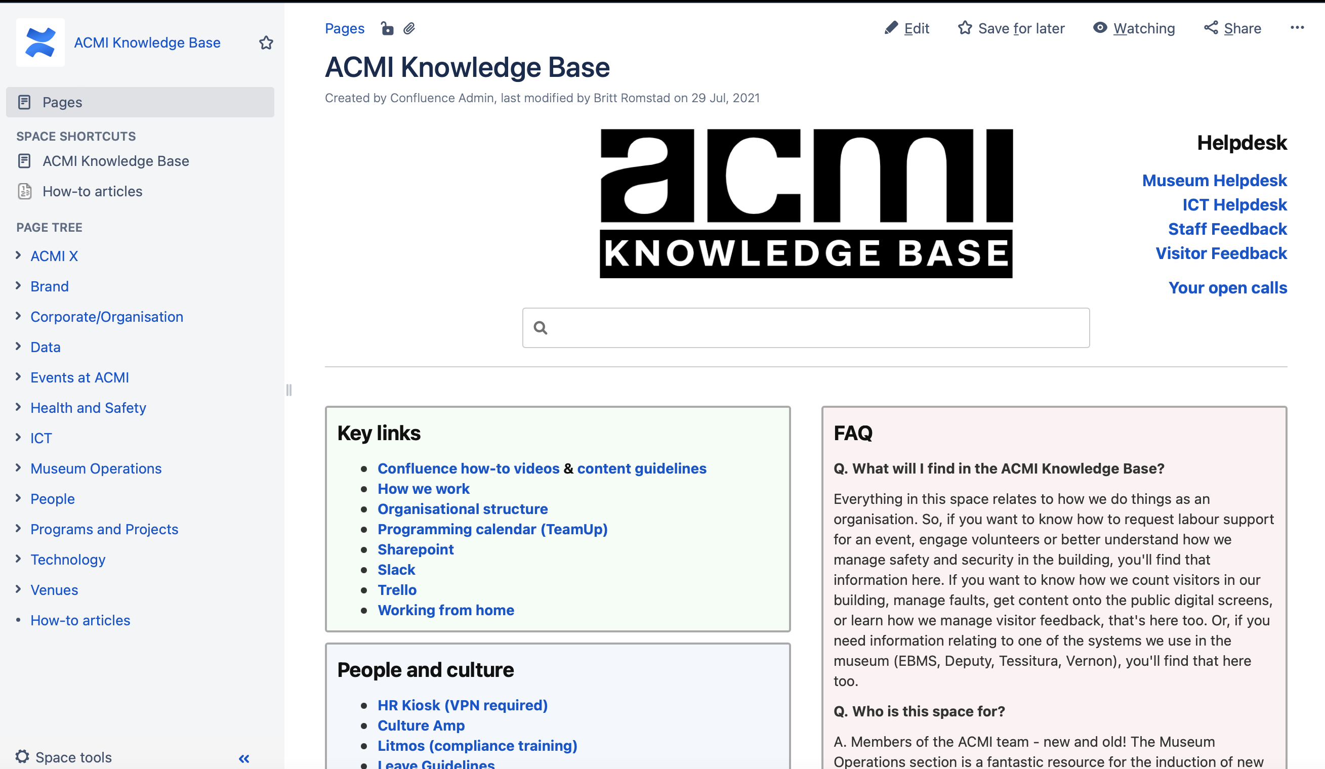
Historically, for example, Confluence had been used by ACMI’s IT team and technical staff for specialized documentation – such as instructions on how to load a DCP (Digital Cinema Print) into a projection system. In the leadup to ACMI’s 2021 relaunch, the visitor-experience and front-of-house teams started to lead and own Confluence as a knowledge base and corporate wiki.
“That loosening up of hierarchy and information flow was critical. It made sense for our customer-facing teams to take ownership of our institutional knowledge base because they deal with our visitors on a minute-by-minute basis,” says Chan.
Staying patient, curious, and open to change
“Katrina Sedgwick, our CEO and director, has been pivotal in creating a culture that welcomes experimentation and understands that not everything’s going to work; that some things take time to show – or unpack – results. Patience is important in that sense,” says Chan.
He recommends not overreacting, or looking at success or failure through a public-relations lens. “You have to have a more measured approach and zoom out a little. Press pause on things, keep looking at the data. See what’s actually going on.”
What Chan keeps coming back to is patience – and playing the long game. “If I see an amazing piece of art in a gallery, it stays with me for many years. It’s not transactional, in that commercial sense of ‘did the customer get what they came for?’”
Keeping teams small helps them stay fast – and take ownership of how to best scope a fix, design it, build it, implement it, and monitor how it’s used in the real world. The end goal is delivering customer value, however small or big.
Chan wants to dig deeper, and encourages visitors to keep their curiosity alive: “Nowadays, we want the visitors to get more questions out of us, or prompt different questions we should be asking, rather than answers.”


