You now have a lot more flexibility when it comes to formatting Trello cards.
For eons (or maybe just since 2011), as you tackled all your to-dos in Trello, you relied on trusty Markdown to format text on your cards. An asterisk here, a dash there, and a backtick over yonder and before you know it, that plain text becomes italicized, a list is born, and a code snippet appears.
While many feel right at home marking up their text with Markdown, others don’t have the time or desire to learn a new syntax to get the format they need to get their work done. So for those folks, we’re rolling out a new editing experience with intuitive, clickable formatting options.
Anyone using Trello free, Standard, or Premium now has access to a brand new card description editing experience on the Trello web application (mobile to come later this year). Trello Enterprise users will see the change in a few weeks. And if you’re familiar with other Atlassian products (like Jira), you might even recognize the new editing toolbar!
And let me reiterate for my fellow Markdown Syntax language enthusiasts: As you have done all these years, you can still edit your Trello descriptions using Markdown syntax. See below to learn about a few tiny changes to how you use it.
How to use the new editing experience
Next time you open one of your Trello cards, you’ll see the new editing options above the card description field:
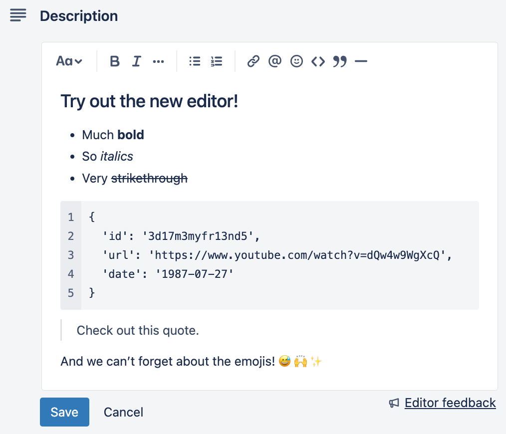
Here’s the rundown of everything you can do with the editor:
- Select varying header font sizes
- Format your text with bold, italics, strikethrough, and code snippets
- Create bulleted or numbered lists
- @ mention your teammates to collaborate
- Insert links and display them in different ways
- Make your descriptions pop with emoji ✨
- And more!
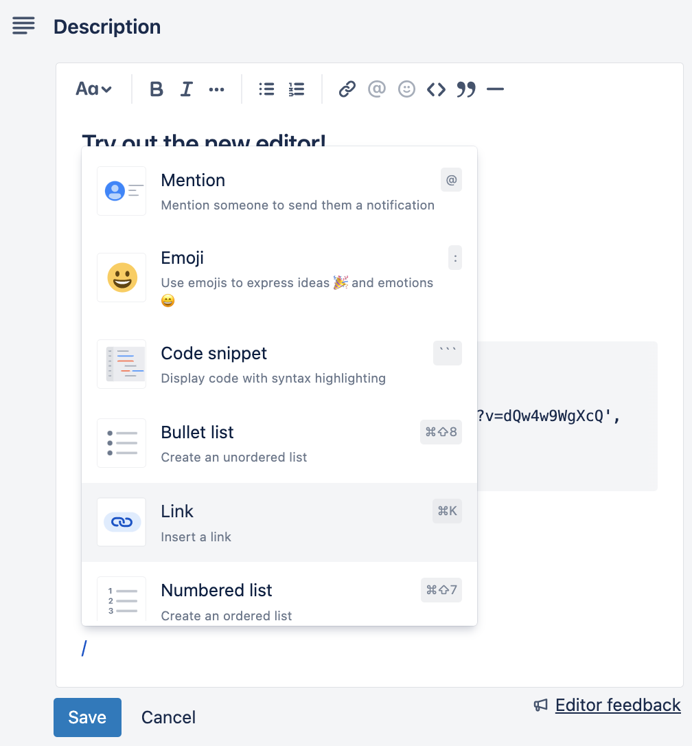
You can also quickly access a dropdown menu of all of the editing options just by typing ‘/’ while in edit mode:
Important note: If you are on Trello free, Standard, or Premium we are rolling out this editing experience gradually, so you may not see it right away. To enable the new editing experience, go here and toggle it on.
Display content your way
When Trello serves as the hub for your team’s work, it’s important that you have options for how you want to visually present your work.
When you’re editing, you can paste a link into the card description and choose how you want to display it—whether that’s simply the raw URL, the default Smartlink inline view, or as a card view, which offers a small preview of the content (with additional information about the link).
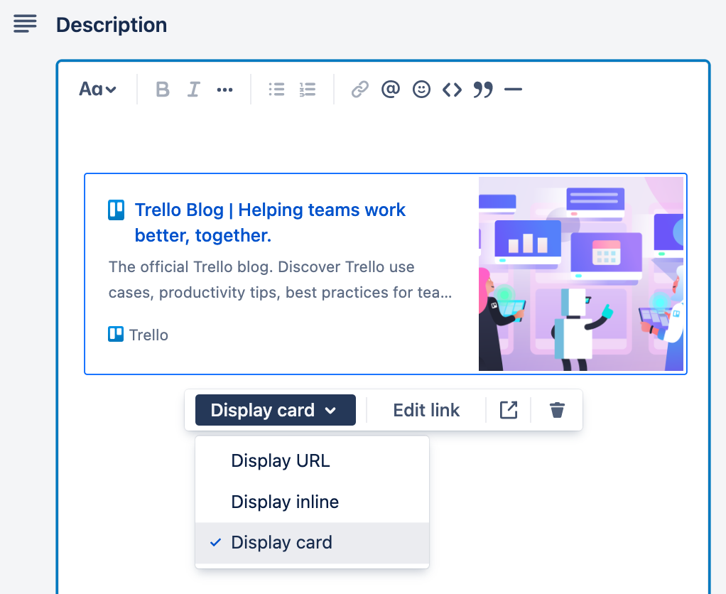
The Trello blog URL displayed as a card. This feature also works for Confluence documents and Jira tickets!
Some handy tips & tricks
Here’s a quick list of some useful keyboard shortcuts and formatting tricks:
- Shortcuts: while editing, press ‘CMD + /’ or ‘CTRL+ /’ to bring up the full list of keyboard shortcuts.
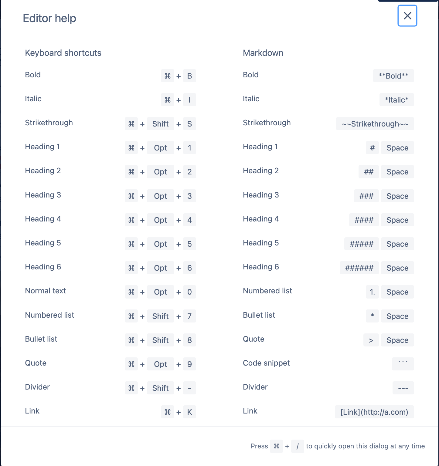
- Spacing: Press ‘Enter’ to create a new paragraph with some extra spacing. If you’re just looking for a line break, hold ‘Shift’ before pressing ‘Enter.’
- Pasting into Trello: If you want pasted text to match the current format in your card description, right-click and select ‘Paste and Match Style’. If you want to preserve the original formatting from where you pulled the text, right-click and select ‘Paste’.
A few small changes with Markdown
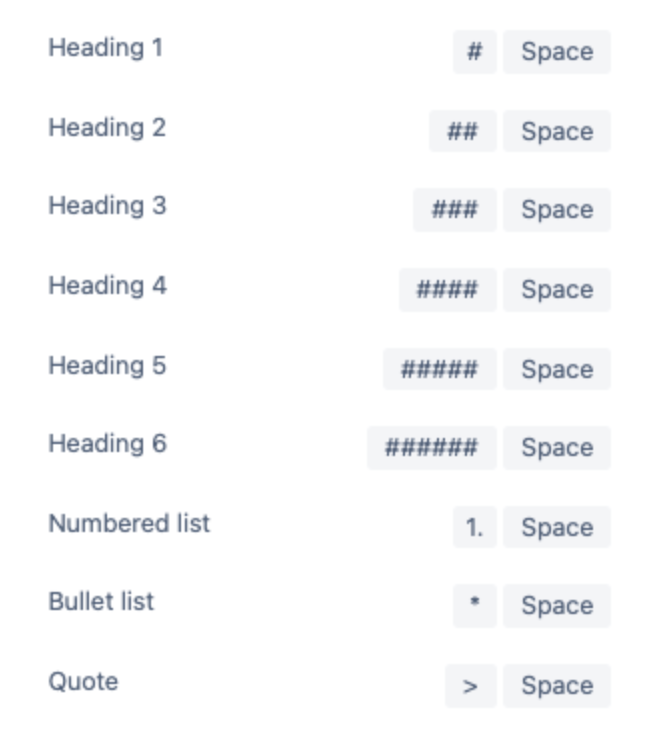
Continuing to use Markdown syntax with the new editor is an option if you want to add things like bold, italics, links, lists, paragraphs, headers, and images in blocks of text.
There is just one small change to be aware of. When it comes to creating headings, numbered lists, bullet lists, and quotes, you need to insert a space after the character.
And that’s a wrap! Give the new editing experience a chance, we hope it helps make working on your Trello cards easier.
