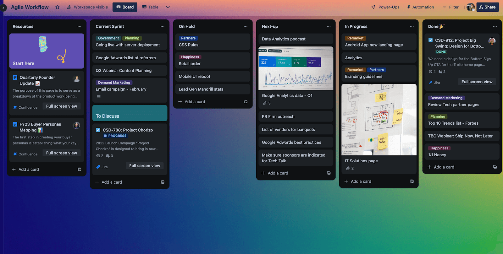
It’s finally here! Trello is officially equipped with a dark mode theme so your productivity can now be, ehm, illuminated, in any brightness setting of your choosing.
We rolled this out with accessibility considerations at the forefront, so that dark mode could be enjoyed by anyone that prefers it.

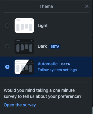
You can toggle between light and dark themes on your Trello boards by clicking the circle in the top right corner of your Trello boards.

“Light Mode” Changes
While developing dark mode, we also made some visual changes to the “light mode” option in Trello. Adding light and dark modes is part of a bigger modernization effort of Trello’s UI, including shifting the color palette and other experience updates.
Color palette modernizations were needed because the original Trello colors could not be made compatible with a darker theme. We took this opportunity to align our color palette to all other Atlassian products. These color updates gave us the ability to develop Trello web in dark mode, something our mobile app already has.
If you have any feedback on light or dark mode themes, please fill out our survey at the bottom of the dark/light toggle menu.
We are excited to see your Trello boards in dark mode!

