A complete guide to box plots
Posted by: Mike Yi
What is a box plot?
A box plot (aka box and whisker plot) uses boxes and lines to depict the distributions of one or more groups of numeric data. Box limits indicate the range of the central 50% of the data, with a central line marking the median value. Lines extend from each box to capture the range of the remaining data, with dots placed past the line edges to indicate outliers.
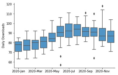
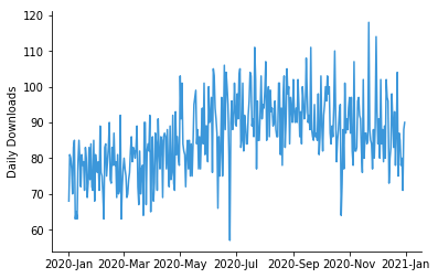
The example box plot above shows daily downloads for a fictional digital app, grouped together by month. From this plot, we can see that downloads increased gradually from about 75 per day in January to about 95 per day in August. There also appears to be a slight decrease in median downloads in November and December. Points show days with outlier download counts: there were two days in June and one day in October with low downloads compared to other days in the month. The box and whiskers plot provides a cleaner representation of the general trend of the data, compared to the equivalent line chart.
When you should use a box plot
Box plots are used to show distributions of numeric data values, especially when you want to compare them between multiple groups. They are built to provide high-level information at a glance, offering general information about a group of data’s symmetry, skew, variance, and outliers. It is easy to see where the main bulk of the data is, and make that comparison between different groups.
On the downside, a box plot’s simplicity also sets limitations on the density of data that it can show. With a box plot, we miss out on the ability to observe the detailed shape of distribution, such as if there are oddities in a distribution’s modality (number of ‘humps’ or peaks) and skew.
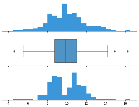
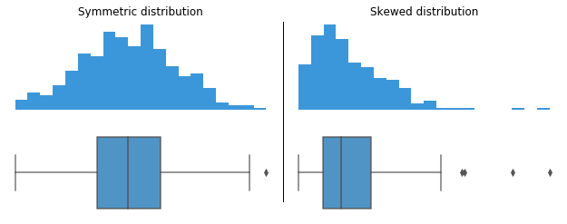
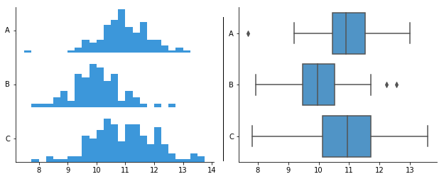
The datasets behind both histograms generate the same box plot in the center panel.
Interpreting a box and whiskers
Construction of a box plot is based around a dataset’s quartiles, or the values that divide the dataset into equal fourths. The first quartile (Q1) is greater than 25% of the data and less than the other 75%. The second quartile (Q2) sits in the middle, dividing the data in half. Q2 is also known as the median. The third quartile (Q3) is larger than 75% of the data, and smaller than the remaining 25%. In a box and whiskers plot, the ends of the box and its center line mark the locations of these three quartiles.
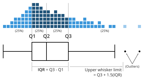
The distance between Q3 and Q1 is known as the interquartile range (IQR) and plays a major part in how long the whiskers extending from the box are. Each whisker extends to the furthest data point in each wing that is within 1.5 times the IQR. Any data point further than that distance is considered an outlier, and is marked with a dot. There are other ways of defining the whisker lengths, which are discussed below.
When a data distribution is symmetric, you can expect the median to be in the exact center of the box: the distance between Q1 and Q2 should be the same as between Q2 and Q3. Outliers should be evenly present on either side of the box. If a distribution is skewed, then the median will not be in the middle of the box, and instead off to the side. You may also find an imbalance in the whisker lengths, where one side is short with no outliers, and the other has a long tail with many more outliers.
Example of data structure
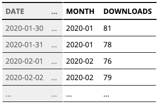
Visualization tools are usually capable of generating box plots from a column of raw, unaggregated data as an input; statistics for the box ends, whiskers, and outliers are automatically computed as part of the chart-creation process. When a box plot needs to be drawn for multiple groups, groups are usually indicated by a second column, such as in the table above.
Best practices for using a box plot
Compare multiple groups
Box plots are at their best when a comparison in distributions needs to be performed between groups. They are compact in their summarization of data, and it is easy to compare groups through the box and whisker markings’ positions.
It is less easy to justify a box plot when you only have one group’s distribution to plot. Box plots offer only a high-level summary of the data and lack the ability to show the details of a data distribution’s shape. With only one group, we have the freedom to choose a more detailed chart type like a histogram or a density curve.
Consider the order of groups
If the groups plotted in a box plot do not have an inherent order, then you should consider arranging them in an order that highlights patterns and insights. One common ordering for groups is to sort them by median value.
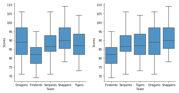
Common box plot options
Vertical vs. horizontal box plot
As observed through this article, it is possible to align a box plot such that the boxes are placed vertically (with groups on the horizontal axis) or horizontally (with groups aligned vertically). The horizontal orientation can be a useful format when there are a lot of groups to plot, or if those group names are long. It also allows for the rendering of long category names without rotation or truncation. On the other hand, a vertical orientation can be a more natural format when the grouping variable is based on units of time.

Variable box width and notches
Certain visualization tools include options to encode additional statistical information into box plots. This is useful when the collected data represents sampled observations from a larger population.
Notches are used to show the most likely values expected for the median when the data represents a sample. When a comparison is made between groups, you can tell if the difference between medians are statistically significant based on if their ranges overlap. If any of the notch areas overlap, then we can’t say that the medians are statistically different; if they do not have overlap, then we can have good confidence that the true medians differ.
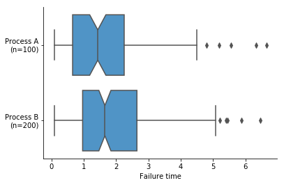
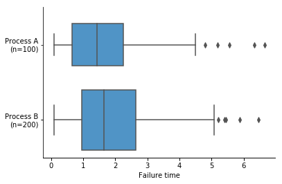
This plot suggests that Process B creates components with better (higher) failure times, but the overlapping notches indicate the difference in medians is not statistically significant.
Box width can be used as an indicator of how many data points fall into each group. Box width is often scaled to the square root of the number of data points, since the square root is proportional to the uncertainty (i.e. standard error) we have about true values. Since interpreting box width is not always intuitive, another alternative is to add an annotation with each group name to note how many points are in each group.
Whisker range and outliers
There are multiple ways of defining the maximum length of the whiskers extending from the ends of the boxes in a box plot. As noted above, the traditional way of extending the whiskers is to the furthest data point within 1.5 times the IQR from each box end. Alternatively, you might place whisker markings at other percentiles of data, like how the box components sit at the 25th, 50th, and 75th percentiles.
Common alternative whisker positions include the 9th and 91st percentiles, or the 2nd and 98th percentiles. These are based on the properties of the normal distribution, relative to the three central quartiles. Under the normal distribution, the distance between the 9th and 25th (or 91st and 75th) percentiles should be about the same size as the distance between the 25th and 50th (or 50th and 75th) percentiles, while the distance between the 2nd and 25th (or 98th and 75th) percentiles should be about the same as the distance between the 25th and 75th percentiles. This can help aid the at-a-glance aspect of the box plot, to tell if data is symmetric or skewed.
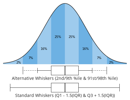
When one of these alternative whisker specifications is used, it is a good idea to note this on or near the plot to avoid confusion with the traditional whisker length formula.
Letter-value plots
As developed by Hofmann, Kafadar, and Wickham, letter-value plots are an extension of the standard box plot. Letter-value plots use multiple boxes to enclose increasingly-larger proportions of the dataset. The first box still covers the central 50%, and the second box extends from the first to cover half of the remaining area (75% overall, 12.5% left over on each end). The third box covers another half of the remaining area (87.5% overall, 6.25% left on each end), and so on until the procedure ends and the leftover points are marked as outliers.

The letter-value plot is motivated by the fact that when more data is collected, more stable estimates of the tails can be made. In addition, more data points mean that more of them will be labeled as outliers, whether legitimately or not. While the letter-value plot is still somewhat lacking in showing some distributional details like modality, it can be a more thorough way of making comparisons between groups when a lot of data is available.
Related plots
Histogram
As noted above, when you want to only plot the distribution of a single group, it is recommended that you use a histogram rather than a box plot. While a histogram does not include direct indications of quartiles like a box plot, the additional information about distributional shape is often a worthy tradeoff.
With two or more groups, multiple histograms can be stacked in a column like with a horizontal box plot. Note, however, that as more groups need to be plotted, it will become increasingly noisy and difficult to make out the shape of each group’s histogram. In addition, the lack of statistical markings can make a comparison between groups trickier to perform. For these reasons, the box plot’s summarizations can be preferable for the purpose of drawing comparisons between groups.
Violin plot
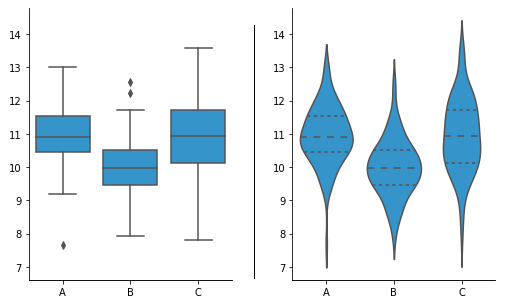
One alternative to the box plot is the violin plot. In a violin plot, each group’s distribution is indicated by a density curve. In a density curve, each data point does not fall into a single bin like in a histogram, but instead contributes a small volume of area to the total distribution. Violin plots are a compact way of comparing distributions between groups. Often, additional markings are added to the violin plot to also provide the standard box plot information, but this can make the resulting plot noisier to read.
Visualization tools
Depending on the visualization package you are using, the box plot may not be a basic chart type option available. Even when box plots can be created, advanced options like adding notches or changing whisker definitions are not always possible. However, even the simplest of box plots can still be a good way of quickly paring down to the essential elements to swiftly understand your data.
The box plot is one of many different chart types that can be used for visualizing data. Learn more from our articles on essential chart types, how to choose a type of data visualization, or by browsing the full collection of articles in the charts category.