Reguła automatyzacji Jira podczas scalania pull requestu
Posted by: Tim Miller
Knowing which of the columns you want to group by and how you want to group them, first, is important. You will need to know that to set up the CASE STATEMENT we’re going to write as a column in a our select statement. In our case, in a group of emails that are accessing our site, we want to know how many clicks each email provider is accounting for since the beginning of August. We also would like to compare an individual email service provider against the rest. For this example, we’re going to use Gmail as our service provider.
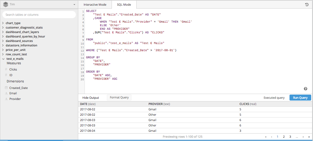
In our SELECT statement, we’ll need the DATE, the PROVIDER and the SUM of the CLICKS to our site. We can get these from the TEST E MAILS table in our data source.
The DATE column is pretty straightforward:
"Test E Mails"."Created_Date" AS "DATEAnd since we’re looking for the SUM of the CLICKS, we’ll need to cast a SUM function over the CLICKS column.
SUM("Test E Mails"."Clicks") AS "CLICKS"That brings us to our CASE STATEMENT. We know from the PostgreSQL Documentation, that a CASE STATEMENT, or a conditional statement, needs to be arranged in the following way:
CASE
  WHEN condition THEN result
  [WHEN ...]
  [ELSE result]
  END
Our first and, in this case only, condition is that we want to know all the email addresses that are provided by Gmail to be separated from every other email provider. So the only WHEN is:
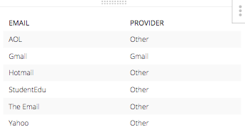
WHEN "Test E Mails"."Provider" = 'Gmail' THEN 'Gmail'And, the else statement would be ‘Other’ for every other email address provider. The resulting table of this CASE STATEMENT with corresponding emails alone. Would look like this:
When you piece all three of those columns for one SELECT STATEMENT and throw in the rest of the necessary pieces to build a SQL query, it all take shape below.
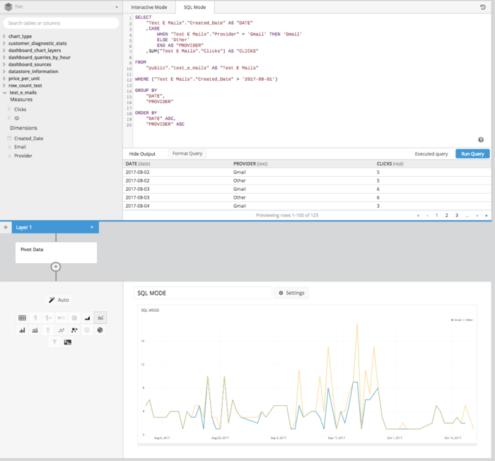
Then after adding a PIVOT DATA step into the Data Pipeline, we’ll get a table properly arranged in the proper format to set up a line chart showing how clicks are compared over time.
In using Atlassian Analytics, we can do all of the above without writing any SQL but leveraging the Data Explorer and the Data Pipeline features. After building our underlying query to pull in all the columns we’re going to need SUM OF CLICKS, DATE and EMAIL ADDRESS we can use the Data Pipeline to manipulate this data post-SQL. First, let’s build the query.
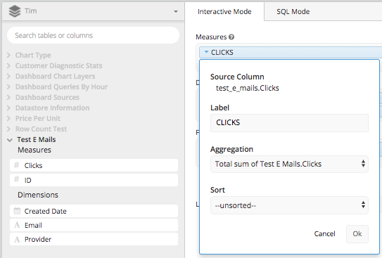
Drag the ‘Clicks Column’ to the measures box and aggregate it by TOTAL SUM of the Column Clicks, then re-label it ‘CLICKS.’
Then drag ‘Created Date’ and ‘Provider’ to the dimensions box and re-label them ‘Date’ and ‘Email Provider.’ After that, using the ‘Created Date’ column you can set the date span (or build your WHERE clause) to be everything after 2017-08-01. This will effectively build everything we need in an underlying query to create the CASE STATEMENT we did above, in Atlassian Analytics’s Data Pipeline.
Adding a CASE STATEMENT pipeline step allows us to set the conditions for the WHEN and the ELSE just like we did before, without having to type in the entire SQL syntax.
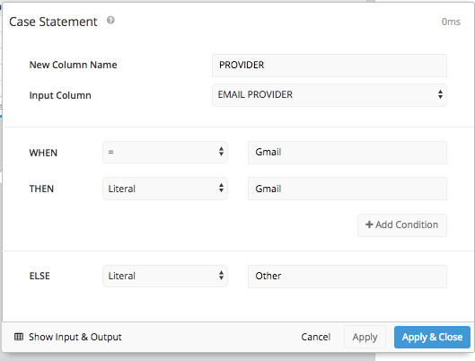
Then after hiding the original ‘Provider’ column and using a REORDER COLUMNS step and a PIVOT DATA step we’ll get the same table arrangement we got in SQL Mode and can present the same table we did in SQL Mode.
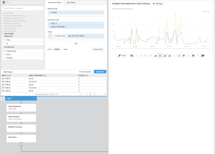
While it may take a few more clicks and steps than in SQL Mode, the resulting line chart done in Interactive Mode requires no knowledge of SQL Syntax. Instead all it takes is a basic understanding of the principles involved. This is another example of how Atlassian Analytics is helping to put the power of data in everybody’s hands, regardless of SQL knowledge.