Jira Automation-Regel beim Mergen von Pull-Anfragen
Posted by: Tina Nguyen
A CEO dashboard visualizes your business data and tracks the health of your business by measuring revenue trends, growth and operational cash flow. For many CEOs, their dashboard is mission control and a window into understand the daily operations and growth of their business.
In creating a CEO dashboard, busy executives are looking for quick and high-level visibility into their business, the ability to pinpoint areas of improvement and drive business action based on their data. With all their high-level metrics in place, CEOs are better equipped to drive the business forward.
But, the benefits of viewing a CEO dashboard is just an internal bonus—it helps externally as well. In 2015, David Taten, a partner at ff Venture Capital and a contributor to TechCrunch wrote, “I prefer to see a screenshot of an internal dashboard, not just something created for the board…. I want to see that management is using a dashboard every day, not just for board meetings.”
Much like creating any departmental dashboard, using a data analytics tool that allows you to directly pull in data from the systems you use to run your business (e.g. Google Analytics, Salesforce, Marketo, Hubspot, Zendesk) will yield the most effective dashboard.
Building a CEO dashboard in Atlassian Analytics
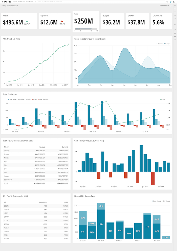
Creating a CEO dashboard doesn’t have to be difficult. With the right data sources and tool in place, you can get from zero insights to the fully fledged dashboard below:

To create a CEO dashboard in Atlassian Analytics, follow these steps:
- Identify the metrics and KPIs you want to track in your dashboard (more on this below).
- Determine the appropriate data sources for these metrics.
- Connect your data sources to Atlassian Analytics, a data warehouse or ETL tool.
- From your organization homepage in Atlassian Analytics, click the + New Dashboard button to create a new dashboard in Atlassian Analytics.
- A modal will appear and direct you to name your new dashboard.
- Click the Add Chart button on the right to create your first chart.
- Use the Data Explorer to quickly start building charts without writing SQL queries and create individual charts for each metric on your dashboard.
- Continue building out your dashboard by using the appropriate chart type for each metric.
- Once you’re done, save and share your dashboard with your organization via a scheduled report or shareable link.
Your dashboard automatically updates, so be sure to project your CEO dashboard on a monitor so you can take a quick glance based on your needs
Mehr als nur Agile
As a dashboard that a CEO would rely on every day to understand the health of their business and drive it forward, the metrics on a CEO dashboard have to leverage visibility and improvement.
For our CEO dashboard above, here are the metrics and their chart type:
- Annual Recurring Revenue / ARR (Single Value Indicator Chart): The amount of money that comes in every year for the duration of a customer’s annual contract. The addition of an indicator helps in determining whether revenue is trending up or down.
- Expenses (Single Value Indicator Chart): In direct correlation with tracking dollars coming into the business, it’s also best practices to measure outward expenses with an indicator as well.
- Goal (Single Value Chart): Every business has a goal, and for many CEOs that goal is a dollar amount - have this metric in the top center of your dashboard to keep you focused. Add an indicator bar to quickly determine the progress of reaching the said goal.
- Budget (Single Value Chart): Tracking budget is in correlation with expenses, as a growing company, you have to keep in mind how much you can actually spend at a high-level.
- Growth (Single Value Chart): The dollar number of revenue growth.
- Churn Rate (Single Value Chart): The percentage at which customers churn.
- ARR Trends Over Time (Line Chart): The measured growth of ARR over the course of your company’s foundation.
- Gross Sales (Area Chart): Quickly visualize the growth of your revenue month-over-month in relation to the previous fiscal year.
- Total Profit/Loss (Bar Line Chart): In this chart, you can see at a high-level all your numbers from new sales revenue, upsell revenue, customer churn and profit.
- Cash Flow (Table Chart): How much cash is being generated in relation to how much is spent in exact numerical values.
- Cash Flow (Bar Chart): How much cash is being generated in relation to how much is spent in a bar chart visualization.
- Customers (Table Chart): A tally of all your company’s customers and the associated data with each company.
- New ARR by Signup (Bar Chart): The breakdown of ARR as measured by signup type.
Mehr als nur Agile
From this dashboard you can drill down into your company’s performance and link off into departmental dashboards that will give you further insights into your business.