풀리퀘스트를 병합하는 경우 Jira Automation 규칙
Posted by: Matt David
If “data is the new oil,” then there’s a lot of free oil lying around just waiting to get used. And you can do some pretty cool things with that data, like finding the answer to the question: Does Buffalo, New York, really get that cold in the winter?
There is a lot of free data out there, ready for you to use for school projects, for market research, or just for fun. Before you get too crazy, though, you need to be aware of the quality of the data you find. Here are a few great sources for free data and a few ways to determine their quality.
7 sources for free datasets anyone can use
All of these dataset sources have strengths, weaknesses, and specialties. Overall, they’re great services, and you can spend a lot of time going down cool rabbit holes. But if you want to stay focused and find what you need, it’s important to understand the nuances of each source and utilize their strengths to your advantage.
Google Dataset Search
As its name implies, Google Dataset Search is “a search engine for datasets,” whose main audience includes data journalists and researchers.
Google Dataset Search has the most datasets out of all the options listed here, with 25 million datasets available when it left beta in January 2020. Since it’s a Google product, the search function is powerful, but if you need to really get specific, it has a ton of filters to narrow down results.
As a go-to for finding free public datasets, you can’t do much better than Google Dataset Search right now. Just keep in mind that the Google graveyard — which is a phenomenon where Google cancels a service or product with little warning — is an ever-present danger for Google products big and small. It’s good to be aware of your other options.
Kaggle
Kaggle is a popular data-science competition website that provides free public datasets you can use to learn artificial intelligence (AI) and machine learning (ML).
Organizations use Kaggle to post a prompt (like Cassava Leaf Disease Classification) and teams all over the world will compete against each other to solve it using algorithms (and win some prize money).
Kaggle is pretty important in the data-science community, providing a way to test and prove your skills — your Kaggle competition performance sometimes comes up in job interviews for AI/ML positions.
After these competitions, the datasets are made available for use. As of the writing this article, Kaggle has a collection of over 68,000 datasets, which it organizes using a tagging system, usability scores, along with up-votes and down-votes.
Kaggle has a robust community on its own site, with discussion boards within each dataset and within each competition. There are also active communities outside of Kaggle, like r/kaggle, which share tips and tutorials.
All this is to say that Kaggle is much more than just a free dataset dispenser; it’s also a way to test your skills as data scientists. The free datasets are a side benefit anyone can take advantage of.
GitHub
GitHub is the world standard for collaborative and open-source code repositories online, and many projects it hosts have datasets you can use. There is a project specifically for public datasets fittingly called Awesome Public Datasets.
Like Kaggle, the available datasets on GitHub are a side benefit of the site’s true purpose. In GitHub’s case, that purpose is being a code repository service first and foremost. It’s not a data repository optimized for dataset discovery, so you might need to get a little creative to find what you’re looking for, and it won’t have the same variety as Google or Kaggle.
Government sources
Many government agencies make their data available online for free, allowing anyone to download public datasets and put them to use. You can find a wide variety of government data from city, state, federal, and international sources.
These datasets are great for students and those focusing on the environment, economy, health care (lots of this type of data due to COVID-19), or demographics. Keep in mind that these aren’t the slickest sites ever — they’re mostly focused on function rather than style.
A few free government datasets we recommend:
FiveThirtyEight
FiveThirtyEight is a data journalism website that sometimes makes its datasets available for use. Their original focus was on sports, but they’ve since branched out to pop culture, science, and politics.
The datasets FiveThirtyEight makes available are highly curated and specific to their journalistic output. Unlike other options on this list, you’ll probably end up browsing the inventory rather than searching. And you might stumble across some fun and interesting datasets, like 50 Years Of World Cup Doppelgangers.
data.world
Data.world is a data catalog service that makes it easy to collaborate on data projects. Most of these projects make their datasets available for free.
Anyone can use data.world to create a workspace or project that hosts a dataset. There is a wide variety of data available, but no easy way to browse. You’ll have to know what you’re searching for to bring up results.
Data.world does require a login to access their free Community plan, which allows you to create your own projects/datasets and provides access to the projects/datasets of others. You’ll have to pay for access to more projects, datasets, and storage.
Quality data means quality work
Free data is great. Free high-quality data is better. If you want to do great work with the data you find, you need to do your due diligence to ensure that it’s good-quality data by asking a few questions.
Should I trust this data source?
First, consider the overall reputation of the source for your data. At the end of the day, datasets are created by humans, and those humans may have specific agendas or biases that can translate through your work.
All the data sources we’ve listed here are reputable, but there are more sources for data that aren’t as reputable. The one caveat to our list here is that community-contributed collections, like data.world or GitHub, may vary in their quality. When in doubt about your data source’s reputation, compare it to similar sources that cover the same topic.
Could the data be inaccurate?
Next, investigate your dataset for inaccuracies. Again, humans create these datasets, and humans aren’t perfect. There may be mistakes in the data that, using a few quick tricks, you can quickly identify and fix.
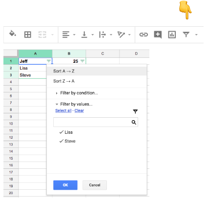
First trick: Come up with estimates for the minimum and maximum for any one of your columns. See if any values within your dataset are outside of that using filtering and sorting options, shown here:

Say you have a dataset on the prices of lightly used cars. You’d expect the price data to be between around $7,000 and $20,000. When you filter your price column lowest to highest, the lowest price probably shouldn’t be very far from $7,000.
But humans can make mistakes and enter data incorrectly — instead of $11,000.00, someone might type in $1,100.00 or $11,00.00.
Another common example is that, sometimes, people don’t want to provide real data for things like phone numbers. You might get a lot of 9999999999 or 0000000000 in these columns.
Also make sure to pay attention to column titles. A field could be titled “% Employed,” and entries could have 0.80 or 80. Both might mean 80% but would appear differently in the final dataset.
So look for mistakes. If they’re simple, obvious mistakes, correct them. If they’re obviously incorrect, remove the entry from the dataset so it doesn’t throw things off down the road.
Could the data be incomplete?
It’s super common for a dataset to be missing data. Before you start doing work with the dataset, it’s a best practice to check for null or missing values. If there are a lot of null values, the dataset is incomplete and might not be good to use.
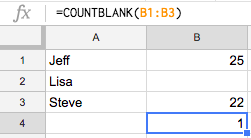
In Excel, you can do this by using the COUNTBLANK function — for example, COUNTBLANK(B1:B3) in the image below results in a count of 1.

Too many null values likely mean an incomplete dataset. If you have a few null values, but not too many, you can go through and replace null values with 0 using SQL, or you can do it manually.
Is the data skewed?
Understanding how your dataset skews will help you choose the right data to analyze. It’s good to use visualizations to see how your dataset skews because it’s not always obvious by looking at the numbers alone.
For numeric columns, use a histogram to see which type of distribution each column has (normal, left, right, uniform, bimodal, etc.). Here’s a quick visualization of a few distributions you might see:

This visual understanding will help you avoid outliers and be aware of general trends as you perform your data analysis. Strict recommendations on what to do next depend on your dataset, but, overall, how it skews will provide a general idea of the data’s quality and hint at which columns to use in an analysis. You can then use this general idea to avoid misrepresenting your data (we wrote a guide to help with that, which you can read here).
For non-numeric columns, use a frequency table to check how many times a value appears. In particular, you might check if there is mostly one value present. If that’s the case, your analysis might be limited because the variety of values is small. Again, this is just to provide a general idea of data quality and indicate which relevant columns to use.
You can create these visuals and frequency tables within Excel or Google Sheets using CSVs, but you might want to look at a business intelligence (BI) tool for complex datasets.
애자일 너머를 향해
Once you have your data and are confident of its quality, it’s time to put it to work. You can go a long way with the likes of Excel, Google Sheets, and Google Data Studio, but if you really want good practice for your data career, you should cut your teeth with the real deal: a BI platform like Atlassian Analytics.
A BI platform will provide powerful data visualization capabilities for any dataset, from small CSVs to large datasets hosted in data warehouses, like Google BigQuery or Amazon Redshift. You can play with your data to create dashboards and even collaborate with others.
Atlassian Analytics focuses on usability for the data newbie and the veteran alike, with Visual SQL, which makes it easy to find the data you need and put it to use without coding a single line of SQL. But if you do want to roll up your sleeves and start to code, you can do that, too (we’ll teach you SQL for free here).