A complete guide to grouped bar charts
Posted by: Mike Yi
What is a grouped bar chart?
A grouped bar chart (aka clustered bar chart, multi-series bar chart) extends the bar chart, plotting numeric values for levels of two categorical variables instead of one. Bars are grouped by position for levels of one categorical variable, with color indicating the secondary category level within each group.
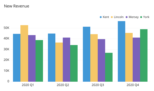
The grouped bar chart above compares new quarterly revenue for four sales representatives across a year. One bar cluster is plotted for each quarter, and in each cluster, one bar for each representative. Colors and positions are consistent within each cluster: for example, we can see that Kent is always in blue and plotted first. We can see from the plot that Lincoln had the best performance in Q1 with Kent best in all remaining quarters. We can also check individual performances such as Mersey’s relatively stable performance across the year, or York’s major bump in Q4 after a slide from Q1 through Q3.
When you should use a grouped bar chart
Like a standard bar chart, the grouped bar chart is built for showing a distribution of data points or making comparisons across different categories of data. Where the grouped bar chart differs is its division of data points across two different categorical variables, not just one. A grouped bar chart is used when you want to look at how the second category variable changes within each level of the first, or when you want to look at how the first category variable changes across levels of the second. We’ll call comparisons of the first type “within-group” comparisons, and comparisons of the second type “between-group”. In the example above, a within-group comparison would focus on the bars for a single quarter, while a between-group comparison would focus on bars for a single representative across quarters.
In order to facilitate these comparisons, bars in a grouped bar chart are plotted systematically. For within-group comparisons, the primary categorical variable’s levels determine a location for a cluster of bars to be plotted. A number of bars are plotted in each group equal to the number of levels of the secondary categorical variable. Between-group comparisons are aided by choosing a consistent color and order for each secondary variable’s level to be plotted in each group.
It is worth calling out the fact that the grouped bar chart is not well-equipped to compare totals across levels of individual categorical variables. Since there aren’t any native elements for group totals in a grouped bar chart, it will take a lot of work on the reader’s part to estimate a total for any categorical level, primary or secondary. If comparing the totals for a categorical variable are important, then a different chart type like a standard bar chart or stacked bar chart will be better at performing the task.
Order of categorical variables
An important consideration when creating a grouped bar chart is to decide which of the two categorical variables will be the primary variable (dictating the axis locations for each bar cluster) and which will be the secondary (dictating the number of bars to plot in each cluster). Domain knowledge and information about the type of categorical variables to be plotted can be used to decide on which one is more important, and thus chosen as the primary variable.
Categorical variables that depict temporal data (e.g. monthly summaries 20XX-Jan, 20XX-Feb, 20XX-Mar, etc.) will usually be a clear choice for the primary categorical. For purely categorical variables like gender or country, we prefer setting them as secondary variables if they have a small number of levels to plot: the more levels there are, the more distinct colors we need and the harder it may be to distinguish between them. On the other hand, other numeric variables like age ranges (18-24, 25-34, 35-44, etc.) or ranked scores (agreement on scale from 1-7) can work well as secondary variables since we might just be more concerned with the continuous distribution of values rather than precise identification of individual levels and their values.
Inevitably, there will be cases where there won’t be a clear choice for how to set your category hierarchy, even after considering domain knowledge and visualization objectives. There’s no harm in just experimenting, and trying both orders of variables to see which one conveys the data best.
Example of data structure
QUARTER | KENT | LINCOLN | MERSEY | YORK |
|---|---|---|---|---|
| 2020-Q1 | KENT 44 700 | LINCOLN 52 800 | MERSEY 43 500 | YORK 38 800 |
| 2020-Q2 | KENT 45 000 | LINCOLN 36 500 | MERSEY 41 000 | YORK 34 100 |
| 2020-Q3 | KENT 51 200 | LINCOLN 44 200 | MERSEY 39 700 | YORK 27 000 |
| 2020-Q4 | KENT 56 500 | LINCOLN 45 300 | MERSEY 41 200 | YORK 48 900 |
Data for grouped bar charts usually come in a tabular form like the one above. The first column indicates the levels of the primary categorical variable, while the second and subsequent columns correspond with each level of the secondary categorical variable. The numeric variables in the cells indicate the height of each bar; bars are plotted by row to generate the bar groups.
Best practices for using a grouped bar chart
Principles for best practices in a grouped bar chart are in line with those for the standard bar chart, but with some adjustments due to the presence of the secondary categorical variable.
Maintain a zero-baseline
The addition of clustered bars actually has no effect on the principle that we should include a zero-baseline in a bar chart. As it was in the base chart, a baseline makes it so that bar lengths are true to the values that they encode.
Ordering of category levels
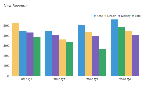
The principle of ordering bars from largest to smallest unless they have an inherent ordering applies just as well for the clustered bar chart as it does for the basic bar chart, but with a small consideration on how ‘largest’ to ‘smallest’ is determined. Size judgments should be made on each categorical variable on its own, ignoring the divisions of the other categorical variable of interest. This is especially important for the secondary categorical variable: having a consistent ordering of bars across groups will usually be more helpful than ordering the bars from largest to smallest within each group. However, that latter within-group sorting does have use cases, such as when rankings across a temporal primary variable are of interest.
Choosing effective colors
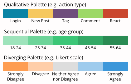
While the general rule was to keep all bars the same color for a standard bar chart, color choices become a vital part of the grouped bar chart in order to distinguish levels of the secondary categorical variable. The important choice to make here is to choose a color palette that matches the type of secondary variable you have: a qualitative palette for a purely categorical variable, or a sequential or diverging palette for categorical variables with inherent ordering.
Common grouped bar chart options
Horizontal grouped bar chart
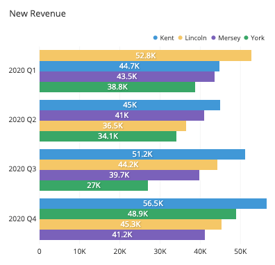
Like with a standard bar chart, a grouped bar chart can be generated with vertical bars (primary categories on the horizontal axis) or horizontal bars (primary categories on the vertical axis. The horizontal orientation provides the same benefits as in the standard bar chart, providing additional room for long primary category labels without the need for rotation or truncation.
Value annotations
Annotations for bar lengths can be added to a grouped bar chart almost as well as they can for the standard bar chart. While annotations can help readers pinpoint exact values as before, the fact that there will usually be many more bars to plot means that the visual clutter of annotations will be heightened for a grouped bar chart.
Additional components for showing total
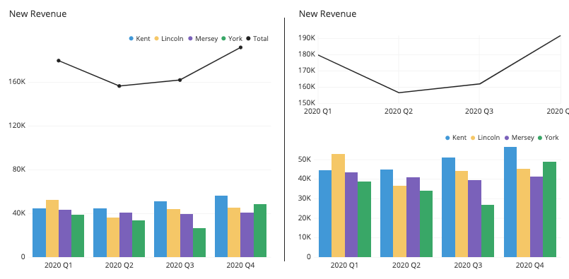
As noted earlier in the article, a grouped bar chart will normally not include any elements showing total values for primary or secondary categorical variables. One way of adding totals for the primary categorical variable can come from adding a large bar behind each group or a line chart component above each group. This can, however, drastically extend the height of the plot, especially when there are a lot of secondary bars. The general recommendation remains to just use a separate plot if totals are of interest rather than trying to force everything into a single plot.
Faceted bar charts
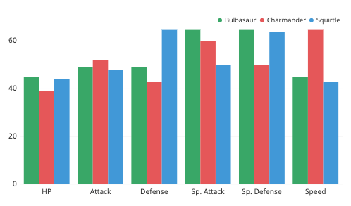
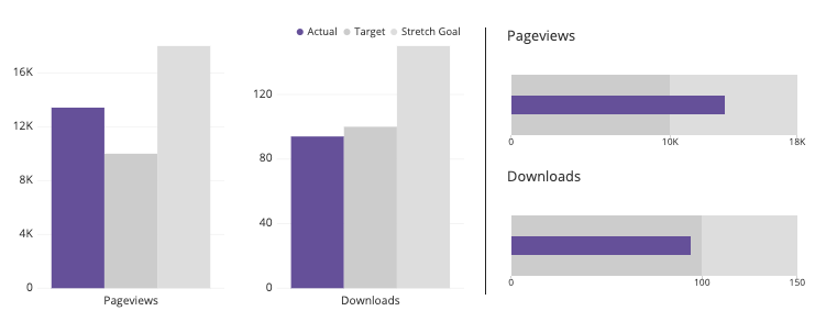
One use case that looks like a grouped bar chart comes from replacing the primary categorical variable with multiple different metrics. Since each metric might have a different axis scale, each metric tends to get its own axis. In actuality, this type of chart is just placing a number of standard bar charts side by side (the titular faceting), but the coloring of bars is what gives the chart its power. The bar coloring and ordering that gets picked up from the grouped bar chart type emphasizes making within-group comparisons better than if each subplot was just considered independently of the others.
Related plots
Line chart
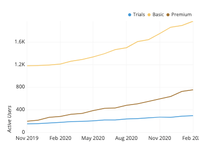
When the primary categorical variable is continuous in nature, especially if it deals with time, then a useful alternative chart type to consider is the line chart. A line chart is especially useful when there are a lot of levels in the primary categorical variable: the need to cluster many bars around each position can make the chart difficult to read. The line chart cleans this up by aligning each of the sub-groups vertically, and the connected line between points makes it easier to track how each sub-group changes.
Stacked bar chart
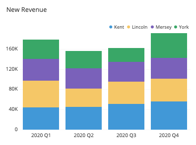
If we modified a grouped bar chart where, for each primary group, we stacked bars end-to-end rather than side-by-side, the result would be a stacked bar chart. Each primary bar’s total length will be the same as if the secondary category was not present, and so a stacked bar chart puts emphasis on the totals of the primary category levels and the relative part-to-whole contribution of each of the secondary category levels. The tradeoff with this chart type is that it now becomes much more difficult to compare subcategories between primary category levels.
Heatmap
If we imagine the bars as having depth, we could imagine changing our point of view to look at them from above. If we also aligned the groups so that they formed a matrix of bars, we would essentially obtain a heatmap. Heatmaps are like tables with the addition of color to enhance detection of patterns and trends. Although heatmaps require annotations in order for numeric values to be read as easily as a grouped bar chart, they are also very compact and have a number of other more general uses.

Bullet chart
A bullet chart or bullet graph is a specialized bar chart used in business contexts to track performance metrics against their goals. A single thin bar indicates the actual metric value, while larger bars and other markings indicate the goal value and other benchmarks. In a way, this is like a clustered bar chart where the secondary categorical levels are the true value, goal, and benchmarks, but plotted in a specific overlapping fashion. Since the bullet chart has only one ‘real’ data value, it is a good, compact way of making a comparison judgment at a quick glance.
Visualization tools
Grouped bar charts are a very common option for visualization tools. Depending on the tool used, the grouped bar chart might be set as a dedicated chart type, while others perform creation of grouped bar charts through a general bar chart type. In this latter case, the grouped bar chart might sit alongside the stacked bar chart as an option for handling the multiple columns for your secondary variable.
For cases where a basic grouped bar chart is not available, one can be created by overlaying multiple bar charts together. This can be performed by adjusting the overall bar width and offsetting the position of each series of bars around the primary locations, one for each secondary category level.
The grouped bar chart is one of many different chart types that can be used for visualizing data. Learn more from our articles on essential chart types, how to choose a type of data visualization, or by browsing the full collection of articles in the charts category.