A complete guide to area charts
Posted by: Mike Yi
What is an area chart?
An area chart combines the line chart and bar chart to show how one or more groups’ numeric values change over the progression of a second variable, typically that of time. An area chart is distinguished from a line chart by the addition of shading between lines and a baseline, like in a bar chart.
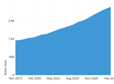
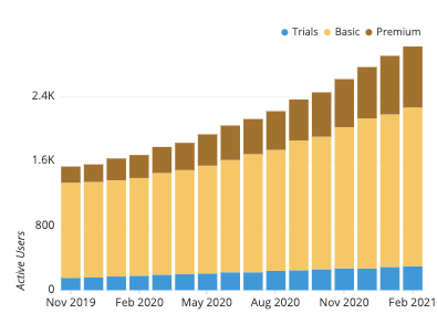
This area chart shows the number of active users for a fictional web-based company, computed by month. Values for each month can be measured not just from the vertical position of the top of the shape, but also the colored height between the baseline and top. In this chart, we can see that the number of active users has about doubled from November 2019 to February 2020, and that the rate of user gains has increased over time.
When you should use an area chart
While the example above only plots a single line with shaded area, an area chart is typically used with multiple lines to make a comparison between groups (aka series) or to show how a whole is divided into component parts. This leads to two different types of area chart, one for each use case.
Overlapping area chart
In the case that we want to compare the values between groups, we end up with an overlapping area chart. In an overlapping area chart, we start with a standard line chart. For each group, one point is plotted at each horizontal value with height indicating the group’s value on the vertical axis variable; a line connects all of a group’s points from left to right. The area chart adds shading between each line to a zero baseline. Since the shading for groups will usually overlap to some extent, some transparency is included in the shading so that all groups’ lines can be easily seen. The shading helps to emphasize which group has the largest value based on which group’s pure color is visible.
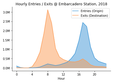
Be careful that one series is not always higher than the other, or the plot may become confused with the other type of area chart: the stacked area chart. In those cases, just keeping to the standard line chart will be a better choice.
Stacked area chart
Generally, when the term ‘area chart’ is used, what is actually implied is the stacked area chart. In the overlapping area chart, each line was shaded from its vertical value to a common baseline. In the stacked area chart, lines are plotted one at a time, with the height of the most recently-plotted group serving as a moving baseline. As such, the fully-stacked height of the topmost line will correspond to the total when summing across all groups.
You will use a stacked area chart when you want to track not only the total value, but also want to understand the breakdown of that total by groups. Comparing the heights of each segment of the curve allows us to get a general idea of how each subgroup compares to the other in their contributions to the total.
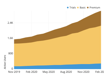
Most of the active users come from basic accounts, but premium users seem to be growing proportionally faster.
Example of data structure
MONTH | TRIALS | BASIC | PREMIUM |
|---|---|---|---|
| 2019-11 | TRIALS 154 | BASIC 1180 | PREMIUM 201 |
| 2019-12 | TRIALS 157 | BASIC 1186 | PREMIUM 219 |
| 2020-01 | TRIALS 170 | BASIC 1195 | PREMIUM 270 |
| 2020-02 | TRIALS 180 | BASIC 1213 | PREMIUM 285 |
| … | TRIALS … | BASIC … | PREMIUM … |
Data that is to be depicted with an area chart is typically aggregated into a table with two or more columns. The first column indicates the positions on the horizontal axis where each line will be plotted. Each column that follows will indicate the vertical contribution for each point, one column per series to be plotted. This format is applicable for both the overlapping and stacked area chart, with the main difference between charts the way the values are interpreted for rendering.
For stacked area charts, some visualization tools require the columns to list not the individual contributions, but the cumulative contributions instead. In this case, the columns specify the line heights directly, and the contributions of each group are implied by the difference in values between columns.
MONTH | TRIALS | + BASIC | + PREMIUM |
|---|---|---|---|
| 2019-11 | TRIALS 154 | + BASIC 1334 | + PREMIUM 1535 |
| 2019-12 | TRIALS 157 | + BASIC 1343 | + PREMIUM 1562 |
| 2020-01 | TRIALS 170 | + BASIC 1365 | + PREMIUM 1635 |
| 2020-02 | TRIALS 180 | + BASIC 1393 | + PREMIUM 1678 |
| … | TRIALS … | + BASIC … | + PREMIUM … |
Best practices for using an area chart
Include a zero-baseline
While a line chart is not restricted to requiring a zero-baseline, the addition of shading means that the heights of the colored regions will be used to compare the size of each group’s values. Thus, like a bar chart, it is compulsory for there to be a zero-baseline against which the shading should be performed. To cut the axis would result in the actual ratio in group values to not match up with what is implied by the generated plot.
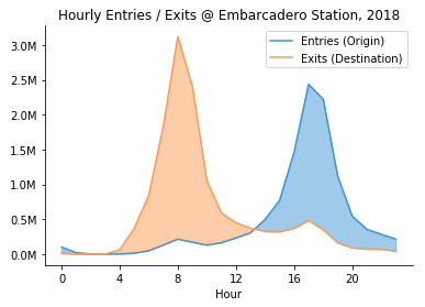
An exception to this rule can come in when we compare two series in an overlapping area chart with a change to the shading rule. If we limit the shading to be between the lines, rather than from both lines to a common baseline, then we can zoom the vertical axis limits into the effect of interest without a baseline. Shading now takes a different meaning, with the color indicating which group as a larger value, and the amount of color the size of the difference.
Limit number of series in an overlapping area chart
The more series we have in an overlapping are chart, the more combinations of colors there will be when they overlap. The fact that most colors will not be associated with a single group can cause some difficulty in interpretation. Even with only three series, this can sometimes be too much to track: three individual colors, three pairwise overlaps, and one color for all three groups overlapping totals seven colors in all.
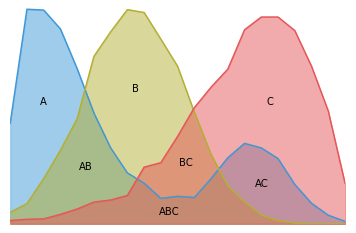
Comparing two series is usually safe, though if one series is always larger than the other, the plot can be easily mistaken for a stacked area plot instead. Readers can also be confused by interpreting the overlapping colors, which will not be present in the general legend. As a general rule of thumb, if you’re thinking about using an overlapping area chart, limit yourself to two series and think about if using a line chart will show the comparison between groups more clearly.
Consider order of lines in stacked area chart
While the total shape of the plot will be the same regardless of the order in which groups’ lines are plotted, reading the visualization can be supported through a good choice of line order. A good rule of thumb is to put the largest or most stable groups at the bottom, with the most variable or smallest groups last and on top. As it will be mentioned in the following section, it takes work to read values for any individual group except for the bottom-most, so it’s a good idea to make that one the most important.
Common misuses
Using an area chart to plot a single series
As noted near the start of the article, the typical use case for the area plot is to make a comparison or to show a division of quantities between two or more series. When we just have a single series of values to plot, it is often the wrong choice to use an area chart. The better option is to choose just a bar chart or line chart, depending on what you want to learn or communicate about the data.
If we want to understand the progression of exact values over time and we don’t have too many values to plot across the horizontal axis, then a bar chart is a good choice. Otherwise, a line chart is a better choice. Lines have a more efficient data-to-ink ratio and cleaner look with a lot of values to plot compared to bars. In addition, when we have a lot of values, we’re likely to be more interested in the direction and slope of trends rather than exact values, a case where line charts perform better.

Interpreting values on individual groups in a stacked area chart
In a stacked area chart, gauging exact values is only really easy for two cases: for the overall total and for the bottommost group. For intermediate groups, getting the exact value of a group’s contribution requires finding the height of that group’s line, and subtracting the height of the line below it.
The task becomes even worse when we want to track changes over time. As before, this is easy for the total and bottommost group. However, intermediate groups are hampered by a changing baseline, making it difficult to perceive exact vertical differences. The below example adapted from this blog post makes this clear. While the central yellow group’s magnitude appears to change over time, in fact, the heights at each point are consistent.
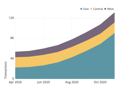
If you want to know about the exact group values and their changes over time, then choosing a standard line chart will be a better option, as demonstrated in this Everyday Analytics article.
Common area chart options
Percentage stacked area chart
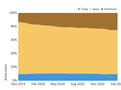
A common option for area charts is the percentage, or relative frequency, stacked area chart. Rather than stack the absolute values of each group at each vertical slice, we stack the relative or percentage contribution of each group to the total, so that the overall height is always 100%. This chart type loses information about the trend of the absolute totals (and so will need its own line chart) but helps to bring out the comparison of relative contributions between groups. As a bonus, this chart type gains a second baseline across the top of the plot upon which an individual group’s contributions can be gauged.
Related plots
Line chart
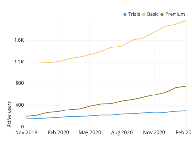
The line chart is the main progenitor for the area chart type. If you aren’t sure if an area chart is what you are interested in, using a line chart is unlikely to steer you wrong. This is especially true for the overlapping area chart, where overlapping regions can quickly get out of control. As another consideration, it is always possible to just generate more plots if you are interested in making multiple comparisons in your data rather than just feel the need to choose just a single chart type to carry as much as possible.
Bar chart and stacked bar chart
The other progenitor for the area chart is the bar chart. More precisely, however, the closest link is between the stacked area chart and stacked bar chart; there’s not really a good analog between the overlapping area chart and any bar chart.
The stacked bar chart is very similar to the stacked area chart, just with bars instead of lines. Thus, many of the limitations of the stacked area chart also apply to the stacked bar chart. However, one advantage of stacked bars is that it is much easier to make a consistent judgment of value within each horizontal-axis bin. The shaded regions in an area chart can become distorted as seen above, especially when a line changes direction. Since each region is rectangular in a stacked bar chart, this kind of distortion is avoided.
Ridgeline plot
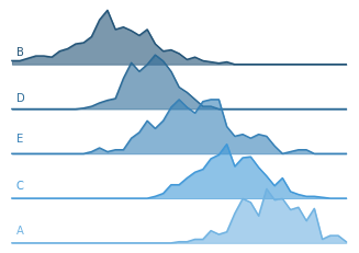
One additional alternative to the overlapping area chart is the ridgeline plot. Rather than plot all lines and colored regions on the same axis, the ridgeline plot puts each line on a different axis, each one with a partial vertical offset from the others. Due to the offset nature of lines, vertical markings are usually left out of a ridgeline plot. This means that ridgeline plots are at their most useful when there is a clear pattern in the individual series’ values based on their shapes alone.
Stream graph
A fanciful relative of the area chart is the stream graph. In a stacked area chart, all of the lines are stacked on top of each other over a straight baseline at the bottom of the stack. With a stream graph, the baseline is set through the center of the chart, and the areas symmetrically gathered around the central line. Because of this, it is difficult to gauge precise values for any group or even the overall total.
As argued by Andy Kirk, stream graphs are best used in an interactive form when lots of data is to be presented to a wide audience. Interactivity is vital to allow readers to dig into the visualization and form their own findings. However, when accurate judgments need to be made or a static presentation needs to be made, it’s better to stick to a more conventional visualization, aggregating the data in a way that best draws out the points you wish to present.
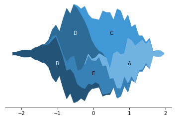
This plot uses the same data as the ridgeline plot above.
Visualization tools
As a combination of two of the most common chart types (line and bar), the area plot is also a fairly common chart option across visualization tools. Where the area chart is present as a chart type, the usual implementation is as a stacked area chart. Overlapping area charts are usually not a built-in option for visualization tools, and will need to be custom-created starting with a line chart base. For some tools, often programmatic, creation of either type of area chart is not a basic chart type option, and some additional work will need to be performed on the data to create an area chart from shaded areas and lines.
The area chart is one of many different chart types that can be used for visualizing data. Learn more from our articles on essential chart types, how to choose a type of data visualization, or by browsing the full collection of articles in the charts category.