How to choose the right data visualization
Posted by: Mike Yi, Mel Restori
Data visualizations are a vital component of a data analysis, as they have the capability of summarizing large amounts of data efficiently in a graphical format. There are many chart types available, each with its own strengths and use cases. One of the trickiest parts of the analysis process is choosing the right way to represent your data using one of these visualizations.
In this article, we will approach the task of choosing a data visualization based on the type of task that you want to perform.
Common roles for data visualization include:
- showing change over time
- showing a part-to-whole composition
- looking at how data is distributed
- comparing values between groups
- observing relationships between variables
-
looking at geographical data
The types of variables you are analyzing and the audience for the visualization can also affect which chart will work best within each role. Certain visualizations can also be used for multiple purposes depending on these factors.
Charts for showing change over time
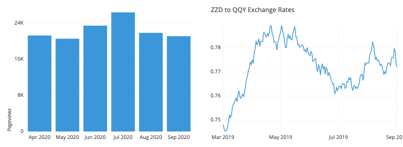
One of the most common applications for visualizing data is to see the change in value for a variable across time. These charts usually have time on the horizontal axis, moving from left to right, with the variable of interest’s values on the vertical axis. There are multiple ways of encoding these values:

- Bar charts encode value by the heights of bars from a baseline.
- Line charts encode value by the vertical positions of points connected by line segments. This is useful when a baseline is not meaningful, or if the number of bars would be overwhelming to plot.
- A box plot can be useful when a distribution of values need to be plotted for each time period; each set of box and whiskers can show where the most common data values lie.
-
There are a number of specialist chart types for the financial domain, like the candlestick chart or Kagi chart.
Charts for showing part-to-whole composition
Sometimes, we need to know not just a total, but the components that comprise that total. While other charts like a standard bar chart can be used to compare the values of the components, the following charts put the part-to-whole decomposition at the forefront:

- The pie chart and cousin donut chart represent the whole with a circle, divided by slices into parts.
- A stacked bar chart modifies a bar chart by dividing each bar into multiple sub-bars, showing a part-to-whole composition within each primary bar.
- Similarly, a stacked area chart modifies the line chart by using shading under the line to divide the total into sub-group values.
-
A host of other more intricate chart types have also been developed to show hierarchical relationships. These include the Marimekko plot and treemap.
Charts for looking at how data is distributed
One important use for visualizations is to show how data points’ values are distributed. This is particularly useful during the exploration process, when trying to build an understanding of the properties of data features.

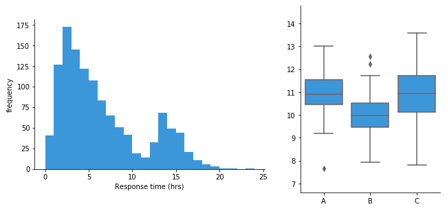
- Bar charts are used when a variable is qualitative and takes a number of discrete values.
- A histogram is used when a variable is quantitative, taking numeric values.
- Alternatively, a density curve can be used in place of a histogram, as a smoothed estimate of the underlying distribution.
- A violin plot compares numeric value distributions between groups by plotting a density curve for each group.
The box plot is another way of comparing distributions between groups, but with a summary of statistics rather than an estimated distributional shape.
Charts for comparing values between groups
Another very common application for a data visualization is to compare values between distinct groups. This is frequently combined with other roles for data visualization, like showing change over time, or looking at how data is distributed.

- A bar chart compares values between groups by assigning a bar to each group.
- A dot plot can be used similarly, except with value indicated by point positions instead of bar lengths. This is like a line chart with the line segments removed, eliminating the ‘connection’ between sequential points. Also like a line chart, a dot plot is useful when including a vertical baseline would not be meaningful.
- A line chart can be used to compare values between groups across time by plotting one line per group.
- A grouped bar chart allows for comparison of data across two different grouping variables by plotting multiple bars at each location, not just one.
- Violin plots and box plots are used to compare data distributions between groups.
- A funnel chart is a specialist chart for showing how quantities move through a process, like tracking how many visitors get from being shown an ad to eventually making a purchase.
- Bullet charts are another specialist chart for comparing a true value to one or more benchmarks.
One sub-category of charts comes from the comparison of values between groups for multiple attributes. Examples of these charts include the parallel coordinates plot (and its special case the slope plot), and the dumbbell plot.
Charts for observing relationships between variables
Another task that shows up in data exploration is understanding the relationship between data features. The chart types below can be used to plot two or more variables against one another to observe trends and patterns between them.

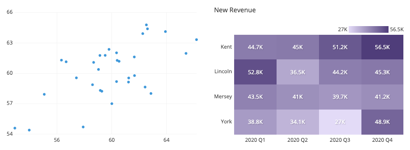
- The scatter plot is the standard way of showing the relationship between two variables.
- Scatter plots can also be expanded to additional variables by adding color, shape, or size to each point as indicators, as in a bubble chart.
- When a third variable represents time, points in a scatter plot can be connected with line segments, generating a connected scatter plot.
- Another alternative for a temporal third-variable is a dual-axis plot, such as plotting a line chart and bar chart with a shared horizontal axis.
- When one or both variables being compared are not numeric, a heatmap can show the relationship between groups. Heatmaps can also be used for purely numeric data, like in a 2-d histogram or 2-d density curve.
Charts for looking at geographical data
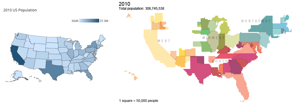
Sometimes, data includes geographical data like latitude and longitude or regions like country or state. While plotting this data might just be extending an existing visualization onto a map background (e.g. plotting points like in a scatter plot on top of a map), there are other chart types that take the mapping domain into account. Two of these are highlighted below:

Right: Cartogram of US Population from census.gov
- A choropleth is like a heatmap that colors in geopolitical regions rather than a strict grid.
- Cartograms take a different approach by using the size of each region to encode value. This approach necessitates some distortion in shapes and topology.
Closing thoughts
Choosing the right chart for the job depends on the kinds of variables that you are looking at and what you want to get out of them. The above is only a general guideline: it is possible that breaking out of the standard modes will help you gain additional insights. Experiment with not just different chart types, but also how the variables are encoded in each chart. It’s also good to keep in mind that you aren’t limited to showing everything in just one plot. Often it is better to keep each individual plot as simple and clear as possible, and instead use multiple plots to make comparisons, show trends, and demonstrate relationships between multiple variables.