A complete guide to funnel charts
Posted by: Mike Yi
What is a funnel chart?
A funnel chart is a specialized chart type that demonstrates the flow of users through a business or sales process. The chart takes its name from its shape, which starts from a broad head and ends in a narrow neck. The number of users at each stage of the process are indicated from the funnel’s width as it narrows.
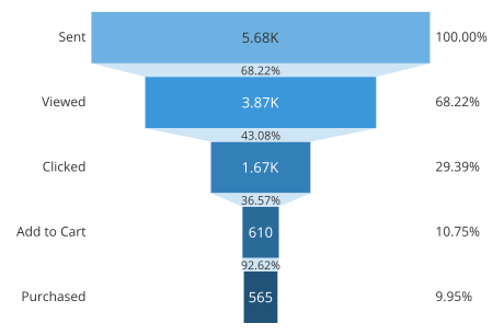
The example funnel chart above depicts responses to a fictional email campaign regarding a special product offer. Each of the five stages of the pipeline are associated with a bar whose length corresponds with the number of users that completed each stage. In addition, listed next to each bar is the proportion of users remaining with respect to the first stage.
From this chart, we can see that the largest absolute gap was between viewing the email and clicking on the promotion link. There was another fair relative dropoff between viewing the linked page, and adding the product to the cart. On the other hand, once the product was in cart, most users then followed through to a purchase.
When you should use a funnel chart
Funnel charts are most often seen in business or sales contexts, where we need to track how a starting set of visitors or users drop out of a process or flow. This chart type shows how the starting whole breaks down into progressive parts.
By visualizing the number of users that make it to each stage of the process, a business can understand where there are significant drop offs and try to make changes to the user experience for the better. Note that there will not be enough detail in a funnel chart to say why an unexpected drop has occurred, so funnels are best used as a high-level visualization before moving into a deeper investigation.
Statistics to highlight in a funnel chart
In a funnel chart, the standard annotation options for each stage usually include showing the raw number of users or the proportion of users compared to the opening stage. Absolute counts are valuable at the start and end of the process to build an understanding of the overall volume of users. The relative proportions can provide quicker insights into how effective each stage of the process is. Where possible, it can be good to show both values so long as it does not clutter up the visualization too much.
For some visualization tools, you may have the option to show other annotations for each stage. One additional statistic worth tracking is the stage-to-stage proportions. Including this annotation between stages allows for concrete knowledge of drop off rates, without needing to resort to outside computation or estimation.
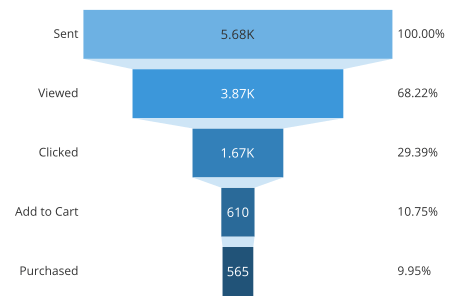
Example of data structure
STAGE | USERS |
|---|---|
| Sent | 5676 |
| Viewed | 3872 |
| Clicked | 1668 |
| Add to Cart | 610 |
| Purchased | 565 |
Data for building a funnel chart are usually summarized as a list of stages and user counts in a table with two columns. While the output of a funnel chart may report users as a proportion of the starting amount, this calculation usually does not need to be done before submitting the data to a visualization application.
Common issues in creating funnel charts
The specialized use case and unique shape of funnel charts carry with them their own issues with respect to visualization best practices. There are many implementations of funnel charts that make them more difficult to understand than needed.
Maintain consistent stage spacing
One possible way of generating a funnel chart is as a straightforward triangle. Stages are marked on the triangle where the widths match the proportion of users that make it to each stage. However, this can distort how large or important each stage is.
With the way that the triangle is separated into regions, it can be tempting to associate stage values to areas instead of to the widths of the region boundaries. While the fact that larger drop offs will correspond with larger areas, the actual area will depend on where that drop off occurs. The tapering of the triangle means that losing a certain number of users early in the process will have a much larger area than those lost late in the process. This makes early losses look more important than later ones, which may not actually be the case.
In the example on the left below, the absolute drop off between the first two stages (Purchased-Prologue) is the same as between the last two (Act 2-Completed). However, the area of the first drop off is much larger due to being higher up on the triangle.
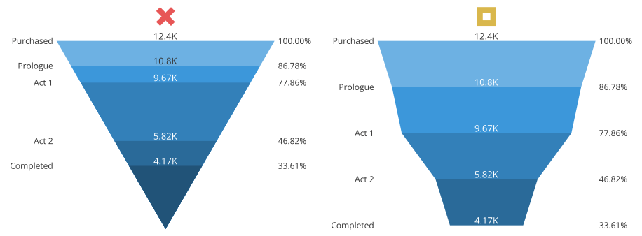
Instead, it is preferred to have stages evenly spaced on the vertical axis. What will vary now are the funnel slopes to connect the stage boundaries.
Match labels to measurement locations
Another common mistake when generating a funnel chart is to add an additional rectangular region to the funnel at the top or bottom, then place the labels in the middle of each region. At first glance, it might seem that areas will accurately match each stage’s value, but this will generally not be true.
The larger the drop off that there is between stages, the more severe the slope will be between region boundaries, and the less area there will be in the corresponding funnel region. The rectangular region will show no drop off, and so be perceived larger than the corresponding stage value should be taken.
In the example below, the second and fifth stages have larger areas than their actual values, while the third and fourth stages have smaller areas than their values.
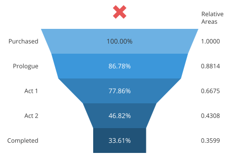
In order to have a funnel plot where areas accurately match up with stage values, we need an alternative strategy for depicting the data.
Use a bar-style funnel chart
The method of constructing a funnel chart above, where stage values are marked on region boundaries with matching widths, is accurate, but not ideal. The fact that there are large, filled-in areas calls for attention from the viewer, yet they cannot be interpreted in terms of the data. It would be much better if we could switch things around, by having area sizes correspond to stage values, separated by thinner area boundaries.
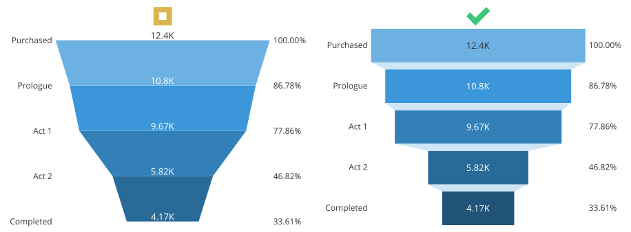
To accomplish this, we can imagine giving the original region boundaries thickness so that they become bars, squashing down the original sloped areas. Since each stage bar has straight edges, this removes the ambiguity of value: area and width are now completely proportional to one another. In order to put the focus on the areas that actually correspond with process stages, we should give the connector regions a lightly-saturated color that does not stand out. When creating a funnel plot, this is the kind of design that you should aim for.
Best practices for using a funnel chart
Include at least three stages
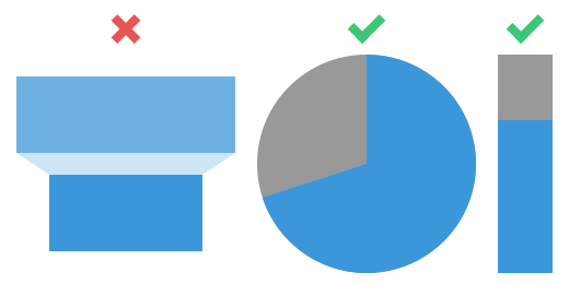
In order to use a funnel chart, you should have at least three stages to plot. When there are only two stages in a process, we only have a single ratio to comprehend. A simpler part-to-whole representation like a pie chart or single stacked bar will work better in this case.
Bar chart
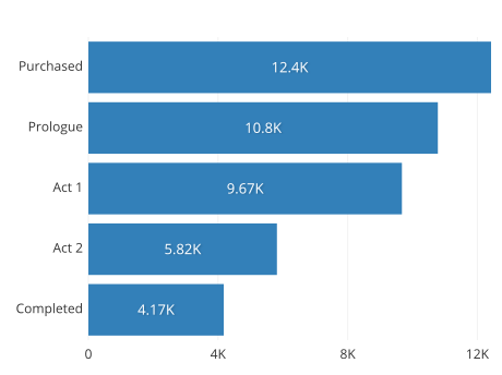
At its core, the funnel chart is really just a fancy-looking bar chart. The funnel chart’s “bars” are aligned to a center line, and connected by additional graphical elements. Meanwhile, a bar chart’s bars are usually aligned to the left or bottom axis (depending on orientation) without additional connecting elements. This common baseline can make it easier to directly compare proportions without needing to look at any annotations.
While the best way to create a funnel chart is to essentially make a center-aligned bar chart, it is often a better idea overall to just use the bar chart instead.
Stacked bar chart
To really sell the part-to-whole breakdown of a funnel process, the most apt chart type is the stacked bar chart. Instead of plotting stage bars in a line like in a standard bar chart, a stacked bar chart overlays all of the bars in the same place. Each region of the stacked bar chart will show the proportion of users that stop at each stage of the process. Make sure that if you use this representation, that it lines up well with how the data will be interpreted.

Note that the order of stages is set such that the process flow can be read from left to right.
One question that might come up is why the uneven spacing of the stacked bar chart is okay here, but it was not okay with the straight triangular form of the funnel. Where the triangular funnel had a different width along its length, a stacked bar has the same width along its length. Because of this, the area corresponding with each user will always be consistent, no matter where in the process they are lost.
Sankey diagram
Other flow diagrams like the Sankey diagram can depict more complicated processes than the funnel chart. While a funnel chart expects a simple, linear process, a Sankey diagram can depict multiple sources of input and output. Like a funnel chart, value is encoded in the width of the chart on each segment of the visualization, but those segments may not be regularly spaced out.
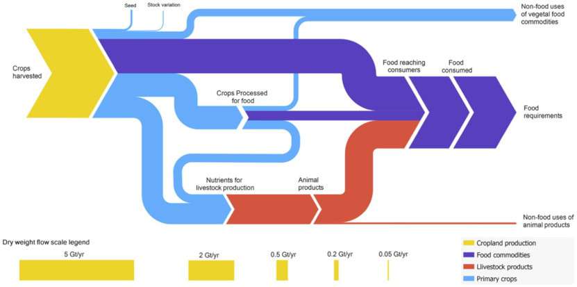
The above Sankey diagram shows how harvested crops are utilized on a global scale. Source: Losses, inefficiencies and waste in the global food system, Agricultural Systems, via sankey-diagrams.com
Visualization tools
Funnel charts are a common option in business intelligence software, where the chart type matches its domain. Due to being a specialized chart type, funnel charts are a much less common built-in option for programmatic libraries. However, it is easy enough to use the more generally recomendable standard bar chart or stacked bar chart. Even when an application or library can create funnel charts, if they aren’t generated using best practices, then it will be better to use an alternative chart type instead.
The funnel chart is one of many different chart types that can be used for visualizing data. Learn more from our articles on essential chart types, how to choose a type of data visualization, or by browsing the full collection of articles in the charts category.