A complete guide to bar charts
Posted by: Mike Yi
One of the most fundamental chart types is the bar chart, and one of your most useful tools when it comes to exploring and understanding your data.
What is a bar chart?
A bar chart (aka bar graph, column chart) plots numeric values for levels of a categorical feature as bars. Levels are plotted on one chart axis, and values are plotted on the other axis. Each categorical value claims one bar, and the length of each bar corresponds to the bar’s value. Bars are plotted on a common baseline to allow for easy comparison of values.
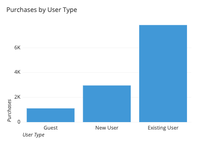
This example bar chart depicts the number of purchases made on a site by different types of users. The categorical feature, user type, is plotted on the horizontal axis, and each bar’s height corresponds to the number of purchases made under each user type. We can see from this chart that while there are about three times as many purchases from new users who create user accounts than those that do not create user accounts (guests), both are dwarfed by the number of purchases made by repeating users.
When you should use a bar chart
A bar chart is used when you want to show a distribution of data points or perform a comparison of metric values across different subgroups of your data. From a bar chart, we can see which groups are highest or most common, and how other groups compare against the others. Since this is a fairly common task, bar charts are a fairly ubiquitous chart type.
The primary variable of a bar chart is its categorical variable. A categorical variable takes discrete values, which can be thought of as labels. Examples include state or country, industry type, website access method (desktop, mobile), and visitor type (free, basic, premium). Some categorical variables have ordered values, like dividing objects by size (small, medium, large). In addition, some non-categorical variables can be converted into groups, like aggregating temporal data based on date (eg. dividing by quarter into 20XX-Q1, 20XX-Q2, 20XX-Q3, 20XX-Q4, etc.) The important point for this primary variable is that the groups are distinct.
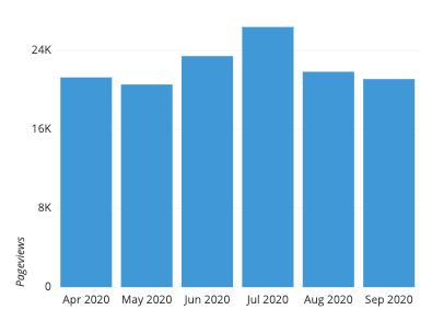
In contrast, the secondary variable will be numeric in nature. The secondary variable’s values determine the length of each bar. These values can come from a great variety of sources. In its simplest form, the values may be a simple frequency count or proportion for how much of the data is divided into each category – not an actual data feature at all. For example, the following plot counts pageviews over a period of six months. You can see from this visualization that there was a small peak in June and July before returning to the previous baseline.
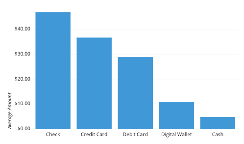
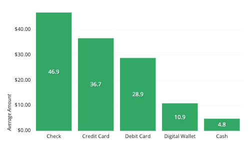
Other times, the values may be an average, total, or some other summary measure computed separately for each group. In the following example, the height of each bar depicts the average transaction size by method of payment. Note that while the average payments are highest with checks, it would take a different plot to show how often customers actually use them.
Example of data structure
PAYMENT TYPE | AVERAGE TRANSACTION | |
|---|---|---|
| Check | 46.861 |
|
| Credit Card | 36.681 |
|
| Debit Card | 28.860 |
|
| Digital Wallet | 18.900 |
|
| Cash | 4.802 |
|
Data rendered as a bar chart might come in a compact form like the above table, with one column for the categories and the second column for their values. Other times, data may come in its unaggregated form like the below table snippet, with the visualization tool automatically performing the aggregation at the time of visualization creation.

For a count-based bar chart, just the first column is needed. For a summary-based bar chart, group by the first column, then compute the summary measure on the second.
Best practices for using bar charts
Use a common zero-valued baseline
First and foremost, make sure that all of your bars are being plotted against a zero-value baseline. Not only does that baseline make it easier for readers to compare bar lengths, it also maintains the truthfulness of your data visualization. A bar chart with a non-zero baseline or some other gap in the axis scale can easily misrepresent the comparison between groups since the ratio in bar lengths will not match the ratio in actual bar values.
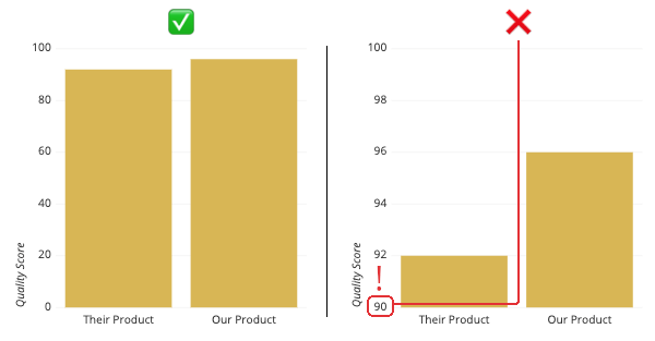
By cutting 90 points out of the vertical axis, a small 4-point difference can be exaggerated to look like a 1:3 ratio.
Maintain rectangular forms for your bars
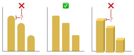
Another major no-no is to mess with the shape of the bars to be plotted. Some tools will allow for the rounding of the bar caps, rather than just have straight edges. This rounding means that it’s difficult for the reader to tell where to read the actual value: from the top of the semicircle, or somewhere in the middle? A little bit of rounding of the corners can be okay, but make sure each bar is flat enough to discern its true value and provide an easy comparison between bars.
Similarly, you should avoid including 3-d effects on your bars. As with heavy rounding, this can make it harder to know how to measure bar lengths, and as a bonus, might cause baselines to not be aligned (see the above point).
Consider the ordering of category levels
One consideration you should have when putting together a bar chart is what order in which you will plot the bars. A standard convention to take is to sort the bars from longest to shortest: while it is always possible to compare the bar lengths no matter the order, this can reduce the burden on the reader to make those comparisons themselves. The major exception to this is if the category labels are inherently ordered in some way. In cases like that, the inherent ordering usually takes precedence.
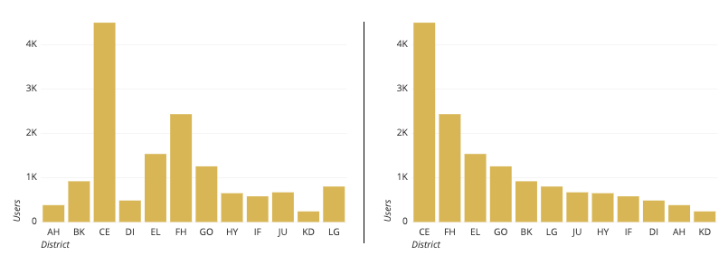
The district codes aren’t inherently ordered, so a better representation is to sort by value.
Use color wisely
Another consideration is on how you should use color in your bar charts. Certain tools will color each bar differently by default, but this can distract the reader by implying additional meaning where none exists. Instead, color should be used with purpose. For example, you might use color to highlight specific columns for storytelling. Colors can also be used if they are meaningful for the categories posted (e.g. to match company or team colors).
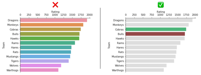
The rainbow colors on the left don’t add anything meaningful to interpretation of the plot. On the right side, most bars are a neutral gray to highlight the comparison of the two colored bars.
Common misuses
Replacing bars with images
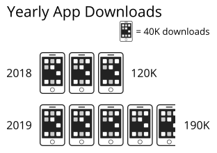
It may be tempting to replace bars with pictures that depict what is being measured (e.g. bags of money for money amounts), be careful that you do not misrepresent your data in this way. If your choice of symbol scales both width and height with value, differences will look much larger than they actually are, since people will end up comparing the areas of the bars rather than just their widths or heights. In the example below, there is a 58% growth in downloads from 2018 to 2019. However, this growth is exaggerated with the icon-based representation, since the surface area of the 2019 icon is more than 2.5 times the size of the 2018 icon.

If you feel the need to use icons to depict value, then a better – though still not great – option is to use the pictogram chart type instead. In a pictogram chart, each category’s value is indicated by a series of icons, with each icon representing a certain quantity. In a certain sense, this is like changing the texture of its corresponding bar to a repeating image. One major caution with this chart type is that it can make values harder to read, since the reader needs to perform some mental mathematics to gauge the relative values of each category.
Common bar chart options
Horizontal bars vs. vertical bars
A common bar chart variation is whether or not the bar chart should be oriented vertically (with categories on the horizontal axis) or horizontally (with categories on the vertical axis). While the vertical bar chart is usually the default, it’s a good idea to use a horizontal bar chart when you are faced with long category labels. In a vertical chart, these labels might overlap, and would need to be rotated or shifted to remain legible; the horizontal orientation avoids this issue.
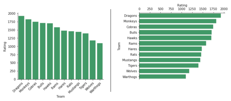
If the bars from a previous example were vertically oriented, the Team tick labels would need to be rotated in order to be readable.
Include value annotations
A common addition to bar charts are value annotations. While it is fairly easy for readers to compare bar lengths and gauge approximate values from a bar chart, exact values aren’t necessarily easy to state. Annotations can report these values where they are important, and are usually placed in the middle of the bar or at their ends.
Include variability whiskers
When the numeric values are a summary measure, a frequent consideration is whether or not to include error bars in the plot. Error bars are additional whiskers added to the end of each bar to indicate variability in the individual data points that contributed to the summary measure. Since there are many choices for uncertainty measure (e.g. standard deviation, confidence interval, interquartile range) it is important that when you display error bars, that you note in an annotation or comment what the error bars represent.
Alternatively, you may wish to depict variance within each category with a different chart type such as the box plot or violin plot. While these plots will have more elements for a reader to parse, they provide a deeper understanding of the distribution of values within each group.
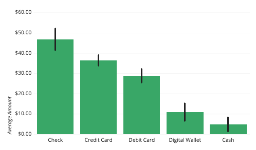
Error bars indicate the standard deviation for transaction amounts for each payment type. The variability is lower for credit and debit cards compared to the others.
Lollipop chart
One variation of the bar chart is the lollipop chart. It presents exactly the same information as a bar chart, but with different aesthetics. Instead of bars, we have lines topped by dots at their endpoints. A lollipop chart is most useful when there are a lot of categories and their values are fairly close together. By changing the aesthetic form of the plotted values, it can make the chart much easier to read.

Related plots
Pie chart
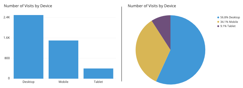
If the values in a bar chart represent parts of a whole (the sum of bar lengths totals the number of data points or 100%), then an alternative chart type you could use is the pie chart. While the pie chart is much-maligned, it still fills a niche when there are few categories to plot, and the parts-to-whole division needs to be put front and center. Still, in general you are most likely to use a bar chart in general usage, as it’s easier to make comparisons between categories.
Histogram
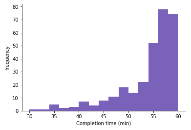
Histograms are a close cousin to bar charts that depict frequency values. While a bar chart’s primary variable is categorical in nature, a histogram’s primary variable is continuous and numeric. The bars in a histogram are typically placed right next to each other to emphasize this continuous nature: bar charts usually have some space between bars to emphasize the categorical nature of the primary variable.
Line chart
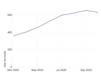
For bar charts that depict summary statistics, the line chart is the closest relative. Like the relationship from the bar chart to a histogram, a line chart’s primary variable is typically continuous and numeric, emphasized by the continuous line between points. Shading the region between the line and a zero baseline generates an area chart, which can be thought of as a combination of the bar chart and line chart.
Dot plot
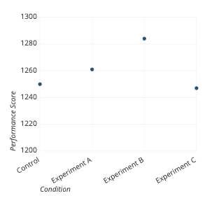
Alternatively, when we have summary statistics over a categorical primary variable, we might choose a dot plot, or Cleveland dot plot, instead of a bar chart. A dot plot is essentially a line plot without line segments connecting each point. This frees it up to be used with categorical levels, rather than a continuous progression. The biggest advantage a dot plot has over a bar chart is that values are indicated by position rather than length, so we don’t necessarily need a zero-baseline. When the necessary baseline on a bar chart interferes with perception of changes or differences between bars, then a line chart or dot plot can be a good alternative choice.
Stacked bar chart and grouped bar chart
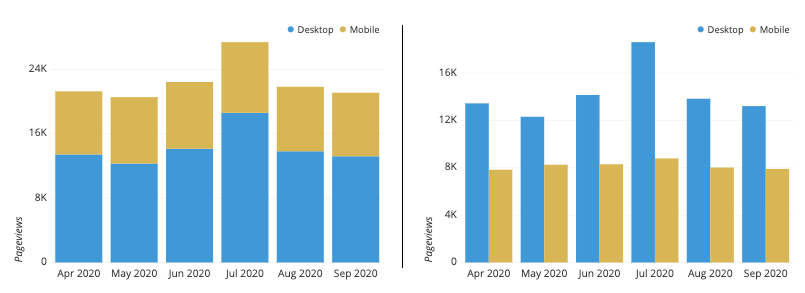
Bar charts can be extended when we introduce a second categorical variable to divide each of the groups in the original categorical variable. If the bar values depict group frequencies, the second categorical variable can divide each bar’s count into subgroups. Applied to the original bars, this results in a stacked bar chart, seen on the left in the figure below. Alternatively, if we move the different subgroups’ bars to the baseline, the resulting chart type is the grouped bar chart, seen on the right. We also use the grouped bar chart when we compute statistical summary measures across levels of two categorical variables.
Visualization tools
Most tools that can create visualizations, whether they be spreadsheets, programming libraries, or business intelligence tools, should be capable of creating basic vertical bar charts. Sometimes, options need to be checked or modified in order to follow best practices. However, for basic data exploration needs, any tool should be sufficient. Other variations like horizontal bars, error bars, and annotations may not always be possible. In particular, the lollipop chart variation is not normally considered a default chart type, and will usually require specialized tweaking with programmatic tools instead.
The bar chart is one of many different chart types that can be used for visualizing data. Learn more from our articles on essential chart types, how to choose a type of data visualization, or by browsing the full collection of articles in the charts category.