A Complete Guide to Line Charts
Posted by: Mike Yi
What is a line chart?
A line chart (aka line plot, line graph) uses points connected by line segments from left to right to demonstrate changes in value. The horizontal axis depicts a continuous progression, often that of time, while the vertical axis reports values for a metric of interest across that progression.
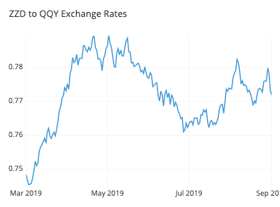
The line chart above shows the exchange rate between two fictional currencies over a six month period. As time progresses from left to right, points connect the daily exchange rates. We can read from the general slope of the line and its vertical positions that the rate improved from about 0.75 to 0.78 between March and early April, then fell gradually to about 0.765 in late May and June.
When you should use a line chart
You will use a line chart when you want to emphasize changes in values for one variable (plotted on the vertical axis) for continuous values of a second variable (plotted on the horizontal). This emphasis on patterns of change is sold by line segments moving consistently from left to right and observing the slopes of the lines moving up or down.
On the horizontal axis, you need a variable that depicts continuous values that have a regular interval of measurement. Very commonly, this variable is a temporal one, generating an observation every minute, hour, day, week, or month. The choice of interval size, or bin, is a decision that the analyst will usually need to make for the data, rather than it being an inherent data characteristic.
On the vertical axis, you will report the value of a second numeric variable for points that fall in each of the intervals defined by the horizontal-axis variable. Often, this will be a statistical summary like a total or average value across events within each bin.
Multiple lines can also be plotted in a single line chart to compare the trend between series. A common use case for this is to observe the breakdown of the data across different subgroups. The ability to plot multiple lines also provides the line chart a special use case where it might not usually be selected. Normally, we would use a histogram to depict the frequency distribution of a single numeric variable. However, since it’s tricky to plot two histograms on the same set of axes, the line chart serves as a good mode of comparison as a substitute. Line charts used to depict frequency distributions are often called frequency polygons.
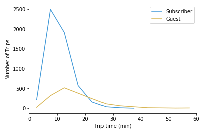
This line chart shows there are many more subscriber trips than guests, but guests tend to take longer trips on average.
Example of data structure
DATE | GUEST | SUBSCRIBERS |
|---|---|---|
| 2019-05-01 | 19 | 103 |
| 2019-05-02 | 22 | 105 |
| 2019-05-03 | 20 | 98 |
| 2019-05-04 | 26 | 83 |
| … | … | … |
To use a line chart, data often needs to be aggregated into a table with two or more columns. Values in the first column indicate positions for points on the horizontal axis for each line to be plotted. Each following column indicates the vertical position for points of a single line.
Certain tools create line charts from a different data format where three columns are expected regardless of how many lines to plot. In these cases, the columns specify the horizontal values, vertical values, and to which line to each row will be assigned.
DATE | USER TYPE | TRIPS |
|---|---|---|
| 2019-03-01 | Guest | 23 |
| 2019-03-01 | Subscriber | 102 |
| 2019-03-02 | Guest | 24 |
| 2019-03-03 | Subscriber | 77 |
| … | … | … |
Best practices for using a line chart
Choose an appropriate measurement interval
An important aspect of creating a line chart is selecting the right interval or bin size. For temporal data, a too-broad of a measurement interval may mean that it takes too long to see where the data trend is leading, hiding away the useful signal. On the flip side of the coin, a too-short a measurement interval may only reveal noise rather than signal.
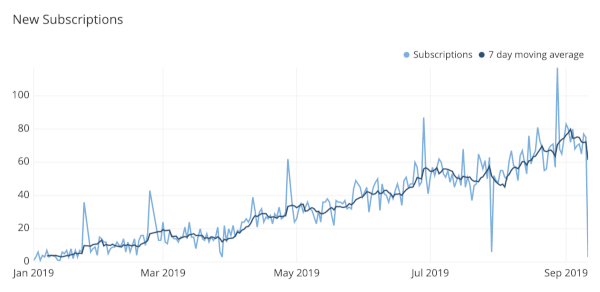
Testing out different intervals or relying on your domain knowledge about what data is being recorded can inform you of a good choice of bin size. It can also be possible to use multiple lines, with one line for a fine-grained interval, and then a second line for the overall trend, averaging over a rolling window.
Don’t plot too many lines
With great power comes great responsibility, so while there is the technical capacity to put many lines onto a single line chart, it is a good idea to be judicious in the amount of data that you plot. A good rule of thumb is to limit yourself to five or fewer lines, lest the plot end up looking like an unreadable tangle. However, if the lines are well-separated, you can still plot all of the values you wish to track.
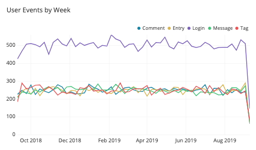
If you find the need to plot more lines than can be read in a single axis, then you might consider faceting the plots into a grid of smaller line charts. It will be more difficult to see details in these plots, so it’s a good idea to sort them by some important characteristic (like average or final value) to help draw out important points. If you are using a tool that allows for interactive plots, another alternative is to be able to highlight individual lines or grey out lines to be out of focus as the reader desires.
Common misuses
Strictly using a zero-value baseline
Despite the zero baseline for the vertical axis being a requirement for bar charts and histograms, you do not need to include a zero baseline for a line chart. Recall that the main goal of a line chart is to emphasize changes in value, rather than the magnitude of the values themselves. In cases where a zero line is not meaningful or useful, it’s fine to zoom the vertical axis range into what will make the changes in value most informative.
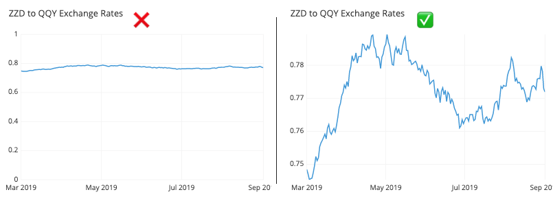
There is one use case where a zero baseline is still necessary, however. When a line chart being used to display frequency distributions, then it is being used in a capacity equivalent to bar charts and histograms. Thus, it will follow the same requirement of needing to include a zero-value baseline as an anchor for the line chart’s heights.
Failing to identify uneven gaps between points
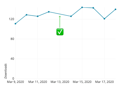
When the line chart is missing information for certain bins, gaps in the record may be interpreted as phantom values if the line does not include distinct dots at each observation. When there aren’t many points to plot, try showing all of the points and not just the line. If including the points would muddy up the interpretability of the plot, another alternative is to include a gap in the line to show where there are missing values.
Interpolating a curve between points
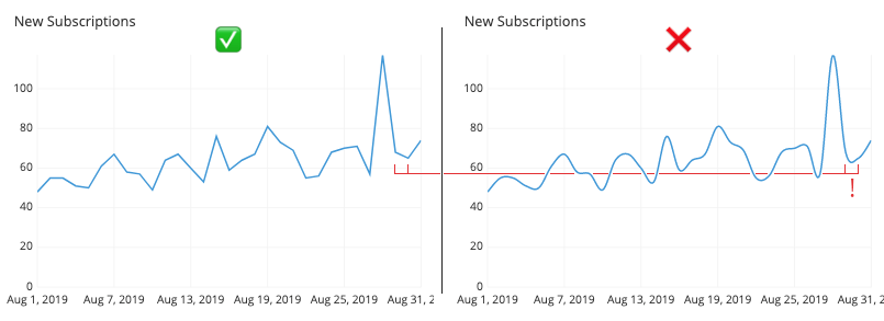
In a standard line chart, each point is connected to the next with a straight line segment, from first to last. However, there may be the aesthetic temptation to try and link all of the points smoothly, fitting a curve that goes through all of the points at once. You should absolutely resist this temptation! As seen in the example below, attempting this kind of fitting will be assured of distorting perception of trends in the data. The direction and steepness of the line is supposed to be indicative of change in value, and so the curve may end up implying the presence of additional data points between the actual measurements that do not exist.
Using a misleading dual axis
Examples of line charts with multiple lines have thus far had each line be part of the same domain, and thus plottable on the same axis. There’s nothing that limits each line to depict values on the same units, however. When a line plot includes two series, each depicting a summary of a different variable, then we end up with a dual axis plot.
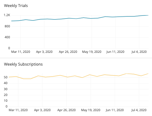
The problem with a dual-axis plot is that it can easily be manipulated to be misleading. Depending on how each axis is scaled, the perceived relationship between the two lines can be changed. In the two plots below, the number of weekly trials and subscriptions are plotted in dual-axis plots. The data is exactly the same for each, but due to the choice of vertical scaling for each variable, the inferred relationship between the variables will change.
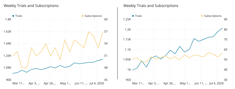
While many visualization tools are capable of creating dual-axis charts, common recommendations suggest against this, regardless of if the two axes are in the same or separate domains. Instead, faceting the two lines into separate plots still allows for the general patterns of change to be observed for both variables, while reducing the temptations to compare them in misleading ways.
Common line chart options
Include additional lines to show uncertainty
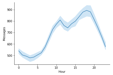
When we have a line that depicts a statistical summary like an average or median, we can also have an option to add to the plot to display uncertainty or variability in the data at each plotted point. One way of doing this is through the addition of error bars at each point to show standard deviation or some other uncertainty measure. Another alternative is to add supporting lines above or below the line to show certain bounds on the data. These lines might be rendered as shading to show the most common data values, as in the example below.
Sparkline
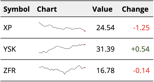
A special use case for the line chart is the sparkline. A sparkline is essentially a small line chart, built to be put in line with text or alongside many values in a table. Because of its small size, it will not include any labeling. Statistics can be placed next to the sparkline to indicate starting and ending values, or perhaps minimum or maximum values. The main point of a sparkline is to show change over a period of time, and is often seen in financial contexts.
Ridgeline plot
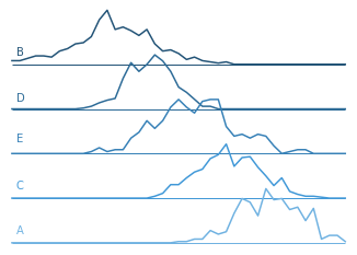
One variant chart type for a line chart with multiple lines is the ridgeline plot. In a ridgeline plot, each line is plotted on a different axis, slightly offset from each other vertically. This slight offset can save on space compared to a complete faceting of plots. Like the sparkline, vertical axis markings are typically eschewed: it would be difficult to read those values on the different axes. Ridgeline plots are mainly used to compare lots of groups on their frequency distributions. This is most useful when a clear pattern is visible when the lines are ordered in some way.
Related plots
Bar chart
If the variable we want to show on the horizontal axis is not numeric or ordered, but instead categorical, then we need to use a bar chart instead of a line chart. The bars in a bar chart are usually separated by small gaps, which help to emphasize the discrete nature of the categories plotted. Note, however, when our horizontal axis is numeric or ordered, we aren’t restricted against using a bar chart, as seen in the example below.
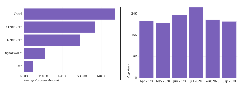
Left: Bar chart over categorical groups. Right: Bar chart over temporal groups.
Dot plot
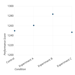
Another chart type we can use when the horizontal axis variable is categorical is the dot plot, or Cleveland dot plot. The dot plot is like a line plot, except that there are no line segments connecting consecutive points. This lack of line segments frees the points from their sequential progression, and so the order of labels and points can be freely adjusted like a bar chart. The major advantage of using a dot plot over a bar chart is that a dot plot, like a line chart, is not beholden to include a zero-baseline. If we have values over levels of a categorical variable, but associated values do not have a meaningful zero-baseline, then the dot plot can be a good chart type option.
Histogram
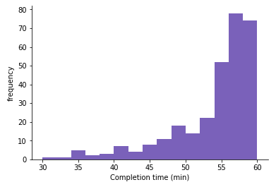
When the vertical axis of a line chart depicts information about a frequency distribution, we have an option to visualize the data as a histogram instead. One of the main benefits of the histogram is that the bars are a more consistent display of frequency within each bin. Frequency judgments can be misleading in a line chart, especially in the peaks and troughs of a distribution. However, a line chart does have one advantage for visualizing frequency distributions: if we need to compare two different groups, this is very difficult for a histogram. As seen in an earlier section when using a line chart, we can just plot the two groups’ lines on the same axes with little issue.
Density curve
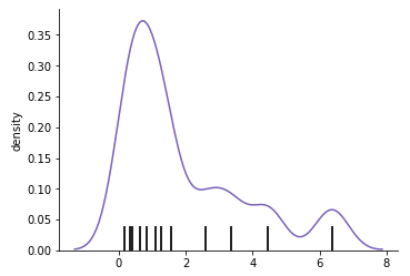
Another alternative for frequency-based line charts is the density curve, or kernel density estimate (KDE). While a line chart aggregates frequency counts by bins into single points, the KDE aggregates the contribution of each point in a continuous way. In a KDE, each point contributes a small lump of volume centered around its true value (the titular kernel); the sum of all volumes gives the final density curve. Since there are so many options for the shape of the kernel, kernel density estimation is usually reserved for programmatic approaches to data visualization.
Area chart
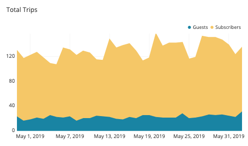
An extension to the line chart involves the addition of shading between the line and a zero-baseline, called an area chart. The area chart can be considered a hybrid of the line chart with the bar chart, since values can be read from not just their vertical positions, but also the size of the shaded area between each point and the baseline.
Connected scatter plot
If you have two series of values that you want to plot using a line chart, an alternative chart type you could use is the connected scatter plot. In a standard scatter plot, the two axes represent two variables of interest, and points plotted on the axes indicate values on those variables. If we connected points in an order specified by a third variable like time, we get a connected scatter plot. A connected scatter plot is good for looking at not just the relationship between two variables, but also how they change across time or values of a third variable.
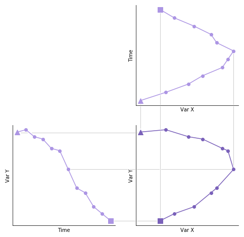
The connected scatter plot (lower right) is a combination of two line charts (upper right, lower left). Note the swapped axes for the upper right chart.
Visualization tools
The line chart is a versatile and useful chart type, and so should be available in pretty much any data visualization tool you choose. Basic line charts where one or more lines are plotted on a single axis should be common, but advanced options like dual axes may not be present or require additional data work to set up. The ridgeline variant is not a common built-in, and usually requires custom programming or a custom package to create. Sparklines too are not common on their own, and are more often seen as built in as part of other reporting tools.
The line chart is one of many different chart types that can be used for visualizing data. Learn more from our articles on essential chart types, how to choose a type of data visualization, or by browsing the full collection of articles in the charts category.