A complete guide to bubble charts
Posted by: Mike Yi
What is a bubble chart?
A bubble chart (aka bubble plot) is an extension of the scatter plot used to look at relationships between three numeric variables. Each dot in a bubble chart corresponds with a single data point, and the variables’ values for each point are indicated by horizontal position, vertical position, and dot size.
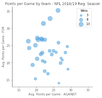
The example bubble chart above depicts the points scored per game by teams in the regular season of the National Football League in 2018. Each bubble represents a single team’s performance. A bubble’s horizontal position notes the average points scored against that team each game, and the vertical position notes the average points scored by that team each game. Each bubble’s size indicates the number of wins earned by each team, with larger bubbles corresponding to higher win rates. (Ties are worth half a win.)
From the plot, we can see that there is a lot more variance in points scored by teams than by their opponents, but there’s no particularly strong correlation between the two. Instead, the main takeaway from the plot comes from the third variable: as teams score more points and allow fewer points from their opponents (towards the upper left), they will earn more victories, as one might naturally expect.
The name “bubble chart” is sometimes used to refer to a different chart type, the packed circle chart. This is a completely different chart type that will be discussed briefly towards the end of the article.
When you should use a bubble chart
Like the scatter plot, a bubble chart is primarily used to depict and show relationships between numeric variables. However, the addition of marker size as a dimension allows for the comparison between three variables rather than just two. In a single bubble chart, we can make three different pairwise comparisons (X vs. Y, Y vs. Z, X vs. Z), as well as an overall three-way comparison. It would require multiple two-variable scatter plots in order to gain the same number of insights; even then, inferring a three-way relationship between data points will not be as direct as in a bubble chart.
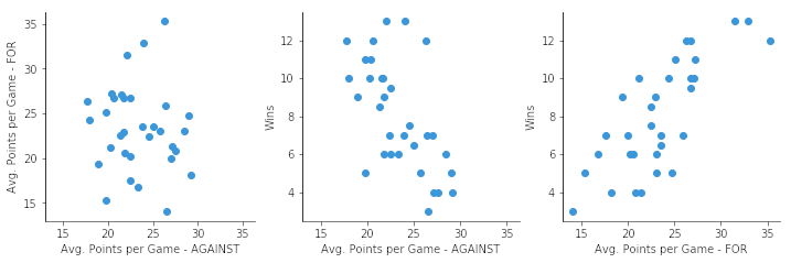
The three scatter plots above show the same data as the original example bubble chart. While it is easier to get the specific win counts for each team from this series of plots, the relationship between all three variables is not as clearly stated as in the bubble chart.
Example of data structure
AVG_POINTS_AGAINST | AVG_POINTS_FOR | WINS |
|---|---|---|
| 26.56 | 14.06 | 3 |
| 26.44 | 25.88 | 7 |
| 17.94 | 24.31 | 10 |
| 23.38 | 16.81 | 6 |
| ... | ... | ... |
A bubble chart is created from a data table with three columns. Two columns will correspond with the horizontal and vertical positions of each point, while the third will indicate each point’s size. One point will be plotted for each row in the table.
Best practices for using a bubble chart
Scale bubble area by value
One easy mistake that can be made is to scale the points’ diameters or radii to the third variable’s values. When this kind of scaling is performed, a point with twice the value of another point will end up with four times the area, making its value look much larger than is actually warranted.
Instead, make sure that the bubbles’ areas correspond with the third variable’s values. In the same scenario as above, a point with twice the value of another point should have sqrt(2) = 1.41 times the diameter or radius so that its area is twice the smaller point’s.
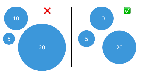
Depending on how you are creating your bubble chart, you may need to scale your data to account for how data values are mapped to point sizes. Many visualization tools will automatically match value to area, but be careful of those cases where value is matched to diameter or radius instead.
Limit number of points to plot
Bubble charts are commonly drawn with transparency on points since overlaps are a much easier occurrence than when all points are a small size. This overlapping also means that there are limitations to the number of data points that can be plotted while keeping a plot readable.

Without transparency, the smaller data point would not have been visible against the larger ones.
There aren’t any hard guidelines for whether a dataset is appropriate for a bubble chart or not, but it’s a point to be aware of when creating a bubble chart. If there appears to be too much overplotting, then it might be worth thinking about a way to summarize the data or choose a different chart type to represent your data. Reducing bubble size can help provide some physical separation between points, but doing so will also make it more difficult to read values from bubble sizes.
Include a legend
As another tip, it’s recommended to include a legend or other key on your plot to show how different bubble sizes correspond with values of your third variable. It is fairly easy to evaluate and compare values based on horizontal or vertical lengths and positions, thanks to the tick marks on the axes. A key for bubble sizes serves the same purpose as those tick marks for the third variable.
If you are using a visualization application with interactive capabilities, it can be a good idea to turn on the feature so that values are visible when individual points are selected or hovered over. For print, it is a good idea to label key points to improve a bubble chart’s communication abilities.
Present a clear trend
If you are thinking about using a bubble chart to present information to other people, make sure that it is able to present a clear trend with its use of point size as an indicator of value. When developing your chart, experiment with the order in which variables are plotted. The two most important variables or the most important relationship should end up on the vertical and horizontal axes. Avoid using a bubble chart if the third variable does not contribute significantly to the story told by the chart, and use additional, simpler plots instead.
Incorporating negative values
If a variable takes negative values, then it cannot be directly assigned to point size as an encoding: after all, how can a shape have a negative area? Additional information needs to be encoded into shape size in order to indicate negative values. For example, you might have filled circles indicate positive values and unfilled circles indicate negative values. As another alternative, you might have positive points in one color, and negative points in a distinct, different color.

Of course, it’s a good idea to check that such encodings make sense in the first place: the variable might be better off assigned to one of the positional axes instead! Try to avoid encoding negative values with bubbles unless it truly adds value to the plot.
Other charts related to bubble charts
Scatter plot
The bubble chart is, of course, built upon the scatter plot as a base, just with the addition of a third variable through point size. It’s worth mentioning, however, that third variables can be added to scatter plots through other point encodings. Most common among these is color. When we have a categorical third variable (taking discrete values that may or may not be ordered), we can assign a distinct hue to each category of points. It is actually possible to use hue as a fourth variable in conjunction with point size, but this should be used carefully since it can result in information overload – the earlier cautions regarding presenting a clear trend are magnified greatly with a fourth variable.
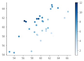
Color can also be used as an encoding for numeric variables. If we have a color palette where colors have a continuous relationship (e.g. light to dark), we can use color to indicate value for a third variable, rather than size. Note that perception of value based on color has similar limitations as using size, so a legend is just as necessary when using color as it is for point size.
Bubble map
If the two positional variables represent geographical coordinates (i.e. latitude and longitude), we can overlay bubbles over a map in the background and get a bubble map. A bubble map is an interesting extension of the scatter map that can help with the latter’s potential issues with overplotting. If a scatter map would have so many points in a region that their number would not be easily visible, we might swap them out with a single bubble that reports the total number of points within the region.
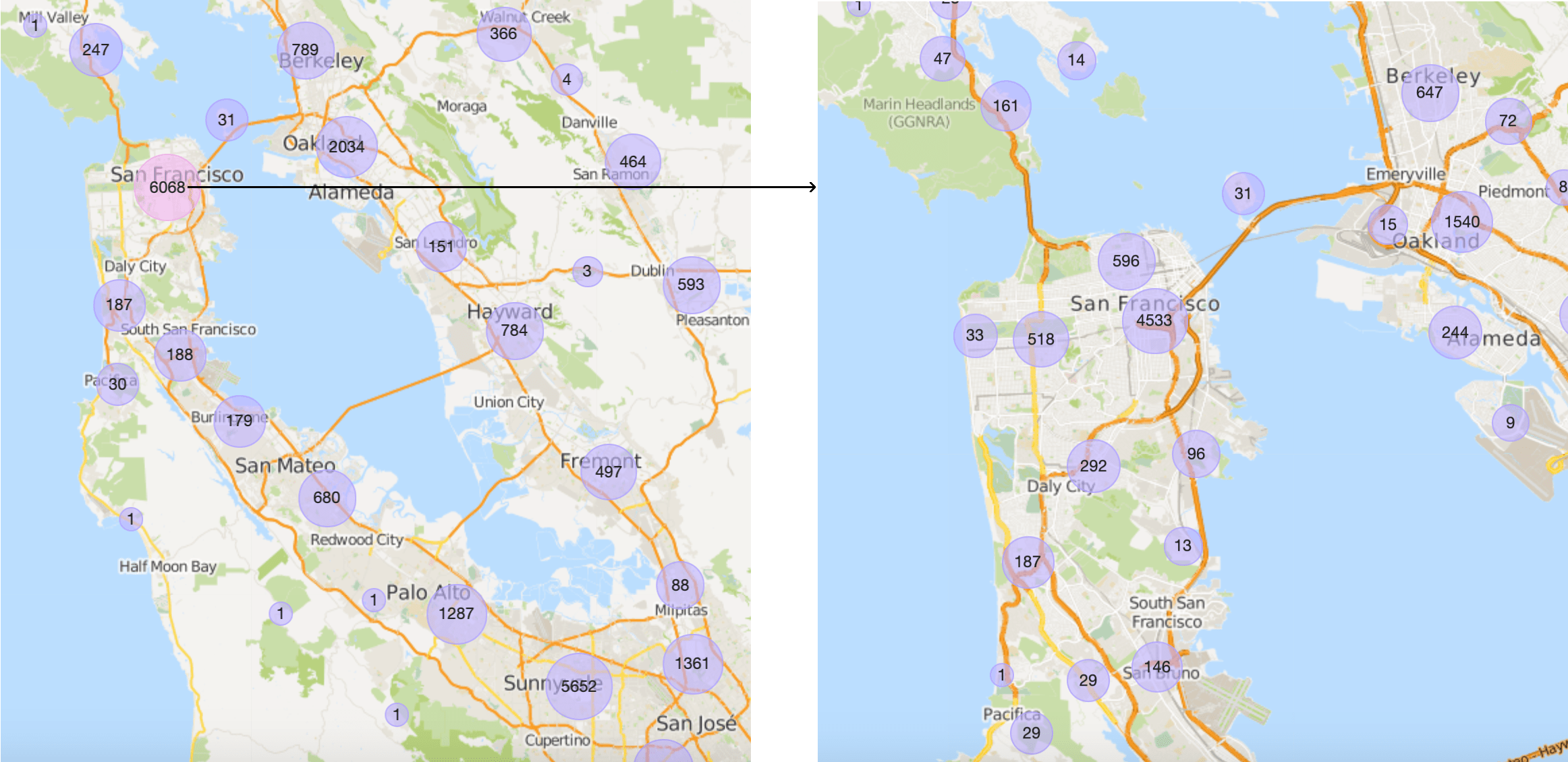
While this example from Craigslist’s rental search doesn’t have the standard bubble scaling, it still demonstrates how bubbles can help summarize potentially densely-packed points.
Packed circle chart
Packed circle charts (aka circular packing, bubble cloud) are a chart type that can look like a bubble chart on its surface. While bubbles in a packed circle chart indicate numeric values or frequencies like before, this is the only variable present: the bubbles are clustered together in a dense arrangement without any real positional axes.
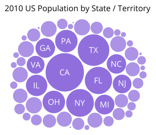
In a way, you can think of a packed circle chart as a bar chart made of discs. However, this exposes the packed circle chart’s weaknesses: like the bubble chart, it is difficult to get exact values or a ranking from the unordered bubble sizes. You’ll usually be better off sticking with a bar chart, lollipop chart, or dot plot to convey information due to their use of position to encode value. The one advantage that packed circles have is that, if there are lots of groups to plot, the circular packing can be much more compact than showing each category in a long line. However, you could also lump smaller values into an “other” group to reduce space in a more conventional chart.
Most often, circular packing tends to appear in a hierarchical context, where smaller circles are placed inside larger circles to show how a whole is divided into parts at multiple levels of division. Even here, the circular form for proportions is somewhat inefficient compared to other chart types like the treemap, so the circular packing chart’s advantage is firmly in aesthetics rather than practicality.
Visualization tools
Depending on the visualization method, bubble charts are sometimes considered their own chart type, but at other times are created through an overarching scatter plot option. Be careful about how certain tools interpret values to be encoded by point size: if they interpret values as dot radii or diameters, you will need to perform transformations in order to make sure point sizes are representative of true values.
The bubble chart is one of many different chart types that can be used for visualizing data. Learn more from our articles on essential chart types, how to choose a type of data visualization, or by browsing the full collection of articles in the charts category.