A complete guide to violin plots
Posted by: Mike Yi
What is a violin plot?
A violin plot depicts distributions of numeric data for one or more groups using density curves. The width of each curve corresponds with the approximate frequency of data points in each region. Densities are frequently accompanied by an overlaid chart type, such as box plot, to provide additional information.
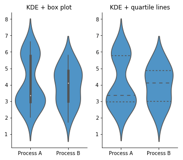
The example violin plot above depicts the results of a fictional experiment with one control group and two experimental conditions. In the middle of each density curve is a small box plot, with the rectangle showing the ends of the first and third quartiles and central dot the median. We can see from the plot that the two experimental techniques provided different benefits compared to the control. However, the second experimental condition (B) has a much more elongated distribution compared to the other two groups, without a distinct peak. The latter fact would have been missed with the box plot alone.
When you should use a violin plot
Violin plots are used when you want to observe the distribution of numeric data, and are especially useful when you want to make a comparison of distributions between multiple groups. The peaks, valleys, and tails of each group’s density curve can be compared to see where groups are similar or different. Additional elements, like box plot quartiles, are often added to a violin plot to provide additional ways of comparing groups, and will be discussed below.
A brief explanation of density curves
The density curve, aka kernel density plot or kernel density estimate (KDE), is a less-frequently encountered depiction of data distribution, compared to the more common histogram. Below, we’ll perform a brief explanation of how density curves are built.
In a KDE, each data point contributes a small area around its true value. The shape of this area is called the kernel function. Kernels can take different shapes from smooth bell curves to sharp triangular peaks. In addition, kernels can have different width, or bandwidth, affecting the influence of each individual data point. Bandwidth size is usually determined by using mathematical rules of thumb, but can be tweaked depending on the shape and skew of the data to be plotted.
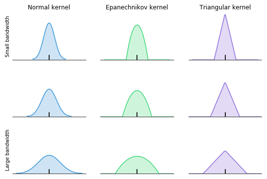
To build the final density curve, the areas for all data points are stacked up into a complete whole. Each data point has an equivalent influence on the final distribution. As there are more data points in a region, the height of the density curve in that area will increase.

Kernel density estimation is best used when a fair amount of data is available, resulting in more stable density estimates. With few data points available, it can be easy to be misled by the smoothness of the curve or the length of the tails past the largest and smallest points.
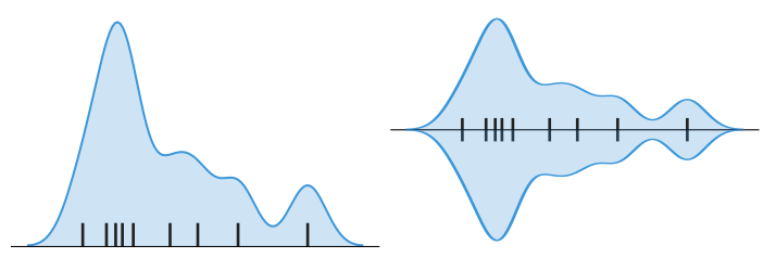
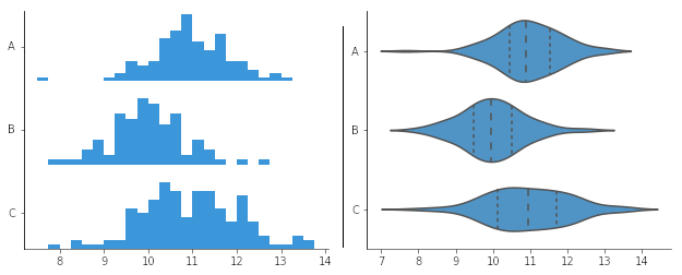
In a violin plot, individual density curves are built around center lines, rather than stacked on baselines. Other than this difference in display pattern, curves in a violin plot follow the exact same construction and interpretation.
Example of data structure
CONDITION | SCORE |
|---|---|
| Control | 30 |
| Exp. A | 33 |
| Exp. B | 25 |
| Exp. A | 36 |
| … | … |
The most common way to structure data for creating a violin plot is through a table with two columns. Each row corresponds with a single data point, while cell values indicate group membership and numeric value for each point. All of the plot features will be automatically calculated from this raw input. If all of the data is in a single group, then the column indicating group membership will not be necessary.
Best practices for using a violin plot
Consider the order of groups
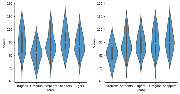
When the groups in a violin plot do not have an inherent ordering, it is possible to change the order in which the groups are plotted to make it easier to gain insights from the data. For example, sorting groups by median value makes it so that the ranking of groups is immediately evident.
Common violin plot options
Overlay with additional chart type
On their own, violin plots can actually be quite limiting. If symmetry, skew, or other shape and variability characteristics are different between groups, it can be difficult to make precise comparisons of density curves between groups. It is for this reason that violin plots are usually rendered with another overlaid chart type.
The most common addition to the violin plot is the box plot. Often, this addition is assumed by default; the violin plot is sometimes described as a combination of KDE and box plot. In certain cases, only a subset of box plot features will be plotted to reduce the visual noise, such as three lines indicating quartile positions, without the whiskers.

There are other distribution plots that can be overlaid instead of a box plot. A rug plot or strip plot adds every data point to the center line as a tick mark or dot, like a 1-d scatter plot. A swarm plot offsets the data points from the central line to avoid overlaps. An alternative strategy is to randomly jitter points from the center line; jittering is easier to perform, though it does not guarantee avoidance of overlaps.
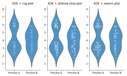
These alternative chart overlays are best used when there are a low to medium number of data points in each group. While showing the individual data points can clarify how the density curves were created and expose information about group size that is not normally evident in a violin plot, their presence adds more chart noise and can be potentially distracting. In addition, once group sizes are large enough, distribution estimates from the density curve and box plot will be stable enough to provide reasonable insights.
Vertical vs. horizontal violin plot
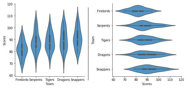
Violin plots can be oriented with either vertical density curves or horizontal density curves. Horizontally-oriented violin plots are a good choice when you need to display long group names or when there are a lot of groups to plot. It is usually easier to expand a plot on its vertical axis than its horizontal; this is important when we need enough room to clearly observe a density curve’s shape.
Ridgeline plot
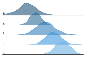
An alternative way of comparing distributions between groups using density curves is with the ridgeline plot. A ridgeline plot is comprised of a vertical stack of regular density curves. Usually, the curves are offset with a slight overlap, which can save space compared to completely separating the axes. This overlap means that the density curves tend to be plotted without any additional overlays. Ridgeline plots are best used when there is a clear pattern in the data across groups.
Related plots
Density curve and box plot
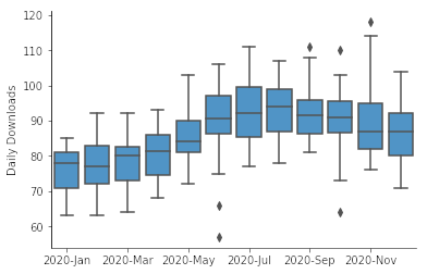
As previously noted, the violin plot is most often rendered as an overlapping series of density curves, boxes, and whiskers. Box plots are limited in what information they can convey, but they are much more straightforward to interpret, especially for making comparisons between groups. Density curves are all about depicting distribution details, but are harder to interpret and visually more noisy. But combined in a violin plot, the two complement each other to get the best of both chart types.
That said, there are scenarios where creating a box plot alone stands out. If there are many groups to plot, the box plot’s simplicity can be a major boon. Any individual box and whiskers needs much less space to be readable than a density curve. Where space is a concern or showing a statistical summary is of top importance, the box plot can be preferable to a violin plot.
Histogram
Compared to density curves, the histogram is the more conventionally-known chart type for depicting distributions. While setting up a KDE requires worrying about kernel shape and bandwidth, creation of a histogram requires consideration of bin sizes and where edges will be aligned. For both chart types, the choice of these parameters can affect how the final plot looks.
Generally, histograms are visualized horizontally with a bottom baseline. It is possible to construct a violin plot using a center-aligned histogram instead of a KDE for the main body, but this tends to require a custom composition of visualization elements.
Visualization tools
Violin plots are less common than other plots like the box plot due to the additional complexity of setting up the kernel and bandwidth. They can also be visually noisy, especially with an overlaid chart type. If you are trying to think of a chart to demonstrate findings to an audience unfamiliar with the violin plot, it might be better to go with a simpler and more straightforward visualization like the box plot.
The violin plot is one of many different chart types that can be used for visualizing data. Learn more from our articles on essential chart types, how to choose a type of data visualization, or by browsing the full collection of articles in the charts category.