A Complete Guide to Stacked Bar Charts
Posted by: Mike Yi
What is a stacked bar chart?
The stacked bar chart (aka stacked bar graph) extends the standard bar chart from looking at numeric values across one categorical variable to two. Each bar in a standard bar chart is divided into a number of sub-bars stacked end to end, each one corresponding to a level of the second categorical variable.
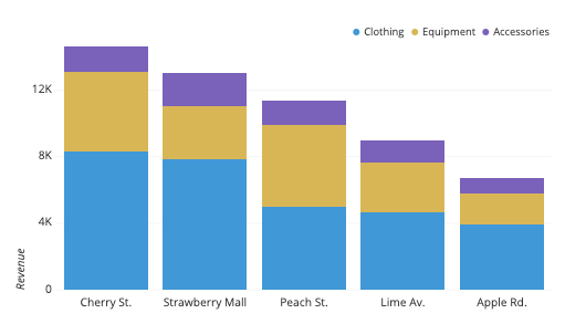
The stacked bar chart above depicts revenue from a fictional fitness retailer for a particular period of time, across two categorical variables: store location and department. The primary categorical variable is store location: we can see from the sorted overall bar heights that the Cherry St. location has the highest revenue and Apple Rd. lowest. Each bar is subdivided based on levels of the second categorical variable, department. We can see that for most locations, clothing is quite a bit larger in sales than equipment, which in turn is larger than accessories. The Strawberry Mall location appears to have a lower proportion of revenue attributed to equipment, while equipment has a larger share for Peach St.
When you should use a stacked bar chart
The main objective of a standard bar chart is to compare numeric values between levels of a categorical variable. One bar is plotted for each level of the categorical variable, each bar’s length indicating numeric value. A stacked bar chart also achieves this objective, but also targets a second goal.
We want to move to a stacked bar chart when we care about the relative decomposition of each primary bar based on the levels of a second categorical variable. Each bar is now comprised of a number of sub-bars, each one corresponding with a level of a secondary categorical variable. The total length of each stacked bar is the same as before, but now we can see how the secondary groups contributed to that total.
Order of categorical variables
One important consideration in building a stacked bar chart is to decide which of the two categorical variables will be the primary variable (dictating major axis positions and overall bar lengths) and which will be the secondary (dictating how each primary bar will be subdivided). The most ‘important’ variable should be the primary; use domain knowledge and the specific type of categorical variables to make a decision on how to assign your categorical variables.
For example, if one categorical variable depicts temporal data (e.g. monthly summaries 20XX-Jan, 20XX-Feb, 20XX-Mar, etc.) then that will usually be a clear choice for the primary categorical. Next in the general hierarchy are other ordered or numeric variables, like age ranges (18-24, 25-34, 35-44, etc.) or ranked scores (agreement on scale from 1-7). Purely label-style categorical variables (e.g. gender, department, geographical region) usually don’t have as strong a weight for being considered as primary. As another consideration, variables with more levels are generally better as primary variables; we want to limit the number of secondary levels to a fairly small amount to make the stack breakdowns easier to read.
Ultimately, these rules of thumb are only general guides. Domain knowledge, visualization objectives, and experimentation will show you the best hierarchy for the categorical variables for each case. For example, if we’re interested in seeing an age breakdown by product department, this is a good reason to set the purely categorical variable (department) as the primary.
Example of data structure
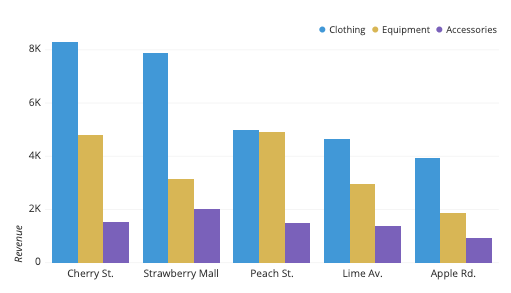
| Store | Clothing | Equipment | Accessories |
| Cherry St. | 8261.68 | 4810.34 | 1536.57 |
| Strawberry Mall | 7875.87 | 3126.58 | 2019.81 |
| Peach St. | 4990.23 | 4923.48 | 1472.59 |
| Lime Av. | 4658.42 | 2955.55 | 1390.55 |
| Apple Rd. | 3952.00 | 1858.46 | 917.90 |
Data for a stacked bar chart is typically formatted into a table with three or more columns. Values down the first column indicate levels of the primary categorical variable. Each column after the first will then correspond with one level of the secondary categorical variable. The main cell values indicate the length of each sub-bar in the plot. Bars are built across rows: when the stacked bar chart is generated, each primary bar will have a total length be the sum across its corresponding row.
For certain tools, an intermediate step for creating a stacked bar chart may require computing cumulative sums across each row. The right-most column will contain the lengths of the primary bars. Sub-bars are defined by the differences in values between consecutive columns. For tools that require this kind of data table structure, beware of negative values since this can cause overlaps or gaps between bars that misrepresent the data.
| Store | Clothing | + Equipment | + Accessories |
| Cherry St. | 8261.68 | 13092.02 | 14628.59 |
| Strawberry Mall | 7875.87 | 11002.45 | 13022.26 |
| Peach St. | 4990.23 | 9913.71 | 11386.30 |
| Lime Av. | 4658.42 | 7613.97 | 9004.52 |
| Apple Rd. | 3952.00 | 5810.46 | 6728.36 |
Best practices for using a stacked bar chart
Stacked bar charts, by their nature, suggest following the same best practices as the standard bar charts they are built up from. However, the addition of a second categorical variable brings additional considerations for creating an effective stacked bar chart.
Maintain a zero-baseline
When a standard bar chart encounters a negative value, the corresponding bar just gets plotted below or to the left of the baseline (depending on if the bars are vertically or horizontally oriented, respectively). In a stacked bar chart, a similar representation can be performed, just stacking bars in the negative direction.
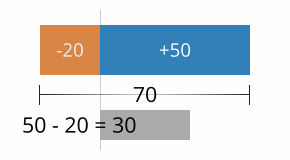
However, when positive bars and negative bars are combined, it is no longer the case that the overall length of the bar corresponds to the bar’s total value. When this occurs, it is a good idea to plot an additional line or series of points on top of the bars to show the true total: the difference between the lengths of the positive bars and negative bars.
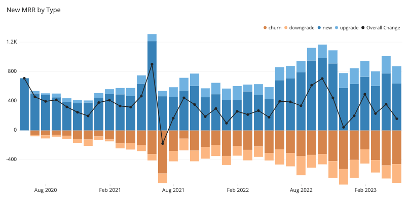
When the secondary values are consistently positive or negative for each subgroup, it is easy to maintain a consistent ordering of sub-bars within each primary bar. However, if multiple subgroups switch between positive and negative at different times, a nice ordering will not be possible as bars switch between being above and below the baseline. In cases like this, it might be best to consider a different chart type for the data. A line chart or grouped bar chart can provide a more consistent display of individual groups, although they lose the ability to see the primary totals. If seeing a total is truly important, that can always be shown in an additional plot – don’t feel as though you need to show everything in a single plot.
Ordering of category levels
With a stacked bar chart, you will need to consider the order of category levels for both categorical variables to be plotted. The rule of thumb for standard bar charts can be applied in both variables: order the bars from largest to smallest unless there is an intrinsic order of levels.

To clarify this rule for the secondary categorical variable, this decision should be based on the overall size of each categorical level. It’s a good idea for each primary bar to be stacked in exactly the same order. Maintaining this consistency makes it easier to associate sub-bars to secondary category levels. This consistency also means that the group that is plotted first always sits on the baseline, making their sizes easy to read. Thus, if tracking exact values is important for a particular secondary variable level, then its sub-bars should be placed on the baseline instead.
Choosing effective colors
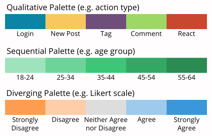
While the general recommendation is to stick with a single color in a standard bar chart, use of color to distinguish secondary variable levels is an inevitability for a stacked bar chart. The important point is to make sure that the choice of color palette to assign to each categorical level matches the variable type: a qualitative palette for purely categorical variables, and sequential, or diverging for variables with a meaningful order.
Common misuses
Interpreting values on individual groups in a stacked area chart
While it is straightforward to compare the total numeric values across the levels of the primary categorical variable, it is less straightforward to gauge other divisions or comparisons using the secondary categorical variable. If we want to see the change in a secondary level across the primary categorical variable, this can only be easily done for the level plotted against the baseline. For all other secondary levels, their baseline will experience shifts, making it more difficult to judge how the sub-bar lengths change across primary bars. In the below example, it can be difficult to tell that the central yellow group is actually decreasing slightly over time.
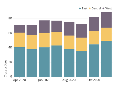
Even trying to compare sub-bars within each primary bar can be difficult. Even when following a guideline to sort secondary category levels by overall size, this presents no guarantee that they will be sorted by size within a particular primary bar. In the same image above, it can be hard to tell where the purple “West” group overtakes the yellow “Central” group in size.
Keep in mind that one of the standard goals of a stacked bar chart is to make relative judgements about the secondary categorical variable, and that making precise judgments are not as important. If comparing the sub-groups is important, then a different chart type like the line chart or grouped bar chart is warranted.
Common stacked bar chart options
Horizontal stacked bar chart
Just like the standard bar chart, the bars in a stacked bar chart can be oriented horizontally (with primary categories on the vertical axis) as well as vertically (with primary categories on the horizontal axis). The horizontal orientation serves the same benefits as before, allowing for the easy display of long category levels without rotation or truncation.

Percentage stacked bar chart
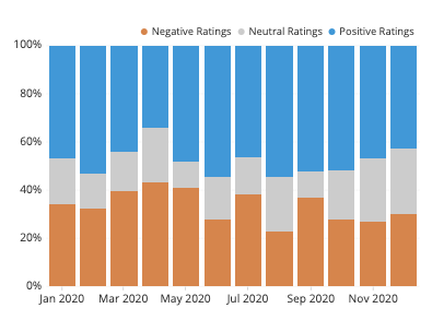
Another common option for stacked bar charts is the percentage, or relative frequency, stacked bar chart. Here, each primary bar is scaled to have the same height, so that each sub-bar becomes a percentage contribution to the whole at each primary category level. This removes our ability to compare the primary category levels’ totals, but allows us to perform a better analysis of the secondary groups’ relative distributions. The fixing of the heights of each primary bar to be the same also creates another baseline at the top of the chart where a second subgroup can be tracked across primary bars.
Value annotations
One way of alleviating the issue of comparing sub-bar sizes from their lengths is to add annotations to each bar indicating its size. This adds a bit more visual clutter, however, so be careful about whether or not it is used. Make sure that the stacked bar chart is in alignment with your primary goals for the visualization, or otherwise choose a different chart type.

Related plots
Pie chart
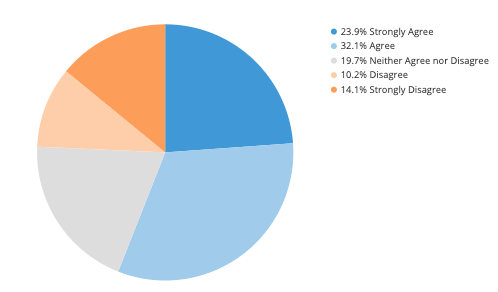
When there is only one bar to be plotted, a pie chart might be considered as an alternative to the stacked bar chart. However, you should try not to use a pie chart when you want to compare two or more primary groups, as is normally the case with a stacked bar chart. Since pie charts generally do not have any tick markings, it can be more difficult to gauge accurate proportions both within and between pies. Pie charts are also limited to relative or percentage comparisons, rather than absolute values. In addition, multiple stacked bar charts will tend to take up less space than multiple pie charts, allowing for an easier view of the full data.
Area chart
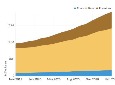
When the primary categorical variable is derived from a continuous feature, such as periods of time, we have the option of using a stacked area chart rather than stacked bars. Stacked areas tend to emphasize changes and trends rather than exact numbers, and it is much cleaner to read when there would otherwise be a lot of bars to plot. In addition, an area chart’s connected nature helps to emphasize the continuous nature of the primary variable.
Grouped bar chart
If we unstack each of the primary bars and instead place the sub-bars in groups on the baseline, then we get a grouped bar chart, also known as a clustered bar chart. With a grouped bar chart, we trade out our ability to observe the totals within each primary category level and gain a more precise understanding of how secondary categories rank within each primary category level.
Marimekko chart
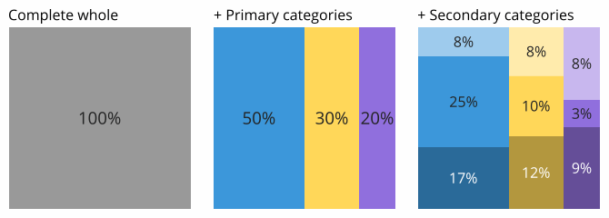
When our numeric variable represents some kind of overall whole that has been divided into parts across two categorical variables, then a more obscure chart type we could choose is the Marimekko chart (aka Mekko chart, mosaic plot, matrix plot). A Marimekko chart is essentially a square or rectangle that has been split into a stacked bar chart in two sequential directions. Compared to the standard absolute value stacked bar chart, each of the primary bars will now have the same length but different widths. Note that this makes interpretation of sub-bars even more difficult in a marimekko chart compared to a stacked bar chart since we cannot just look at bar lengths, but instead need to look at box areas.
Visualization tools
Stacked bar charts are a common chart type for visualization tools, as they are built upon the ubiquitous standard bar chart. Depending on the tool used, the stacked bar chart might simply be part of the basic bar chart type, created automatically from the presence of multiple value columns in the data table. Tools may also put the stacked bar chart and grouped bar chart together, with an option to choose between them.
When a stacked bar chart is not a built-in chart type for a tool, it may be possible to create one by generating multiple bar charts on top of one another. This is where computation of cumulative totals or addition of logic to handle negative values will be necessary.
The stacked bar chart is one of many different chart types that can be used for visualizing data. Learn more from our articles on essential chart types, how to choose a type of data visualization, or by browsing the full collection of articles in the charts category.