A complete guide to histograms
Posted by: Mike Yi
What is a histogram?
A histogram is a chart that plots the distribution of a numeric variable’s values as a series of bars. Each bar typically covers a range of numeric values called a bin or class; a bar’s height indicates the frequency of data points with a value within the corresponding bin.
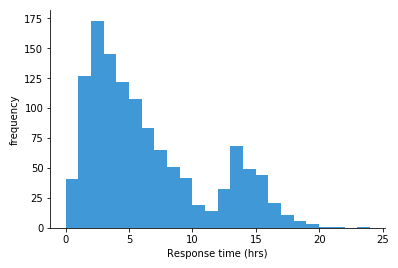
The histogram above shows a frequency distribution for time to response for tickets sent into a fictional support system. Each bar covers one hour of time, and the height indicates the number of tickets in each time range. We can see that the largest frequency of responses were in the 2-3 hour range, with a longer tail to the right than to the left. There’s also a smaller hill whose peak (mode) at 13-14 hour range. If we only looked at numeric statistics like mean and standard deviation, we might miss the fact that there were these two peaks that contributed to the overall statistics.
When you should use a histogram
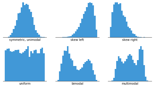
Histograms are good for showing general distributional features of dataset variables. You can see roughly where the peaks of the distribution are, whether the distribution is skewed or symmetric, and if there are any outliers.
In order to use a histogram, we simply require a variable that takes continuous numeric values. This means that the differences between values are consistent regardless of their absolute values. For example, even if the score on a test might take only integer values between 0 and 100, a same-sized gap has the same meaning regardless of where we are on the scale: the difference between 60 and 65 is the same 5-point size as the difference between 90 to 95.
Information about the number of bins and their boundaries for tallying up the data points is not inherent to the data itself. Instead, setting up the bins is a separate decision that we have to make when constructing a histogram. The way that we specify the bins will have a major effect on how the histogram can be interpreted, as will be seen below.
When a value is on a bin boundary, it will consistently be assigned to the bin on its right or its left (or into the end bins if it is on the end points). Which side is chosen depends on the visualization tool; some tools have the option to override their default preference. In this article, it will be assumed that values on a bin boundary will be assigned to the bin to the right.
Example of data structure
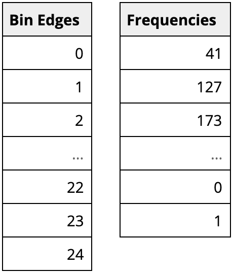
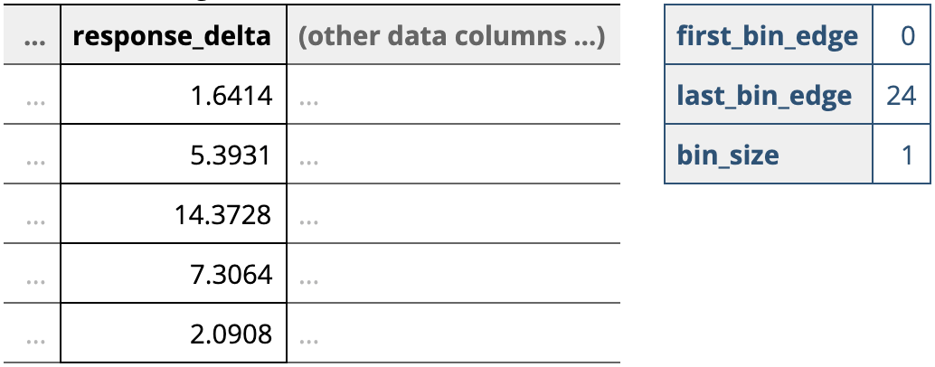
One way that visualization tools can work with data to be visualized as a histogram is from a summarized form like above. Here, the first column indicates the bin boundaries, and the second the number of observations in each bin. Alternatively, certain tools can just work with the original, unaggregated data column, then apply specified binning parameters to the data when the histogram is created.
Best practices for using a histogram
Use a zero-valued baseline
An important aspect of histograms is that they must be plotted with a zero-valued baseline. Since the frequency of data in each bin is implied by the height of each bar, changing the baseline or introducing a gap in the scale will skew the perception of the distribution of data.
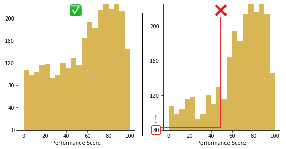
Trimming 80 points from the vertical axis makes the distribution of performance scores look much better than they actually are.
Choose an appropriate number of bins
While tools that can generate histograms usually have some default algorithms for selecting bin boundaries, you will likely want to play around with the binning parameters to choose something that is representative of your data. Wikipedia has an extensive section on rules of thumb for choosing an appropriate number of bins and their sizes, but ultimately, it’s worth using domain knowledge along with a fair amount of playing around with different options to know what will work best for your purposes.
Choice of bin size has an inverse relationship with the number of bins. The larger the bin sizes, the fewer bins there will be to cover the whole range of data. With a smaller bin size, the more bins there will need to be. It is worth taking some time to test out different bin sizes to see how the distribution looks in each one, then choose the plot that represents the data best. If you have too many bins, then the data distribution will look rough, and it will be difficult to discern the signal from the noise. On the other hand, with too few bins, the histogram will lack the details needed to discern any useful pattern from the data.
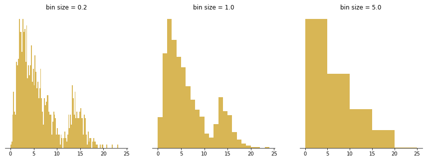
The left panel’s bins are too small, implying a lot of spurious peaks and troughs. The right panel’s bins are too large, hiding any indication of the second peak.
Choose interpretable bin boundaries
Tick marks and labels typically should fall on the bin boundaries to best inform where the limits of each bar lies. Labels don’t need to be set for every bar, but having them between every few bars helps the reader keep track of value. In addition, it is helpful if the labels are values with only a small number of significant figures to make them easy to read.
This suggests that bins of size 1, 2, 2.5, 4, or 5 (which divide 5, 10, and 20 evenly) or their powers of ten are good bin sizes to start off with as a rule of thumb. This also means that bins of size 3, 7, or 9 will likely be more difficult to read, and shouldn’t be used unless the context makes sense for them.

Top: carelessly splitting the data into ten bins from min to max can end up with some very odd bin divisions. Bottom: fewer tick marks are needed when the bin size is easy to follow.
A small word of caution: make sure you consider the types of values that your variable of interest takes. In the case of a fractional bin size like 2.5, this can be a problem if your variable only takes integer values. A bin running from 0 to 2.5 has opportunity to collect three different values (0, 1, 2) but the following bin from 2.5 to 5 can only collect two different values (3, 4 – 5 will fall into the following bin). This means that your histogram can look unnaturally “bumpy” simply due to the number of values that each bin could possibly take.
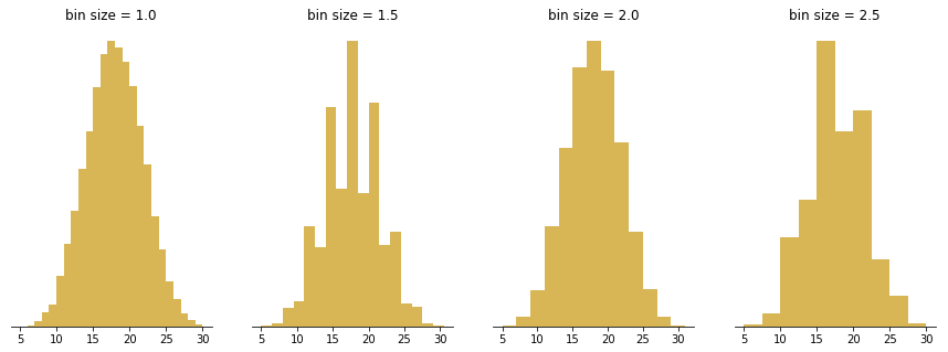
The figure above visualizes the distribution of outcomes when summing the result of five die rolls, repeated 20 000 times. The expected bell shape looks spiky or lopsided when bin sizes that capture different amounts of integer outcomes are chosen.
Common misuses
Measured variable is not continuous numeric
As noted in the opening sections, a histogram is meant to depict the frequency distribution of a continuous numeric variable. When our variable of interest does not fit this property, we need to use a different chart type instead: a bar chart. A variable that takes categorical values, like user type (e.g. guest, user) or location are clearly non-numeric, and so should use a bar chart. However, there are certain variable types that can be trickier to classify: those that take on discrete numeric values and those that take on time-based values.
Variables that take discrete numeric values (e.g. integers 1, 2, 3, etc.) can be plotted with either a bar chart or histogram, depending on context. Using a histogram will be more likely when there are a lot of different values to plot. When the range of numeric values is large, the fact that values are discrete tends to not be important and continuous grouping will be a good idea.
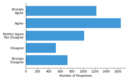
One major thing to be careful of is that the numbers are representative of actual value. If the numbers are actually codes for a categorical or loosely-ordered variable, then that’s a sign that a bar chart should be used. For example, if you have survey responses on a scale from 1 to 5, encoding values from “strongly disagree” to “strongly agree”, then the frequency distribution should be visualized as a bar chart. The reason is that the differences between individual values may not be consistent: we don’t really know that the meaningful difference between a 1 and 2 (“strongly disagree” to “disagree”) is the same as the difference between a 2 and 3 (“disagree” to “neither agree nor disagree”).
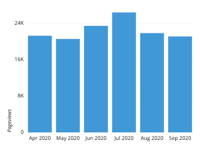
A trickier case is when our variable of interest is a time-based feature. When values correspond to relative periods of time (e.g. 30 seconds, 20 minutes), then binning by time periods for a histogram makes sense. However, when values correspond to absolute times (e.g. January 10, 12:15) the distinction becomes blurry. When new data points are recorded, values will usually go into newly-created bins, rather than within an existing range of bins. In addition, certain natural grouping choices, like by month or quarter, introduce slightly unequal bin sizes. For these reasons, it is not too unusual to see a different chart type like bar chart or line chart used.
Using unequal bin sizes
While all of the examples so far have shown histograms using bins of equal size, this actually isn’t a technical requirement. When data is sparse, such as when there’s a long data tail, the idea might come to mind to use larger bin widths to cover that space. However, creating a histogram with bins of unequal size is not strictly a mistake, but doing so requires some major changes in how the histogram is created and can cause a lot of difficulties in interpretation.
The technical point about histograms is that the total area of the bars represents the whole, and the area occupied by each bar represents the proportion of the whole contained in each bin. When bin sizes are consistent, this makes measuring bar area and height equivalent. In a histogram with variable bin sizes, however, the height can no longer correspond with the total frequency of occurrences. Doing so would distort the perception of how many points are in each bin, since increasing a bin’s size will only make it look bigger. In the center plot of the below figure, the bins from 5-6, 6-7, and 7-10 end up looking like they contain more points than they actually do.
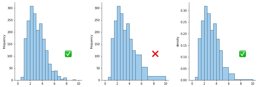
Left: histogram with equal-sized bins; Center: histogram with unequal bins but improper vertical axis units; Right: histogram with unequal bins with density heights
Instead, the vertical axis needs to encode the frequency density per unit of bin size. For example, in the right pane of the above figure, the bin from 2-2.5 has a height of about 0.32. Multiply by the bin width, 0.5, and we can estimate about 16% of the data in that bin. The heights of the wider bins have been scaled down compared to the central pane: note how the overall shape looks similar to the original histogram with equal bin sizes. Density is not an easy concept to grasp, and such a plot presented to others unfamiliar with the concept will have a difficult time interpreting it.
Because of all of this, the best advice is to try and just stick with completely equal bin sizes. The presence of empty bins and some increased noise in ranges with sparse data will usually be worth the increase in the interpretability of your histogram. On the other hand, if there are inherent aspects of the variable to be plotted that suggest uneven bin sizes, then rather than use an uneven-bin histogram, you may be better off with a bar chart instead.
Common histogram options
Absolute frequency vs. relative frequency
Depending on the goals of your visualization, you may want to change the units on the vertical axis of the plot as being in terms of absolute frequency or relative frequency. Absolute frequency is just the natural count of occurrences in each bin, while relative frequency is the proportion of occurrences in each bin. The choice of axis units will depend on what kinds of comparisons you want to emphasize about the data distribution.
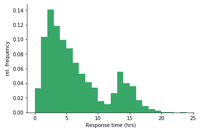
Converting the first example to be in terms of relative frequency, it’s much easier to add up the first five bars to find that about half of the tickets are responded to within five hours.
Displaying unknown or missing data
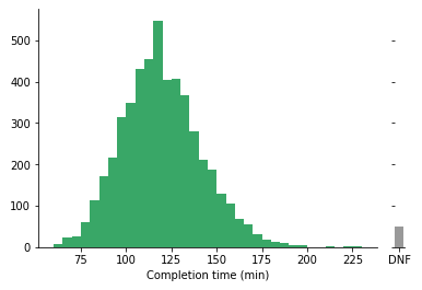
This is actually not a particularly common option, but it’s worth considering when it comes down to customizing your plots. If a data row is missing a value for the variable of interest, it will often be skipped over in the tally for each bin. If showing the amount of missing or unknown values is important, then you could combine the histogram with an additional bar that depicts the frequency of these unknowns. When plotting this bar, it is a good idea to put it on a parallel axis from the main histogram and in a different, neutral color so that points collected in that bar are not confused with having a numeric value.
Related plots
Bar chart
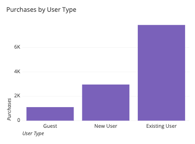
As noted above, if the variable of interest is not continuous and numeric, but instead discrete or categorical, then we will want a bar chart instead. In contrast to a histogram, the bars on a bar chart will typically have a small gap between each other: this emphasizes the discrete nature of the variable being plotted.
Line chart
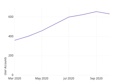
If you have binned numeric data but want the vertical axis of your plot to convey something other than frequency information, then you should look towards using a line chart. The vertical position of points in a line chart can depict values or statistical summaries of a second variable. When a line chart is used to depict frequency distributions like a histogram, this is called a frequency polygon.
Density curve
A density curve, or kernel density estimate (KDE), is an alternative to the histogram that gives each data point a continuous contribution to the distribution. In a histogram, you might think of each data point as pouring liquid from its value into a series of cylinders below (the bins). In a KDE, each data point adds a small lump of volume around its true value, which is stacked up across data points to generate the final curve. The shape of the lump of volume is the ‘kernel’, and there are limitless choices available. Because of the vast amount of options when choosing a kernel and its parameters, density curves are typically the domain of programmatic visualization tools.
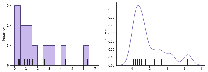
The thick black dashes indicate data points that contribute to the histogram (left) and density curve (right). Note how each point contributes a small bell-shaped curve to the overall shape.
Box plot and violin plot
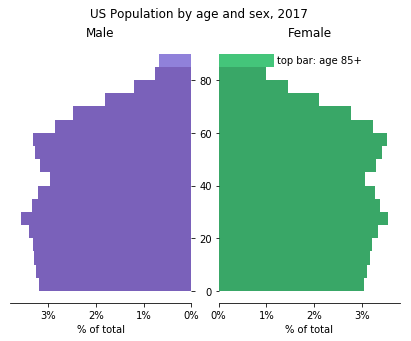
Histograms are good at showing the distribution of a single variable, but it’s somewhat tricky to make comparisons between histograms if we want to compare that variable between different groups. With two groups, one possible solution is to plot the two groups’ histograms back-to-back. A domain-specific version of this type of plot is the population pyramid, which plots the age distribution of a country or other region for men and women as back-to-back vertical histograms.
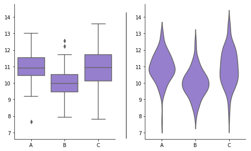
However, if we have three or more groups, the back-to-back solution won’t work. One solution could be to create faceted histograms, plotting one per group in a row or column. Another alternative is to use a different plot type such as a box plot or violin plot. Both of these plot types are typically used when we wish to compare the distribution of a numeric variable across levels of a categorical variable. Compared to faceted histograms, these plots trade accurate depiction of absolute frequency for a more compact relative comparison of distributions.
Visualization tools
As a fairly common visualization type, most tools capable of producing visualizations will have a histogram as an option. Where a histogram is unavailable, the bar chart should be available as a close substitute. Creation of a histogram can require slightly more work than other basic chart types due to the need to test different binning options to find the best option. However, this effort is often worth it, as a good histogram can be a very quick way of accurately conveying the general shape and distribution of a data variable.
The histogram is one of many different chart types that can be used for visualizing data. Learn more from our articles on essential chart types, how to choose a type of data visualization, or by browsing the full collection of articles in the charts category.