A complete guide to heatmaps
Posted by: Mike Yi
What is a heatmap?
A heatmap (aka heat map) depicts values for a main variable of interest across two axis variables as a grid of colored squares. The axis variables are divided into ranges like a bar chart or histogram, and each cell’s color indicates the value of the main variable in the corresponding cell range.
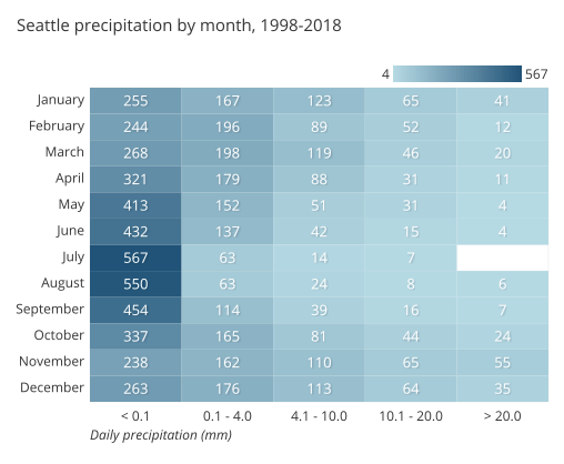
The example heatmap above depicts the daily precipitation distribution, grouped by month, and recorded over eleven years in Seattle, Washington. Each cell reports a numeric count, like in a standard data table, but the count is accompanied by a color, with larger counts associated with darker colorings. From the heat map, we can see from the darkest colorings in the left-most column that most days had no precipitation across the entire year. The pattern in cell colors across months also shows that rain is more common in the winter from November to March, and least common in the summer months of July and August.
2-d density plots
The term heatmap is also used in a more general sense, where data is not constrained to a grid. For example, tracking tools for websites can be set up to see how users interact with the site, like studying where a user clicks, or how far down a page readers tend to scroll.

Example heatmap from Google Maps documentation
Every click (or other tracking event) is associated with a position, which radiates a small amount of numeric value around its location. These values are totaled together across all events and then plotted with an associated colormap. The visual language of these tools’ output, associating value with color, is similar to the type of heatmap defined at the top, just without a grid-based structure. Heatmaps of this type are sometimes also known as 2-d density plots.
When you should use a heatmap
Heatmaps are used to show relationships between two variables, one plotted on each axis. By observing how cell colors change across each axis, you can observe if there are any patterns in value for one or both variables.
The variables plotted on each axis can be of any type, whether they take on categorical labels or numeric values. In the latter case, the numeric value must be binned like in a histogram in order to form the grid cells where colors associated with the main variable of interest will be plotted.
Cell colorings can correspond to all manner of metrics, like a frequency count of points in each bin, or summary statistics like mean or median for a third variable. One way of thinking of the construction of a heatmap is as a table or matrix, with color encoding on top of the cells. In certain applications, it is also possible for cells to be colored based on non-numeric values (e.g. general qualitative levels of low, medium, high).
Example of data structure
USERNAME | < 0.01 | 0.1 - 4.0 | 4.1 - 10.0 | … |
|---|---|---|---|---|
| January | < 0.01 255 | 0.1 - 4.0 167 | 4.1 - 10.0 123 | … … |
| February | < 0.01 244 | 0.1 - 4.0 196 | 4.1 - 10.0 89 | … … |
| March | < 0.01 268 | 0.1 - 4.0 198 | 4.1 - 10.0 119 | … … |
| April | < 0.01 321 | 0.1 - 4.0 179 | 4.1 - 10.0 88 | … … |
| … | < 0.01 … | 0.1 - 4.0 … | 4.1 - 10.0 … | … … |
Different visualization applications can have different ways of accepting data for plotting as a heatmap. In one major form, data can be supplied in the same way it would be naturally displayed as a table. The first column will hold values for one axis of the heatmap, while the names of the remaining columns will correspond with bins for the remaining axis. Values in those columns will be encoded into the heatmap itself.
The other common form for heatmap data sets it up in a three-column format. Each cell in the heatmap is associated with one row in the data table. The first two columns specify the ‘coordinates’ of the heat map cell, while the third column indicates the cell’s value.
MONTH | PRCP_BUCKET | COUNT |
|---|---|---|
| March | 10.1 - 20.0 | 46 |
| March | > 20.0 | 20 |
| April | < 0.1 | 321 |
| April | 0.1 - 4.0 | 179 |
| … | … | … |
Best practices for using a heatmap
Choose an appropriate color palette
Color is a core component of this chart type, so it’s worth making sure that you choose an appropriate color palette to match the data. Most frequently, there will be a sequential color ramp between value and color, where lighter colors correspond to smaller values and darker colors to larger values, or vice versa. However, a diverging color palette may be used when values have a meaningful zero point.

Include a legend
As an associated note, it is generally required for a heatmap to include a legend for how colors map to numeric values. Since color on its own has no inherent association with value, a key is vital for viewers to grasp the values in a heatmap. An exception for including a legend can come when the absolute association of value to color is not important, only the relative patterns of data plotted.

The GitHub contributions calendar uses a general legend to show volume of contributions by day. (Source: GitHub)
Show values in cells
There is a lack of precision for mapping color to value, especially compared to other encodings like position or length. Where possible, it is a good idea to add cell value annotations to the heatmap as a double encoding of value.
Sort levels by similarity or value
When one or both axis variables in a plot are categorical in nature, it can be worth considering changing the order in which those axis variable levels are plotted. If the categories do not have an inherent ordering, we might want to choose an order that best helps the reader grasp patterns in the data. A common option is to sort categories by their average cell value from largest to smallest.
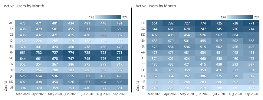
The right-side heatmap is sorted by the last column value.
A more advanced technique involves grouping and clustering category values by measurement of similarity. This is often seen in the clustered heatmap use case discussed below.
Select useful tick marks
For numeric axis variables, choices can be made in how bins are set up and how they are indicated in the chart. If there are few bins, it is fine to keep tick marks on each bin like for a categorical axis variable. However, when there are a lot of bins, a better option is to plot tick marks between sets of bins to avoid overcrowding. The number of bins that you should use and how large they are will depend on the nature of the data, so it can be a good idea to experiment with different settings. See our article on histograms for more detailed tips on setting bin sizes for numeric variables.
Common heatmap options
Clustered heatmap
Instead of having the horizontal axis represent levels or values of a single variable, it is a common variation to have it represent measurements of different variables or metrics. If we set the vertical axis as individual observations, we end up with something resembling a standard data table, where each row is an observation and the columns the entity’s value on each measured variable.
This type of heatmap is sometimes known as a clustered or clustering heatmap, since the goal of this kind of chart is to build associations between both the data points and their features. We want to see which individuals are similar or different from each other, with a similar objective for variables. Analysis tools that construct this type of heatmap will usually implement clustering as part of their process. This use case is found in areas like the biological sciences, such as when studying similarities in gene expression across individuals.
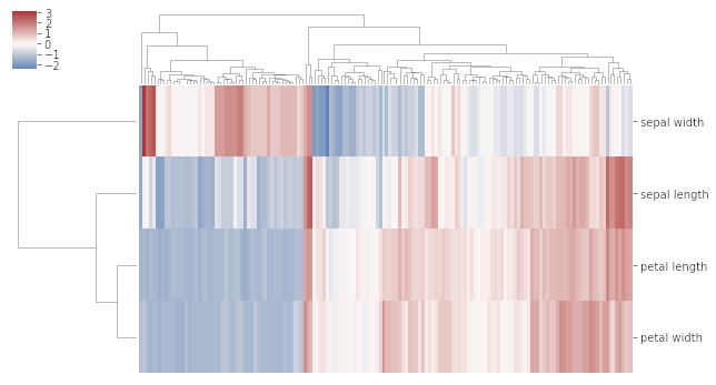
In the above clustered heatmap, each column represents an individual flower specimen, and each row a measurement from that specimen.
Correlogram
A correlogram is a variant of the heatmap that replaces each of the variables on the two axes with a list of numeric variables in the dataset. Each cell depicts the relationship between the intersecting variables, such as a linear correlation. Sometimes, these simple correlations are replaced with more complex representations of relationship, like scatter plots.
Correlograms are often seen in an exploratory role, helping analysts understand relationships between variables in service of building descriptive or predictive statistical models.
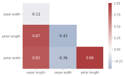
Petal length is highly correlated with petal width and sepal length; sepal length is negatively correlated with the other three variables.
Related plots
Bar chart and histogram
The closest one-dimensional analogues for the heatmap are the bar chart and histogram, corresponding to categorical and numeric data, respectively. For these charts, bar lengths are indicators of value, instead of color. (Although it’s worth noting that histogram bars tend to solely depict frequency information – when a summary metric is computed on each bin, we tend to use a line chart instead.) The best practices notes for ordering levels and setting tick marks above come from these more basic chart types.

Grouped bar chart
An alternative way of showing data in a heatmap is through a grouped bar chart. Each row of the heatmap becomes a cluster of bars, and each bar’s height indicates the corresponding cell’s value. Color is instead used to make sure that column values can be tracked between clusters.
Grouped bar charts are used when more precise comparisons between cell values are desired. However, they are a poor choice when there are a lot of bars that need to be plotted and when both axis variables are numeric in nature. In that case, it’s best to stick with the heatmap, which is more compact and does a better job of showing a broad overview across both axis variables at the same time.

Scatter plot
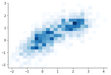
Scatter plots may not seem related to heatmaps, since they plot individual data points by position rather than color. However, when there are so many data points that they have a high level of overlap, this can obscure the relationship between variables, an issue called overplotting. One of the options for overcoming overplotting is to use a heatmap instead, which counts the number of points that fall in each bin. This use of a heatmap is also known as a 2-d histogram.

Choropleth
The language of associating color to value is not solely the domain of the heatmap. One particular example of this kind of encoding can be seen in the choropleth. A choropleth is like a heatmap in that numeric values are encoded with colored areas, but these values are associated with geographic regions rather than a strict grid.

Visualization tools
The heatmap is a common chart type, though its implementation can vary greatly depending on the application being used. Pay careful attention to the data format required by the program in order to make sure your data is interpreted properly. Clustered heatmaps and correlograms are more specialized variants, and will usually be accompanied by different workflows or dedicated functions or tools.
The heatmap is one of many different chart types that can be used for visualizing data. Learn more from our articles on essential chart types, how to choose a type of data visualization, or by browsing the full collection of articles in the charts category.